
Recommended
More Related Content
Similar to Migration within usa
Similar to Migration within usa (9)
More from hanslunow
More from hanslunow (20)
Recently uploaded
Recently uploaded (20)
Migration within usa
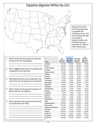
- 1. Please use the data from the graph below to complete the following activity. Color all the states that saw an increase in migration yellow, and all those that saw a decrease red. Color all other states green. 1. Which states had the largest net migration, and which lost the most people? __________________________________ __________________________________ 2. Which regions experienced the greatest gain in population from migration? __________________________________ __________________________________ 3. What generalization can you make about the states that saw the greatest out-migration? __________________________________ __________________________________ 4. Which states saw the greatest migration of Blacks, Whites, and Hispanics. __________________________________ __________________________________ __________________________________ 5. What additional data would you think should be studied with this? Why? __________________________________ __________________________________ __________________________________ __________________________________ __________________________________ __________________________________ 78