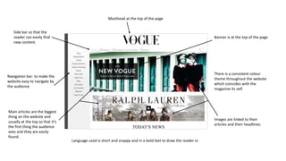
1. Navigation bar: to make the
website easy to navigate by
the audience
Masthead at the top of the page
Banner is at the top of the page
There is a consistent colour
theme throughout the website
which coincides with the
magazine its self.
Images are linked to their
articles and their headlines.
Language used is short and snappy and in a bold text to draw the reader in.
Side bar so that the
reader can easily find
new content.
Main articles are the biggest
thing on the website and
usually at the top so that it’s
the first thing the audience
sees and they are easily
found.