Download as PDF, PPTX


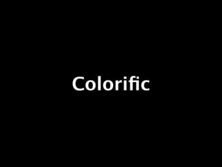


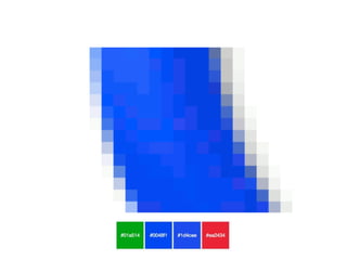


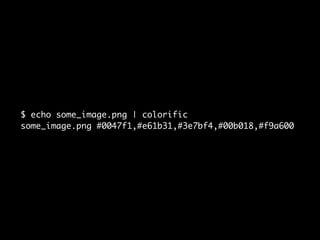
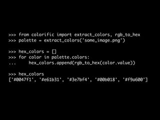
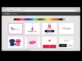
![>>> from colorific import extract_colors, rgb_to_hex
>>> palette = extract_colors('some_image.png')
>>> hex_colors = []
>>> for color in palette.colors:
... hex_colors.append(rgb_to_hex(color.value))
>>> hex_colors
['#0047f1', '#e61b31', '#3e7bf4', '#00b018', '#f9a600']](https://image.slidesharecdn.com/pycon-colourcopy-120819070853-phpapp02/85/Graphic-design-colour-trends-30-320.jpg)

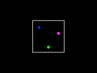
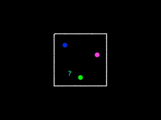
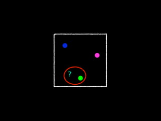


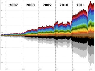
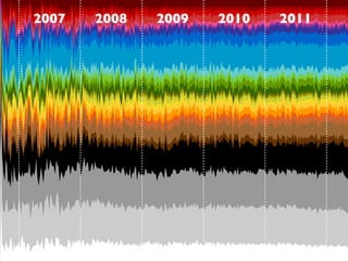

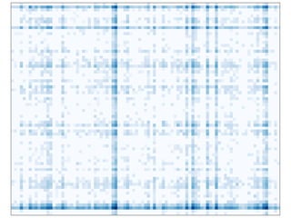
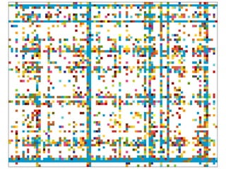

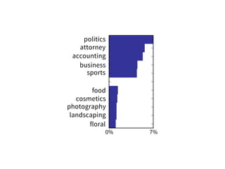


The document discusses various aspects of graphic design, focusing on color trends and the extraction of colors from images using a tool called Colorific. It highlights color theory and provides examples of using the Colorific library to analyze images and generate color palettes. Additionally, it touches on indexing design data using R-trees for efficient spatial data management.


