Colour
•Download as PPTX, PDF•
0 likes•113 views
The document discusses experimenting with different fonts and colors in Photoshop for a film title. The author screenshots a desired font into Photoshop and uses selection tools to isolate just the font. They test different shades of red as potential colors for the bold title, hoping a brighter red will stand out against white titles in the trailer by connoting blood in a bold way, while a darker red could represent older, dried blood and the dead villain. Effects are also tested on the font selections.
Report
Share
Report
Share

Recommended
Model Call Girl Services in Delhi reach out to us at 🔝 9953056974 🔝✔️✔️
Our agency presents a selection of young, charming call girls available for bookings at Oyo Hotels. Experience high-class escort services at pocket-friendly rates, with our female escorts exuding both beauty and a delightful personality, ready to meet your desires. Whether it's Housewives, College girls, Russian girls, Muslim girls, or any other preference, we offer a diverse range of options to cater to your tastes.
We provide both in-call and out-call services for your convenience. Our in-call location in Delhi ensures cleanliness, hygiene, and 100% safety, while our out-call services offer doorstep delivery for added ease.
We value your time and money, hence we kindly request pic collectors, time-passers, and bargain hunters to refrain from contacting us.
Our services feature various packages at competitive rates:
One shot: ₹2000/in-call, ₹5000/out-call
Two shots with one girl: ₹3500/in-call, ₹6000/out-call
Body to body massage with sex: ₹3000/in-call
Full night for one person: ₹7000/in-call, ₹10000/out-call
Full night for more than 1 person: Contact us at 🔝 9953056974 🔝. for details
Operating 24/7, we serve various locations in Delhi, including Green Park, Lajpat Nagar, Saket, and Hauz Khas near metro stations.
For premium call girl services in Delhi 🔝 9953056974 🔝. Thank you for considering us!call girls in Dakshinpuri (DELHI) 🔝 >༒9953056974 🔝 genuine Escort Service 🔝✔️✔️
call girls in Dakshinpuri (DELHI) 🔝 >༒9953056974 🔝 genuine Escort Service 🔝✔️✔️9953056974 Low Rate Call Girls In Saket, Delhi NCR
Top Rated Pune Call Girls Koregaon Park ⟟ 6297143586 ⟟ Call Me For Genuine Sex Service At Affordable Rate
Booking Contact Details
WhatsApp Chat: +91-6297143586
pune Escort Service includes providing maximum physical satisfaction to their clients as well as engaging conversation that keeps your time enjoyable and entertaining. Plus they look fabulously elegant; making an impressionable.
Independent Escorts pune understands the value of confidentiality and discretion - they will go the extra mile to meet your needs. Simply contact them via text messaging or through their online profiles; they'd be more than delighted to accommodate any request or arrange a romantic date or fun-filled night together.
We provide -
01-may-2024(v.n)
Top Rated Pune Call Girls Koregaon Park ⟟ 6297143586 ⟟ Call Me For Genuine S...
Top Rated Pune Call Girls Koregaon Park ⟟ 6297143586 ⟟ Call Me For Genuine S...Call Girls in Nagpur High Profile
Mtp kit in kuwait௹+918133066128....) @abortion pills for sale in Kuwait City ✒Abortion CLINIC In Kuwait ?Kuwait pills +918133066128௵) safe Abortion Pills for sale in Salmiya, Kuwait city,Farwaniya-cytotec pills for sale in Kuwait city. Kuwait pills +918133066128WHERE I CAN BUY ABORTION PILLS IN KUWAIT, CYTOTEC 200MG PILLS AVAILABLE IN KUWAIT, MIFEPRISTONE & MISOPROSTOL MTP KIT FOR SALE IN KUWAIT. Whatsapp:+Abortion Pills For Sale In Mahboula-abortion pills in Mahboula-abortion pills in Kuwait City- .Kuwait pills +918133066128)))abortion pills for sale in Mahboula …Mtp Kit On Sale Kuwait pills +918133066128mifepristone Tablets available in Kuwait?Zahra Kuwait pills +918133066128Buy Abortion Pills Cytotec Misoprostol 200mcg Pills Brances and now offering services in Sharjah, Abu Dhabi, Dubai, **))))Abortion Pills For Sale In Ras Al-Khaimah(((online Cytotec Available In Al Madam))) Cytotec Available In muscat, Cytotec 200 Mcg In Zayed City, hatta,Cytotec Pills௵+ __}Kuwait pills +918133066128}— ABORTION IN UAE (DUBAI, SHARJAH, AJMAN, UMM AL QUWAIN, ...UAE-ABORTION PILLS AVAILABLE IN DUBAI/ABUDHABI-where can i buy abortion pillsCytotec Pills௵+ __}Kuwait pills +918133066128}}}/Where can I buy abortion pills in KUWAIT , KUWAIT CITY, HAWALLY, KUWAIT, AL JAHRA, MANGAF , AHMADI, FAHAHEEL, In KUWAIT ... pills for sale in dubai mall and where anyone can buy abortion pills in Abu Dhabi, Dubai, Sharjah, Ajman, Umm Al Quwain, Ras Al Khaimah ... Abortion pills in Dubai, Abu Dhabi, Sharjah, Ajman, Fujairah, Ras Al Khaimah, Umm Al Quwain…Buy Mifepristone and Misoprostol Cytotec , Mtp KitABORTION PILLS _ABORTION PILLS FOR SALE IN ABU DHABI, DUBAI, AJMAN, FUJUIRAH, RAS AL KHAIMAH, SHARJAH & UMM AL QUWAIN, UAE ❤ Medical Abortion pills in ... ABU DHABI, ABORTION PILLS FOR SALE ----- Dubai, Sharjah, Abu dhabi, Ajman, Alain, Fujairah, Ras Al Khaimah FUJAIRAH, AL AIN, RAS AL KHAIMAMedical Abortion pills in Dubai, Abu Dhabi, Sharjah, Al Ain, Ajman, RAK City, Ras Al Khaimah, Fujairah, Dubai, Qatar, Bahrain, Saudi Arabia, Oman, ...Where I Can Buy Abortion Pills In Al ain where can i buy abortion pills in #Dubai, Exclusive Abortion pills for sale in Dubai ... Abortion Pills For Sale In Rak City, in Doha, Kuwait.௵ Kuwait pills +918133066128₩ Abortion Pills For Sale In Doha, Kuwait,CYTOTEC PILLS AVAILABLE Abortion in Doha, ꧁ @ ꧂ ☆ Abortion Pills For Sale In Ivory park,Rabie Ridge,Phomolong. ] Abortion Pills For Sale In Ivory Park, Abortion Pills+918133066128In Ivory Park, Abortion Clinic In Ivory Park,Termination Pills In Ivory Park,. *)][(Abortion Pills For Sale In Tembisa Winnie Mandela Ivory Park Ebony Park Esangweni Oakmoor Swazi Inn Whats'app...In Ra al Khaimah,safe termination pills for sale in Ras Al Khaimah. | Dubai.. @Kuwait pills +918133066128Abortion Pills For Sale In KuwaAbortion Pills in Oman (+918133066128) Cytotec clinic buy Oman Muscat
Abortion Pills in Oman (+918133066128) Cytotec clinic buy Oman MuscatAbortion pills in Kuwait Cytotec pills in Kuwait
More Related Content
Recently uploaded
Model Call Girl Services in Delhi reach out to us at 🔝 9953056974 🔝✔️✔️
Our agency presents a selection of young, charming call girls available for bookings at Oyo Hotels. Experience high-class escort services at pocket-friendly rates, with our female escorts exuding both beauty and a delightful personality, ready to meet your desires. Whether it's Housewives, College girls, Russian girls, Muslim girls, or any other preference, we offer a diverse range of options to cater to your tastes.
We provide both in-call and out-call services for your convenience. Our in-call location in Delhi ensures cleanliness, hygiene, and 100% safety, while our out-call services offer doorstep delivery for added ease.
We value your time and money, hence we kindly request pic collectors, time-passers, and bargain hunters to refrain from contacting us.
Our services feature various packages at competitive rates:
One shot: ₹2000/in-call, ₹5000/out-call
Two shots with one girl: ₹3500/in-call, ₹6000/out-call
Body to body massage with sex: ₹3000/in-call
Full night for one person: ₹7000/in-call, ₹10000/out-call
Full night for more than 1 person: Contact us at 🔝 9953056974 🔝. for details
Operating 24/7, we serve various locations in Delhi, including Green Park, Lajpat Nagar, Saket, and Hauz Khas near metro stations.
For premium call girl services in Delhi 🔝 9953056974 🔝. Thank you for considering us!call girls in Dakshinpuri (DELHI) 🔝 >༒9953056974 🔝 genuine Escort Service 🔝✔️✔️
call girls in Dakshinpuri (DELHI) 🔝 >༒9953056974 🔝 genuine Escort Service 🔝✔️✔️9953056974 Low Rate Call Girls In Saket, Delhi NCR
Top Rated Pune Call Girls Koregaon Park ⟟ 6297143586 ⟟ Call Me For Genuine Sex Service At Affordable Rate
Booking Contact Details
WhatsApp Chat: +91-6297143586
pune Escort Service includes providing maximum physical satisfaction to their clients as well as engaging conversation that keeps your time enjoyable and entertaining. Plus they look fabulously elegant; making an impressionable.
Independent Escorts pune understands the value of confidentiality and discretion - they will go the extra mile to meet your needs. Simply contact them via text messaging or through their online profiles; they'd be more than delighted to accommodate any request or arrange a romantic date or fun-filled night together.
We provide -
01-may-2024(v.n)
Top Rated Pune Call Girls Koregaon Park ⟟ 6297143586 ⟟ Call Me For Genuine S...
Top Rated Pune Call Girls Koregaon Park ⟟ 6297143586 ⟟ Call Me For Genuine S...Call Girls in Nagpur High Profile
Mtp kit in kuwait௹+918133066128....) @abortion pills for sale in Kuwait City ✒Abortion CLINIC In Kuwait ?Kuwait pills +918133066128௵) safe Abortion Pills for sale in Salmiya, Kuwait city,Farwaniya-cytotec pills for sale in Kuwait city. Kuwait pills +918133066128WHERE I CAN BUY ABORTION PILLS IN KUWAIT, CYTOTEC 200MG PILLS AVAILABLE IN KUWAIT, MIFEPRISTONE & MISOPROSTOL MTP KIT FOR SALE IN KUWAIT. Whatsapp:+Abortion Pills For Sale In Mahboula-abortion pills in Mahboula-abortion pills in Kuwait City- .Kuwait pills +918133066128)))abortion pills for sale in Mahboula …Mtp Kit On Sale Kuwait pills +918133066128mifepristone Tablets available in Kuwait?Zahra Kuwait pills +918133066128Buy Abortion Pills Cytotec Misoprostol 200mcg Pills Brances and now offering services in Sharjah, Abu Dhabi, Dubai, **))))Abortion Pills For Sale In Ras Al-Khaimah(((online Cytotec Available In Al Madam))) Cytotec Available In muscat, Cytotec 200 Mcg In Zayed City, hatta,Cytotec Pills௵+ __}Kuwait pills +918133066128}— ABORTION IN UAE (DUBAI, SHARJAH, AJMAN, UMM AL QUWAIN, ...UAE-ABORTION PILLS AVAILABLE IN DUBAI/ABUDHABI-where can i buy abortion pillsCytotec Pills௵+ __}Kuwait pills +918133066128}}}/Where can I buy abortion pills in KUWAIT , KUWAIT CITY, HAWALLY, KUWAIT, AL JAHRA, MANGAF , AHMADI, FAHAHEEL, In KUWAIT ... pills for sale in dubai mall and where anyone can buy abortion pills in Abu Dhabi, Dubai, Sharjah, Ajman, Umm Al Quwain, Ras Al Khaimah ... Abortion pills in Dubai, Abu Dhabi, Sharjah, Ajman, Fujairah, Ras Al Khaimah, Umm Al Quwain…Buy Mifepristone and Misoprostol Cytotec , Mtp KitABORTION PILLS _ABORTION PILLS FOR SALE IN ABU DHABI, DUBAI, AJMAN, FUJUIRAH, RAS AL KHAIMAH, SHARJAH & UMM AL QUWAIN, UAE ❤ Medical Abortion pills in ... ABU DHABI, ABORTION PILLS FOR SALE ----- Dubai, Sharjah, Abu dhabi, Ajman, Alain, Fujairah, Ras Al Khaimah FUJAIRAH, AL AIN, RAS AL KHAIMAMedical Abortion pills in Dubai, Abu Dhabi, Sharjah, Al Ain, Ajman, RAK City, Ras Al Khaimah, Fujairah, Dubai, Qatar, Bahrain, Saudi Arabia, Oman, ...Where I Can Buy Abortion Pills In Al ain where can i buy abortion pills in #Dubai, Exclusive Abortion pills for sale in Dubai ... Abortion Pills For Sale In Rak City, in Doha, Kuwait.௵ Kuwait pills +918133066128₩ Abortion Pills For Sale In Doha, Kuwait,CYTOTEC PILLS AVAILABLE Abortion in Doha, ꧁ @ ꧂ ☆ Abortion Pills For Sale In Ivory park,Rabie Ridge,Phomolong. ] Abortion Pills For Sale In Ivory Park, Abortion Pills+918133066128In Ivory Park, Abortion Clinic In Ivory Park,Termination Pills In Ivory Park,. *)][(Abortion Pills For Sale In Tembisa Winnie Mandela Ivory Park Ebony Park Esangweni Oakmoor Swazi Inn Whats'app...In Ra al Khaimah,safe termination pills for sale in Ras Al Khaimah. | Dubai.. @Kuwait pills +918133066128Abortion Pills For Sale In KuwaAbortion Pills in Oman (+918133066128) Cytotec clinic buy Oman Muscat
Abortion Pills in Oman (+918133066128) Cytotec clinic buy Oman MuscatAbortion pills in Kuwait Cytotec pills in Kuwait
Recently uploaded (20)
call girls in Dakshinpuri (DELHI) 🔝 >༒9953056974 🔝 genuine Escort Service 🔝✔️✔️
call girls in Dakshinpuri (DELHI) 🔝 >༒9953056974 🔝 genuine Escort Service 🔝✔️✔️
Recommendable # 971589162217 # philippine Young Call Girls in Dubai By Marina...
Recommendable # 971589162217 # philippine Young Call Girls in Dubai By Marina...
Abortion pill for sale in Muscat (+918761049707)) Get Cytotec Cash on deliver...
Abortion pill for sale in Muscat (+918761049707)) Get Cytotec Cash on deliver...
Top Rated Pune Call Girls Koregaon Park ⟟ 6297143586 ⟟ Call Me For Genuine S...
Top Rated Pune Call Girls Koregaon Park ⟟ 6297143586 ⟟ Call Me For Genuine S...
AMBER GRAIN EMBROIDERY | Growing folklore elements | Root-based materials, w...
AMBER GRAIN EMBROIDERY | Growing folklore elements | Root-based materials, w...
Escorts Service Basapura ☎ 7737669865☎ Book Your One night Stand (Bangalore)
Escorts Service Basapura ☎ 7737669865☎ Book Your One night Stand (Bangalore)
RT Nagar Call Girls Service: 🍓 7737669865 🍓 High Profile Model Escorts | Bang...
RT Nagar Call Girls Service: 🍓 7737669865 🍓 High Profile Model Escorts | Bang...
HiFi Call Girl Service Delhi Phone ☞ 9899900591 ☜ Escorts Service at along wi...
HiFi Call Girl Service Delhi Phone ☞ 9899900591 ☜ Escorts Service at along wi...
VIP Model Call Girls Kalyani Nagar ( Pune ) Call ON 8005736733 Starting From ...
VIP Model Call Girls Kalyani Nagar ( Pune ) Call ON 8005736733 Starting From ...
8377087607, Door Step Call Girls In Kalkaji (Locanto) 24/7 Available
8377087607, Door Step Call Girls In Kalkaji (Locanto) 24/7 Available
Brookefield Call Girls: 🍓 7737669865 🍓 High Profile Model Escorts | Bangalore...
Brookefield Call Girls: 🍓 7737669865 🍓 High Profile Model Escorts | Bangalore...
Abortion Pills in Oman (+918133066128) Cytotec clinic buy Oman Muscat
Abortion Pills in Oman (+918133066128) Cytotec clinic buy Oman Muscat
Verified Trusted Call Girls Adugodi💘 9352852248 Good Looking standard Profil...
Verified Trusted Call Girls Adugodi💘 9352852248 Good Looking standard Profil...
Featured
Featured (20)
Product Design Trends in 2024 | Teenage Engineerings
Product Design Trends in 2024 | Teenage Engineerings
How Race, Age and Gender Shape Attitudes Towards Mental Health
How Race, Age and Gender Shape Attitudes Towards Mental Health
AI Trends in Creative Operations 2024 by Artwork Flow.pdf
AI Trends in Creative Operations 2024 by Artwork Flow.pdf
Content Methodology: A Best Practices Report (Webinar)
Content Methodology: A Best Practices Report (Webinar)
How to Prepare For a Successful Job Search for 2024
How to Prepare For a Successful Job Search for 2024
Social Media Marketing Trends 2024 // The Global Indie Insights
Social Media Marketing Trends 2024 // The Global Indie Insights
Trends In Paid Search: Navigating The Digital Landscape In 2024
Trends In Paid Search: Navigating The Digital Landscape In 2024
5 Public speaking tips from TED - Visualized summary
5 Public speaking tips from TED - Visualized summary
Google's Just Not That Into You: Understanding Core Updates & Search Intent
Google's Just Not That Into You: Understanding Core Updates & Search Intent
The six step guide to practical project management
The six step guide to practical project management
Beginners Guide to TikTok for Search - Rachel Pearson - We are Tilt __ Bright...
Beginners Guide to TikTok for Search - Rachel Pearson - We are Tilt __ Bright...
Colour
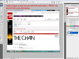
- 1. Today I began to play around with font and colour, I ‘PRTSC’ my desired font onto photoshop.
- 2. I then used the magic wand to highlight the text then went to ‘layer-inverse+delete’ so just the font was left behind
- 3. I used the magic wand (image-select similar’ to highlight all of the font then picked the colour picker to select a red shadeALT+ (BACKSPACE). Picking red for the title of the film I think will stand out againest our other titles in the trailer which will be white. The brighter red I thought would be good to use as it is bold and connotes blood. The darker red reminds me of more dried up blood which could be used as the older blood can represent the dead villain and still connotes blood.
- 4. Here I was testing the different Effects and applied them to the font.