
Recommended
More Related Content
Similar to Manisha pgfd c switch
Recently uploaded
Recently uploaded (20)
Manisha pgfd c switch
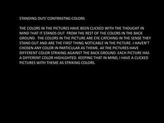
- 1. STANDING OUT/ CONTRASTNG COLORS THE COLORS IN THE PICTURES HAVE BEEN CLICKED WITH THE THOUGHT IN MIND THAT IT STANDS OUT FROM THE REST OF THE COLORS IN THE BACK GROUND. THE COLORS IN THE PICTURE ARE EYE CATCHING IN THE SENSE THEY STAND OUT AND ARE THE FIRST THING NOTICABLE IN THE PICTURE. I HAVEN’T CHOSEN ANY COLOR IN PARTICULAR AS THEME. All THE PICTURES HAVE DIFFERENT COLOR STRIKING AGAINST THE BACK GROUND. EACH PICTURE HAS A DIFFERENT COLOR HIGHLGHTED. KEEPING THAT IN MIND, I HAVE A CLICKED PICTURES WITH THEME AS STRIKING COLORS.
- 3. The first thing one notices after looking at the picture is the bag in yellow. This, despite the pile of bricks that are large in number. The bag outshines the presence of bricks. Though they compliment each other well together. In life, we come across a lot of situations where we fear being cornered or be the odd one out. Be it opting for an uncommon field of study, accepting oneself for being who they are or speaking for the right even if it means standing against the crowd. What we fail to notice is how it makes us strong headed as a person. Standing out does not necessarily mean to be tagged a weirdo. It is also when you out-do the others and are looked up to as an inspiration. As a designer, to me the stack of bricks give a look of a pattern. The bag acts like a patch against it. It can be used to create a check shirt in brick red color with a pocket in yellow attached to it.
- 5. The two stripes in white stand out against all the other pipes in yellow. I clicked this picture keeping this thought in mind that the whites represent a homosexual couple and the other pipes in majority, are the crowd(straight) in general. It depicts how in the society of ours, the homosexuals are looked down upon and are the unacceptable lot. People go to crazy levels to even get rid of it as if it were a disease. Because of this attitude of the society towards them, many fear to even be open about it. However, over the years, there’s been a decline in the level of such narrow thinking and are being treated equally. As a designer, I see the pattern of stripes on the wall. The combination of white streaks amongst the yellow makes for a good combination. It can be used on the seam where buttons are stitched on a shirt.
- 7. The color red is the highlight of the picture against the dark back ground. The color combination in the picture reminds me of royalty and the rich. It reminds me of the era when gowns and high collared vests were in. Red depicts power and black, discipline (for the way the books have been arranged). Hints of gold on the edges give it an accessorized look. It would make for a good military jacket, with the black portion as the front bodice and red, as shoulder flap.
- 9. The color red draws our attention first against the silver body. With so many people around us at some point or the other in our lives, creation of memories is bound to happen. Some are so fresh as if they happened just yesterday, while some are left behind. To me this picture depicts the memories that are difficult to forget yet are the one that makes us stronger every time it flashes. To some it could be a tragic scar reminding them of the traumatic experience, while to others it could be a mark of driving force to attain something. The combination of red and silver gives a very classy look. It would make for a good evening wear on a casual occasion- gown in silver and a dash of red flowery patch like a brooch.
- 11. Clearly, the blue thread stand out against the white threads. Not just because of the stark difference in color but also because of the texture. The picture represents the different types of people who live in the society. The threads in white are the people of low strata. The tattered look and texture aptly describes them. While the blue thread is in a neat condition depicting the traits of the rich. Also, the placement of the blue thread on top of the whites gives it a look as though the whites are slaves to the blue. The blue, on top level of hierarchy looks down upon the whites. It would make for a good gown in white(of varied textures). A dash of blue as a patch of glitter.
- 13. The color green stands out from the black and white doodle. The doodle here represents chaos. Then color green represents a ray of hope. It shows how despite all odds, some people manage to overcome difficulties without showing a hint of grudge . The way the lace moves from one loop to the other depicts the journey of difficulty. And how in the end it still manages to look beautiful. It is a lesson for all to follow. Not only should we stop cribbing about our problems, we should also start being thankful for what we have and count our blessings. Doodles as designs are totally in at all times. I would draw them on shoe like I have in the picture. Other places where I would use this design would be on bags, on walls as a wall art, on stoles et ol.
- 15. The white switch board looks like an attached small patch on huge red back ground in the back. In a way the switch board depicts danger. As, if it’s not handled carefully with proper caution one can get electrocuted (If used with wet hands or fidgeted with good conductors). The red in the back serves as a color of warning to the user. Though the switch look very soothing and harmless, its misuse could prove to be fatal. Similarly, in life one needs to be really careful before blindly believing anything to be true. The color combination is chic. A tunic in red with white pocket would make for a good dress.
- 17. The brick in yellow is the one that contrasts from all the other bricks in the back ground. They are not of the same color but are shades of different colors blending together. In life, all of us have a purpose to serve. We are here on our own, yet we are to live in the society with harmony irrespective of our religion, creed and the like. The bricks show how despite being different they manage to blend well and look in sync. Similarly, in times of difficulty, without thinking of the consequences, one should help thy neighbours or anybody in need for that matter.(provided they are worth trusting). There would be a lot of conflicts in thoughts, no doubt but we are to stay together in harmony for the good of each other. The print would look good on a bag or as a hanging on the wall or as a door mat. Manisha Majhi PGFD-C