SlideShare a Scribd company logo
1 of 1
The top of the poster features the most important things that the
               consumers need to see. The band name, and logo are larger than
               the album name. This connotes the band’s high image, and that
               their name only needs to be heard to sell albums.                                   The members of the band
                                                                                                   have had their photos
                                                                                                   edited, making them
                                                                                                   appear fragmented. This
                                                                                                   connotes the themes of the
                                                                                                   album – the destruction
                                                                                                   and oppression of people.
                                                                                                   The fragments imply how
                                                                                                   it is distorting people.
                                                                                                   The style of the pictures is
                                                                                                   also an implication of how
                                                                                                   they have changed their
                                                                                                   style of music, and how it
The image takes up the                                                                             is now more chaotic then
middle third of the page                                                                           their previous works.
making it the first thing
that audience’s see.


                     The image of the album cover is to make it recognisable to the consumers.
                     This is much smaller than the image of the band, because Linkin Park do not
                     need to show off the album design, instead; they rely on the image of the
                     band itself to sell records.
                     The Record company, and the official band website encompass a
                     significantly smaller amount of the text than the other texts. Both of these are
                     links to the audience gaining access to more information and more music.

More Related Content

Viewers also liked

NaviSite Services - SnapShot
NaviSite Services - SnapShotNaviSite Services - SnapShot
NaviSite Services - SnapShotVikram Somani
 
Ara eliminar os gases intestinais
Ara eliminar os gases intestinaisAra eliminar os gases intestinais
Ara eliminar os gases intestinaisFabiano Paiva
 
2014 04 26_quadro_greve_plena 30-04
2014 04 26_quadro_greve_plena 30-042014 04 26_quadro_greve_plena 30-04
2014 04 26_quadro_greve_plena 30-04Vitor Dias
 

Viewers also liked (8)

NaviSite Services - SnapShot
NaviSite Services - SnapShotNaviSite Services - SnapShot
NaviSite Services - SnapShot
 
Ara eliminar os gases intestinais
Ara eliminar os gases intestinaisAra eliminar os gases intestinais
Ara eliminar os gases intestinais
 
Minero
MineroMinero
Minero
 
Revicion5
Revicion5Revicion5
Revicion5
 
Ejercicio 8
Ejercicio  8Ejercicio  8
Ejercicio 8
 
Profesora
ProfesoraProfesora
Profesora
 
sunplummarket
sunplummarketsunplummarket
sunplummarket
 
2014 04 26_quadro_greve_plena 30-04
2014 04 26_quadro_greve_plena 30-042014 04 26_quadro_greve_plena 30-04
2014 04 26_quadro_greve_plena 30-04
 

Similar to A thousand suns poster

Foo fighters website analysis
Foo fighters website analysisFoo fighters website analysis
Foo fighters website analysisPippahLarke
 
Metal hammer analysis
Metal hammer analysisMetal hammer analysis
Metal hammer analysiskieranhyde
 
Double page spread analysis
Double page spread analysisDouble page spread analysis
Double page spread analysissimpleplanfan
 

Similar to A thousand suns poster (6)

Mojo
MojoMojo
Mojo
 
Foo fighters website analysis
Foo fighters website analysisFoo fighters website analysis
Foo fighters website analysis
 
Metal hammer analysis
Metal hammer analysisMetal hammer analysis
Metal hammer analysis
 
Scanned images
Scanned imagesScanned images
Scanned images
 
Double page spread analysis
Double page spread analysisDouble page spread analysis
Double page spread analysis
 
Poster Analysis
Poster AnalysisPoster Analysis
Poster Analysis
 

More from Conor Willis

More from Conor Willis (9)

Persistence of Vision
Persistence of VisionPersistence of Vision
Persistence of Vision
 
Persistence of vision
Persistence of visionPersistence of vision
Persistence of vision
 
Props
PropsProps
Props
 
A thousand Suns Poster
A thousand Suns PosterA thousand Suns Poster
A thousand Suns Poster
 
A thousand suns poster
A thousand suns posterA thousand suns poster
A thousand suns poster
 
Web pages etc
Web pages etcWeb pages etc
Web pages etc
 
Catalyst meaning
Catalyst meaning Catalyst meaning
Catalyst meaning
 
Catalyst meaning
Catalyst meaning Catalyst meaning
Catalyst meaning
 
Linkin park changes
Linkin park changesLinkin park changes
Linkin park changes
 

A thousand suns poster

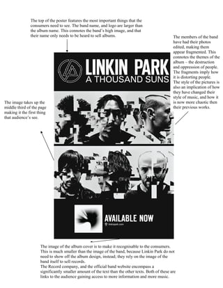
  • 1. The top of the poster features the most important things that the consumers need to see. The band name, and logo are larger than the album name. This connotes the band’s high image, and that their name only needs to be heard to sell albums. The members of the band have had their photos edited, making them appear fragmented. This connotes the themes of the album – the destruction and oppression of people. The fragments imply how it is distorting people. The style of the pictures is also an implication of how they have changed their style of music, and how it The image takes up the is now more chaotic then middle third of the page their previous works. making it the first thing that audience’s see. The image of the album cover is to make it recognisable to the consumers. This is much smaller than the image of the band, because Linkin Park do not need to show off the album design, instead; they rely on the image of the band itself to sell records. The Record company, and the official band website encompass a significantly smaller amount of the text than the other texts. Both of these are links to the audience gaining access to more information and more music.