
Recommended
More Related Content
More from Catherine Hnatov
More from Catherine Hnatov (18)
Recently uploaded
Recently uploaded (20)
Type combining
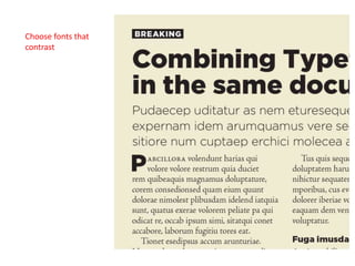
- 2. Choose fonts from a large font family
- 3. Combine type from same historic period
- 7. When combining in paragraphs use type with similar characteristics, such as x-height and cap height
- 14. If you intend to m ix typefaces in the sam e paragraph, for a run-in head or for em phasis, m ake them both the sam e x-height—that is, the height of the letter x in the face (see Figure 14). If the x-heights differ m arkedly, it will be jarring to your readers as their eyes run into the bum ps of higher x-heights. If you’re using a character style or nested style to call out the run-in heads, just slightly reduce the size of the font with the larger x-height to bring it into line with the body text. Bodoni and Futura may seem like un - likely bedfellows. Designed 130 years apart, one is a modern typeface with extreme contrast between the thin and thick parts of its stroke, and the oth - er is a geometric, almost monoweight, sans serif. What they have in common, though, is a verticality of stroke, mak - ing them a good match. Lucida Sans Lucida sans and Lucida Bright Fonts that were designed to go together
Editor's Notes
- Arno Pro
- Fonts that were designed to go together