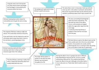
1. Using the colour red in the boarder
can show sexual content and danger
but the danger is contrasted by the The colour blue is seen in many ways. Some say cold and
innocence within the frame. The background is gold which shows some say calm. In this album in particular cold would be
Britney’s wealth and success. best as this may show how fame can be cold once you’ve
reached it and Britney Spears hasn’t had a smooth ride.
Britney’s looking down which shows her The stars surrounding the photograph
venerability even though she seems strong. within the frame traps Britney. This
links with the name of the album
‘Circus’ as the animals are trapped
within the cages when away from the
main stage.
It could also show how Britney is
The majority of Britney’s makeup is light and trapped in fame and has no escape
natural. This could show innocence and purity. from the paps.
If you look further into the makeup her eyes are
a lot darker which shows how there’s more to
her and there’s something deeper to her. The fonts that are used on the album cover are the
fonts usually used a lot in the circus and on their
posters. Circus posters are usually used for
advertising the circus is coming to town. By putting
Britney’s wearing a pale pink dress and by this on the album it looks like its advertising.
wearing a pale dress it shows purity and
innocence again like in her makeup.
Naming the album ‘Circus’ is going to be seen in different
The shape ‘Britney Spears’ is
ways depending on how you see her. A circus is usually
written on the disk may show
The dress Britney is wearing is made of silk entertaining, lively and fun. This could be how Britney
Britney’s ups and downs
which is linked with femininity which isn’t wants her album to be seen. Although on the other hand a
throughout her life.
usually linked with the circus. circus is also seen as a ‘freak show’ which could be seen as
her life.