
Recommended
More Related Content
Viewers also liked
Viewers also liked (20)
Similar to (Practical) Beyond Responsive Web Design (WordCamp Miami 2011)
Similar to (Practical) Beyond Responsive Web Design (WordCamp Miami 2011) (20)
Recently uploaded
Recently uploaded (20)
(Practical) Beyond Responsive Web Design (WordCamp Miami 2011)
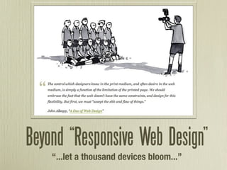
- 1. Beyond “Responsive Web Design” “...let a thousand devices bloom...”
- 2. Who am I?
- 4. Ethan Marcotte (@beep), “On Being Responsive” “A responsive design is composed of three distinct parts:”
- 5. 1. A flexible grid.
- 6. 1. A flexible grid. 2. Flexible images. Or more specifically, images that work in a flexible context.
- 7. 1. A flexible grid. 2. Flexible images. Or more specifically, images that work in a flexible context. 3. Media queries.
- 8. Great. So what do Responsive Web Designs look like?
- 9. Colly.com?
- 10. Flexible grid Flexible images Media queries
- 11. “Switchy” design Not responsive design
- 13. Flexible grid Flexible images Media queries
- 14. Awesome. So why do I care?
- 15. “RWD is just fancy tricks for mobile, and no one uses mobile anyway.” “iPhones and Android phones can browse the current web just fine.”
- 18. 2010: 38% of US cell phone users access the Internet on their phones (about 89 million) 53% of cell phone Internet users access websites at least once per day In 2009, only 17% of US cell phone users owned smartphones http://goo.gl/YMtgf
- 19. So how do we do this thing?
- 20. It all starts with planning.
- 21. Luke Wroblewski (@lukew): http://goo.gl/0kTal
- 24. More space shouldn’t mean more stuff.
- 25. Back to the basics: 1. A flexible grid. 2. Flexible images. 3. Media queries.
- 26. Flexible / Fluid Grids • Size everything in ems or percentages • Flexible: Ems for everything • Fluid: Percentages for width, ems for height • The Golden Formula: target ÷ context = result
- 27. You’re already halfway there...
- 28. Flexible Images Two methods: foreground (<img>) and background (CSS)
- 29. Flexible <img>s • max-width: 100%; width: 100%; • overflow: hidden;
- 30. Flexible backgrounds Use background-position to selectively crop your backgrounds http://goo.gl/YLLC3
- 31. Responsive Images • Uses .htaccess to look for “responsive” image requests, and feeds them a 1px transparent .gif • Then, uses JS to detect browser width and load the appropriate-size image accordingly http://goo.gl/Eu3zA
- 32. And now, the moment you’ve been waiting for...
- 33. Media Queries • Ever make a print stylesheet before? • <link rel=”stylesheet” href=”#” media=”screen” /> • <link rel=”stylesheet” href=”#” media=”print” />
- 34. Media Queries In your HTML: <link rel=”stylesheet” href=”#” media=”screen and (min-device-width: 640px)” /> In a stylesheet: @media screen and (orientation:landscape) { #content { ... } }
- 35. • height • color • width • color-index • device-height • monochrome • device-width • resolution • orientation • scan • aspect-ratio • grid • device-aspect-ratio
- 36. Remember: Mobile First! • No support for media queries is the first media query • Mobile stylesheet + media queries = desktop site
- 37. Mobile Viewports • Newer smartphones pretend to be much larger than they actually are (980px for iPhone)... • ...meaning they get your desktop stylesheet.
- 38. Mobile Viewports <meta name=”viewport” content=”width=device-width, initial-scale=1.0” />
- 40. CSS3 Transforms • rotate • skew • scale • -transform-origin
- 41. CSS3 Transitions -transition: property duration easing • all • ease • opacity • ease-in • font-size • ease-out • text-shadow • ease-in-out • color • linear • height • cubic-bezier • width • left • top...
- 42. CSS3 Transitions nav li a { color: rgb(0,0,0); -webkit-transition: all 1s ease-out; } nav li a:hover { color: rgb(200,0,0); -webkit-transition: all 1s ease-in; }
- 43. CSS3 Animation • Define keyframes in CSS • Set duration, number of iterations, animation direction, timing function • only works in webkit
- 44. What if my phone can’t do that?
- 45. Modernizr.js
- 47. yepnope.js
- 48. “The choice is not between using media queries and creating a dedicated mobile site; the choice is between using media queries and doing nothing at all.” - Jeremy Keith, “A responsive mind”
- 49. That’s about it... Questions? @kzurawel http://arborwebsolutions.com