
Recommended
More Related Content
Similar to School magazine: Front page evaluation
Similar to School magazine: Front page evaluation (20)
More from Plumstead Manor Sixth Form
Recently uploaded
Recently uploaded (20)
School magazine: Front page evaluation
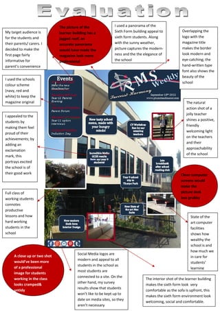
- 1. My target audience is for the students and their parents/ carers. I decided to make the first page fairly informative for parent’s convenience The interior shot of the learner building makes the sixth form look very comfortable as the sofa is upfront, this makes the sixth form environment look welcoming, social and comfortable. State of the art computer facilities shows how wealthy the school is and how much we in care for students’ learning Full class of working students connotes productive lessons and how hard working students in the school Overlapping the logo with the magazine title makes the border look modern and eye-catching; the hand-written type font also shows the beauty of the school I appealed to the students by making them feel proud of their achievements; by adding an exclamation mark, this portrays excited the school is of their good work I used a panorama of the Sixth Form building appeal to sixth form students. Along with the sunny weather, picture captures the modern- ness and the the elegance of the school Social Media logos are modern and appeal to all students in the school as most students are connected to a site. On the other hand, my survey results show that students won’t like to be kept up to date on media sites, so they aren’t necessary The natural action shot of a jolly teacher shines a positive, friendly welcoming light on the teachers and their approachability of the school A close up or two shot would’ve been more of a professional image for students working in the class looks cramped& untidy Clean computer screens would make the picture look less grubby The picture of the learner building has a jagged roof; an accurate panorama would have made the magazine look more professional I used the schools colour scheme (navy, red and white) to keep the magazine original