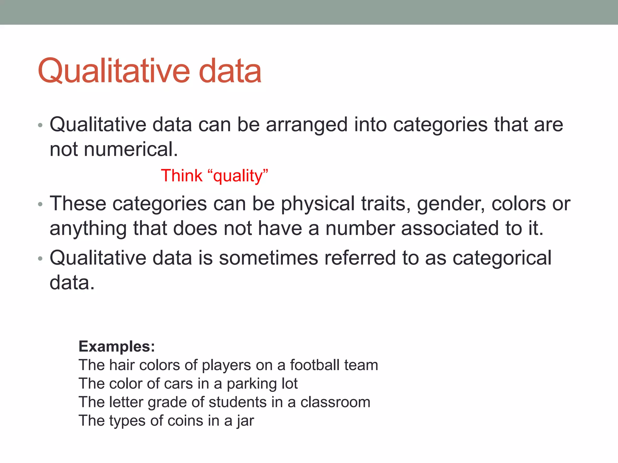
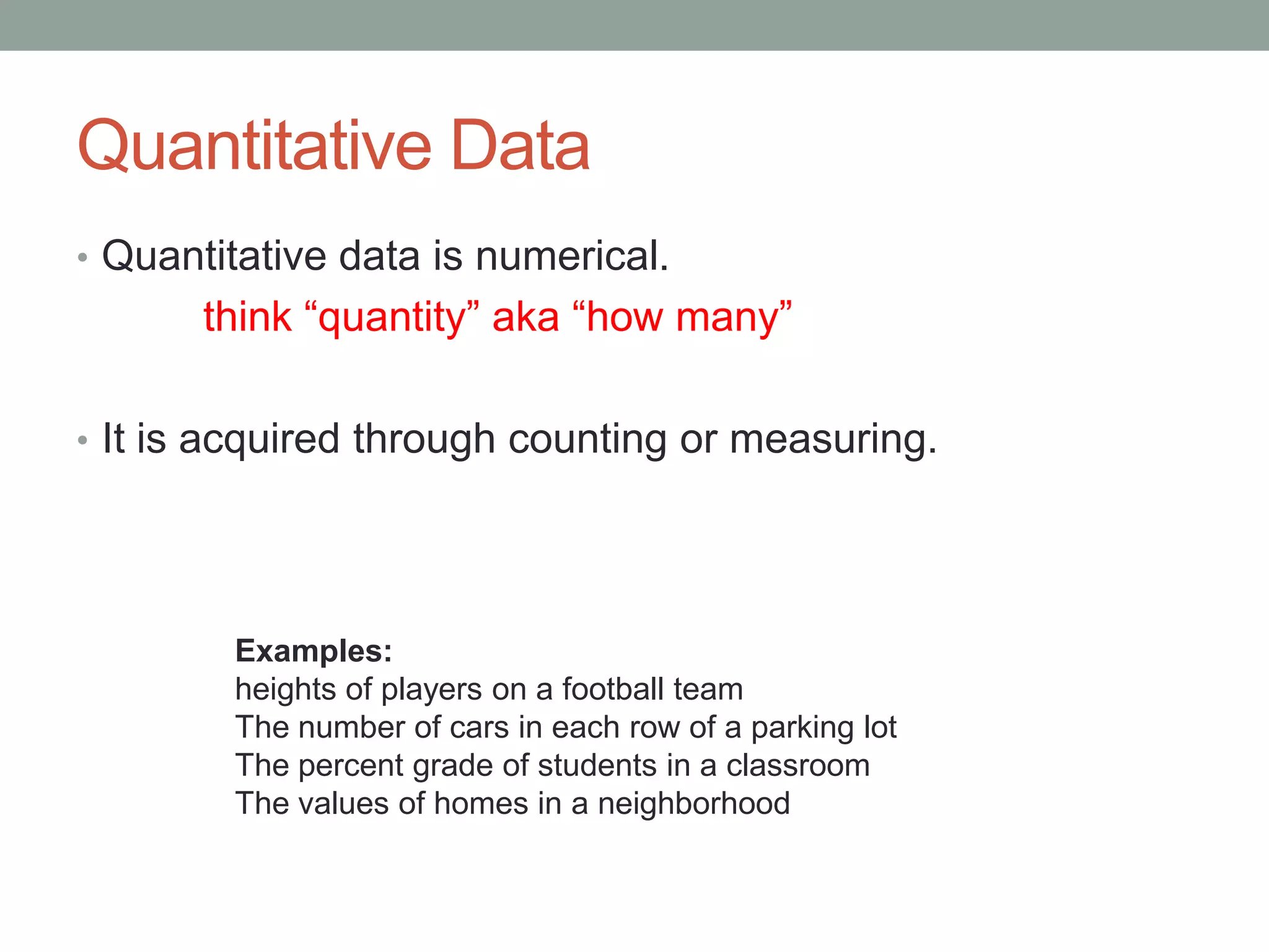
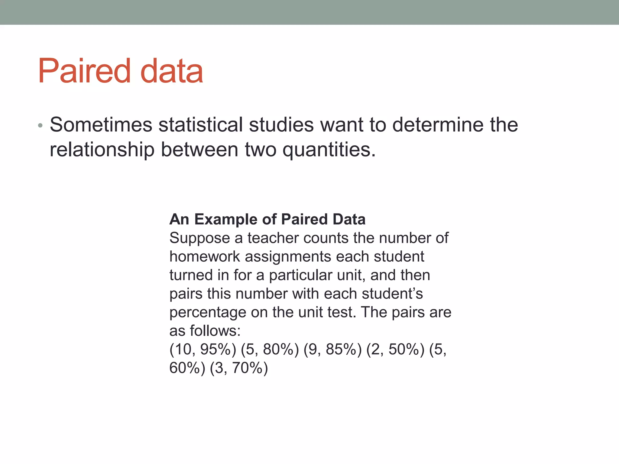
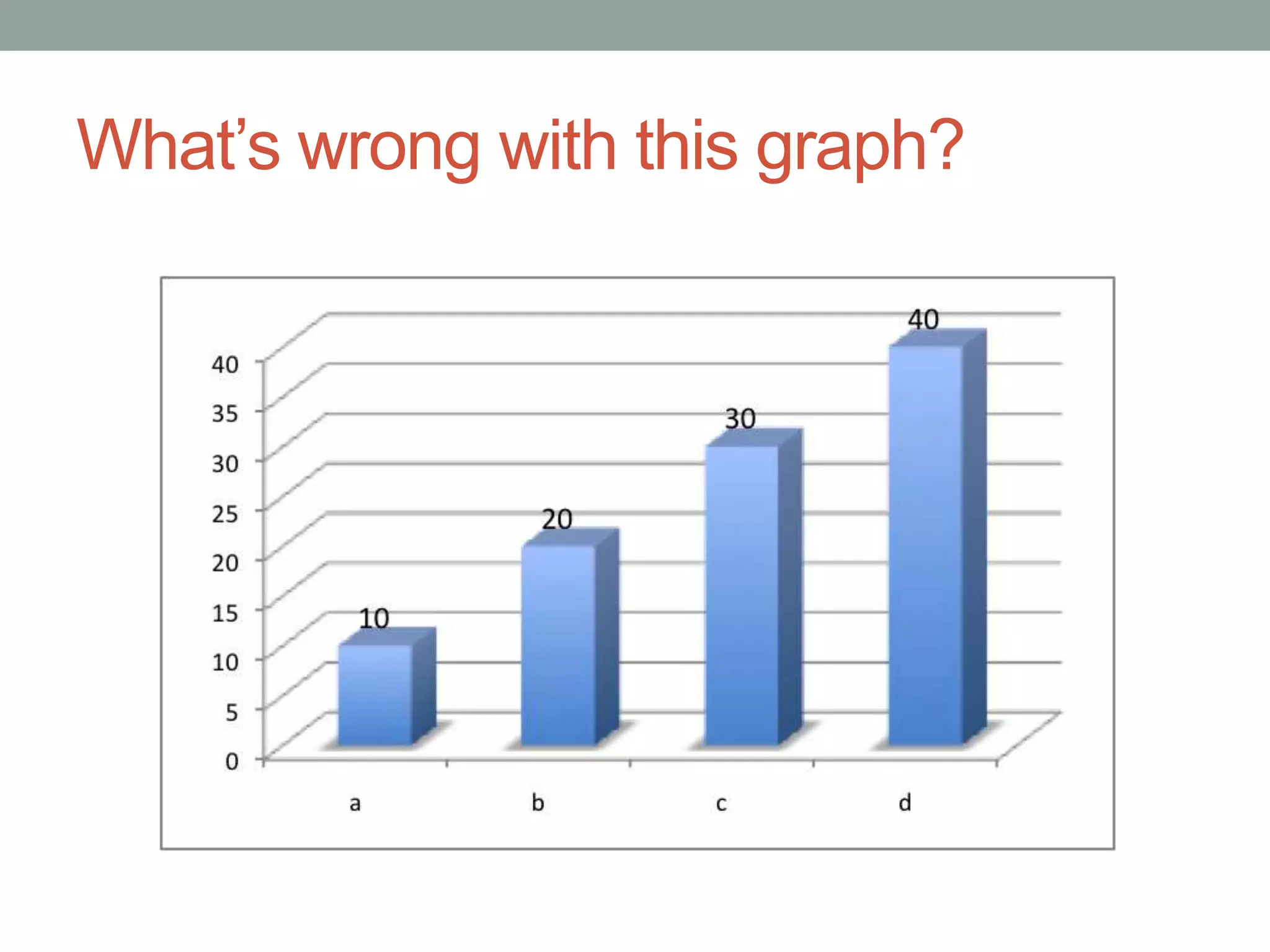
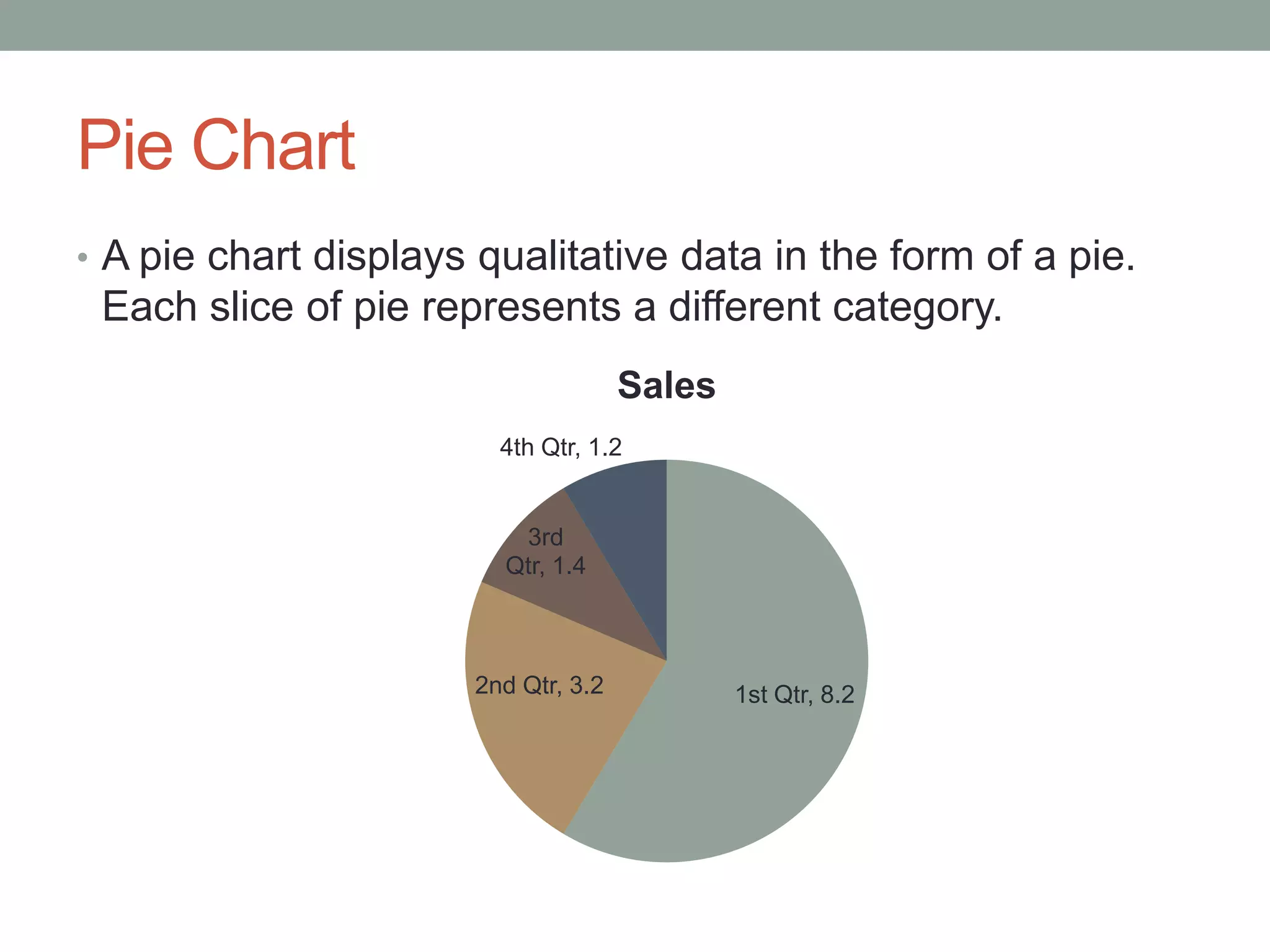
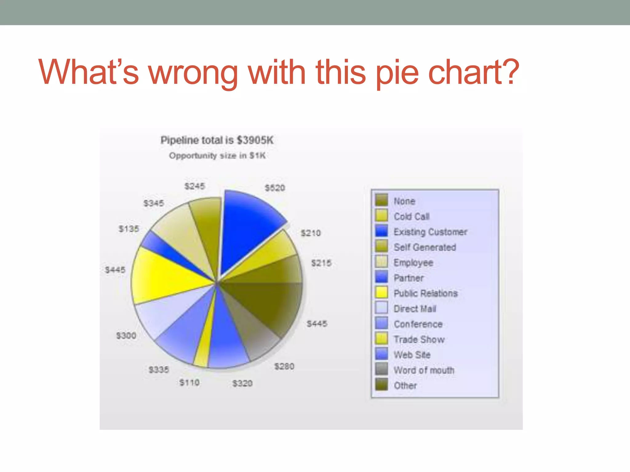
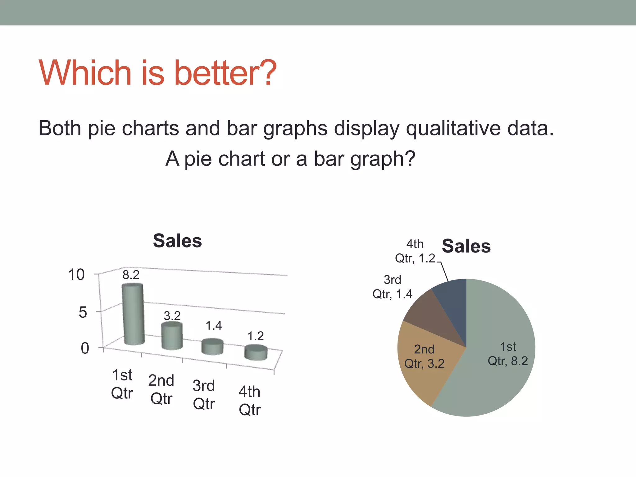
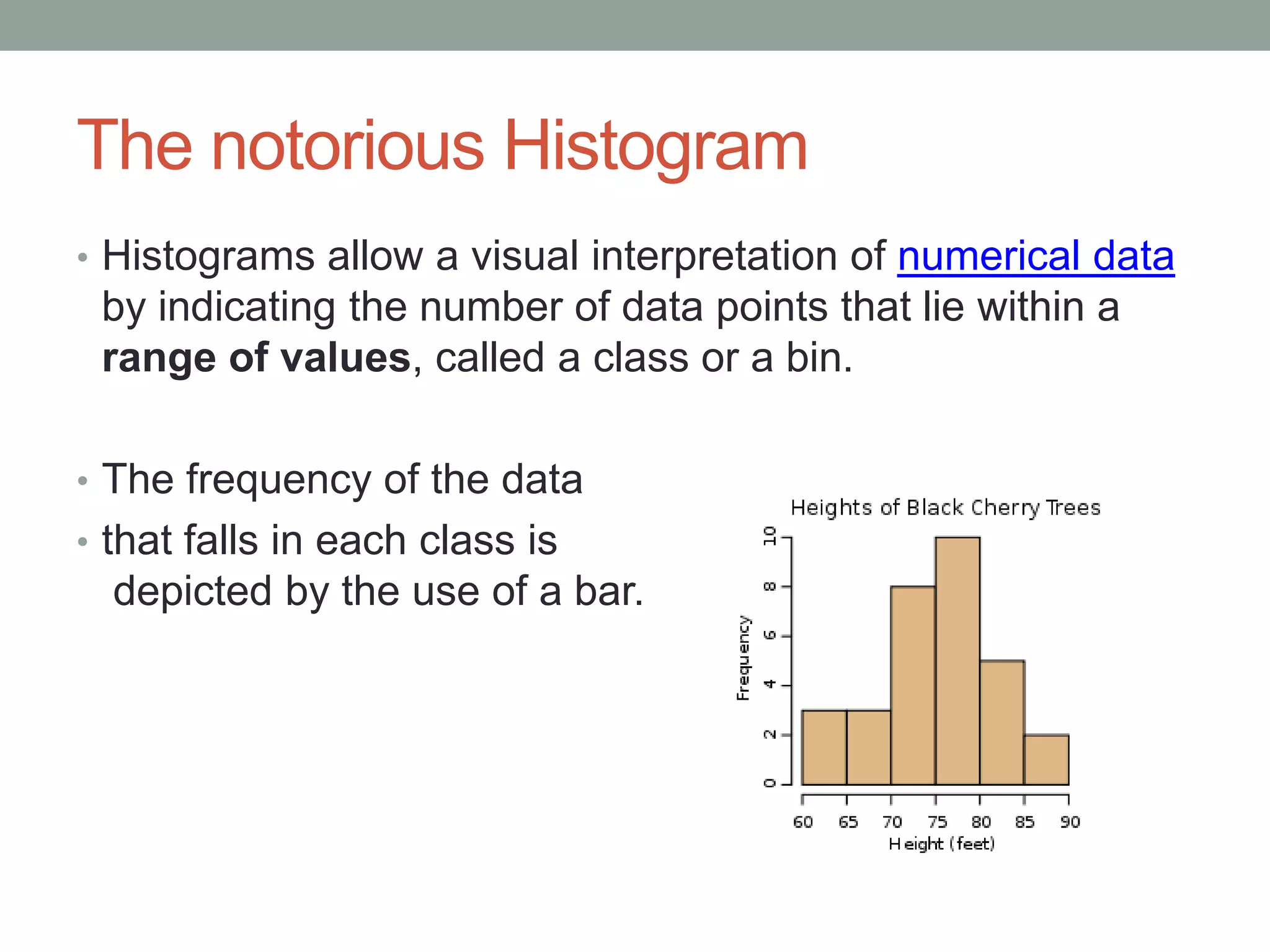
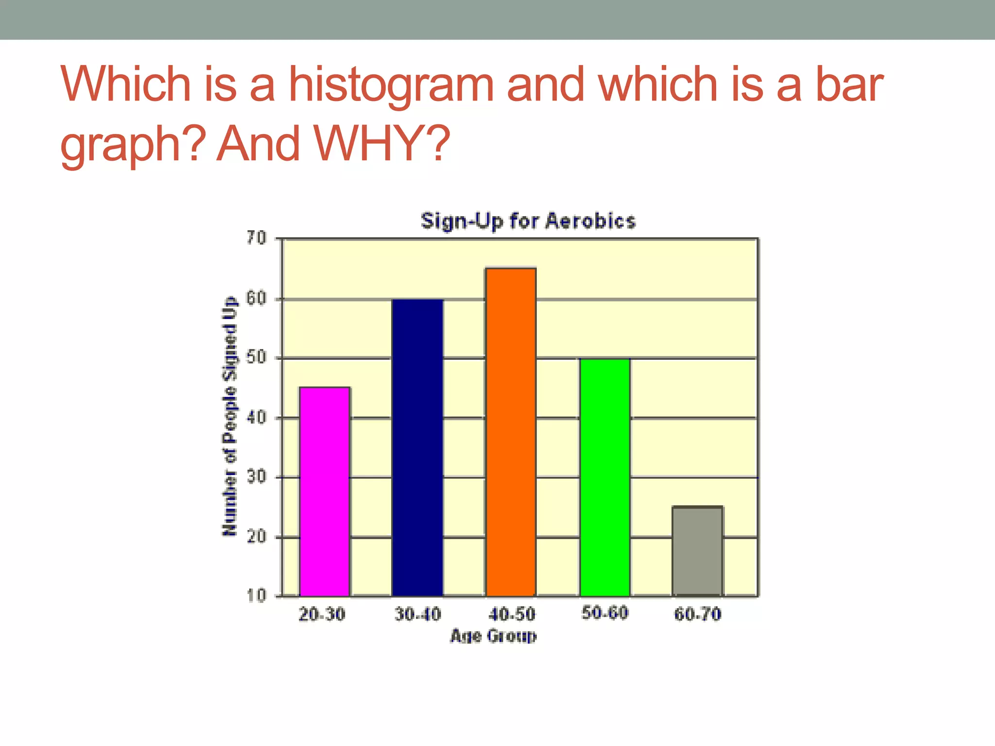
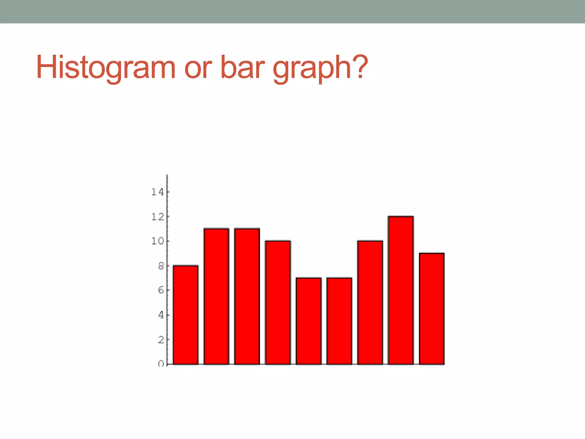
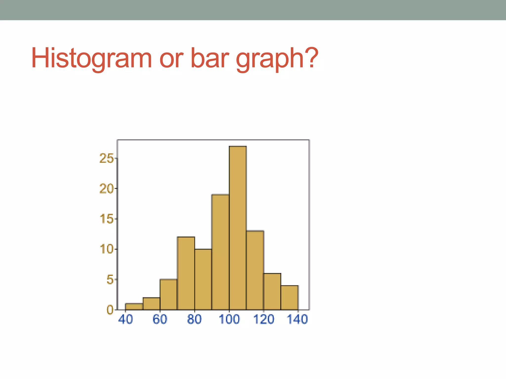
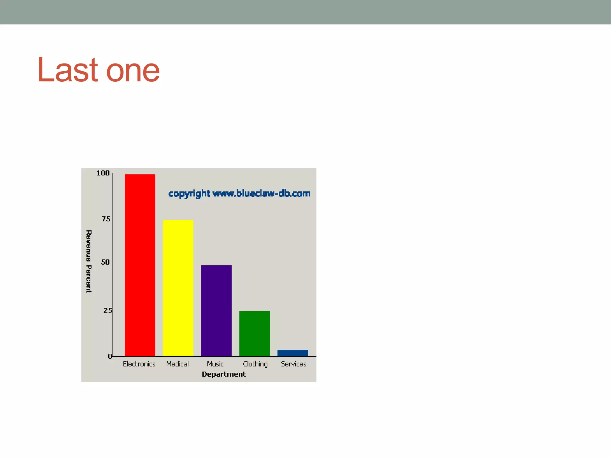
INTRO TO STATISTICS
Data Displays
Graphs in Statistics

• Different situations call for different types of graphs.


• Many times the type of data determines what graph is
 appropriate to use.

• Categories of data:
  • Qualitative data, quantitative data and paired data each use
    different types of graphs.
Qualitative data
• Qualitative data can be arranged into categories that are
 not numerical.
                Think “quality”
• These categories can be physical traits, gender, colors or
  anything that does not have a number associated to it.
• Qualitative data is sometimes referred to as categorical
  data.


    Examples:
    The hair colors of players on a football team
    The color of cars in a parking lot
    The letter grade of students in a classroom
    The types of coins in a jar
Quantitative Data
• Quantitative data is numerical.
       think “quantity” aka “how many”

• It is acquired through counting or measuring.


        Examples:
        heights of players on a football team
        The number of cars in each row of a parking lot
        The percent grade of students in a classroom
        The values of homes in a neighborhood
Paired data
• Sometimes statistical studies want to determine the
 relationship between two quantities.


              An Example of Paired Data
              Suppose a teacher counts the number of
              homework assignments each student
              turned in for a particular unit, and then
              pairs this number with each student’s
              percentage on the unit test. The pairs are
              as follows:
              (10, 95%) (5, 80%) (9, 85%) (2, 50%) (5,
              60%) (3, 70%)
Most Common Data Displays
• Bar graph
• Pie chart
• Histogram
Bar Graphs
• A bar graph is a way to visually represent qualitative data.


• the information you’re looking at should be categorical,
 not numerical.

• The bars are arranged in order of frequency, so that more
 important categories are emphasized.
Which one is better?
       Winter
         Fall                   Gas Bill
      Summer                    Electric Bill
       Spring                   Water Bill

                0   2   4   6

           6
           5
           4
           3
           2                     Water Bill
           1                     Electric Bill
           0                     Gas Bill
What’s wrong with this graph?
Pie Chart
• A pie chart displays qualitative data in the form of a pie.
 Each slice of pie represents a different category.
                                     Sales
                        4th Qtr, 1.2


                         3rd
                        Qtr, 1.4


                      2nd Qtr, 3.2           1st Qtr, 8.2
What’s wrong with this pie chart?
Which is better?
Both pie charts and bar graphs display qualitative data.
             A pie chart or a bar graph?


               Sales                      4th      Sales
                                        Qtr, 1.2
   10    8.2                         3rd
                                    Qtr, 1.4
    5           3.2
                       1.4
                              1.2
    0                                      2nd           1st
                                          Qtr, 3.2     Qtr, 8.2
        1st 2nd
        Qtr Qtr       3rd    4th
                      Qtr    Qtr
The notorious Histogram
• Histograms allow a visual interpretation of numerical data
 by indicating the number of data points that lie within a
 range of values, called a class or a bin.

• The frequency of the data
• that falls in each class is
  depicted by the use of a bar.
Which is a histogram and which is a bar
graph? And WHY?
Histogram or bar graph?
Last one
Differences
Bar Graph                 Histogram
Your task
1) Create a data display (graph) for each of your
    questions.
       a) is the data qualitative or quantitative?
       b) decide which type of graph you are going to use
       c) explain why you chose that graph
       d) what does the data tell you/ how does it help you
in planning your event?

2) Write up two summaries of your event.
       a) The before: Who, what, when, where, why
       b The after: How did it go? Give a pretend summary
of events. State how many people went. How much did you
make (if a charity)?

Data displays in statistics

  • 1.
  • 2.
    Graphs in Statistics •Different situations call for different types of graphs. • Many times the type of data determines what graph is appropriate to use. • Categories of data: • Qualitative data, quantitative data and paired data each use different types of graphs.
  • 3.
    Qualitative data • Qualitativedata can be arranged into categories that are not numerical. Think “quality” • These categories can be physical traits, gender, colors or anything that does not have a number associated to it. • Qualitative data is sometimes referred to as categorical data. Examples: The hair colors of players on a football team The color of cars in a parking lot The letter grade of students in a classroom The types of coins in a jar
  • 4.
    Quantitative Data • Quantitativedata is numerical. think “quantity” aka “how many” • It is acquired through counting or measuring. Examples: heights of players on a football team The number of cars in each row of a parking lot The percent grade of students in a classroom The values of homes in a neighborhood
  • 5.
    Paired data • Sometimesstatistical studies want to determine the relationship between two quantities. An Example of Paired Data Suppose a teacher counts the number of homework assignments each student turned in for a particular unit, and then pairs this number with each student’s percentage on the unit test. The pairs are as follows: (10, 95%) (5, 80%) (9, 85%) (2, 50%) (5, 60%) (3, 70%)
  • 6.
    Most Common DataDisplays • Bar graph • Pie chart • Histogram
  • 7.
    Bar Graphs • Abar graph is a way to visually represent qualitative data. • the information you’re looking at should be categorical, not numerical. • The bars are arranged in order of frequency, so that more important categories are emphasized.
  • 8.
    Which one isbetter? Winter Fall Gas Bill Summer Electric Bill Spring Water Bill 0 2 4 6 6 5 4 3 2 Water Bill 1 Electric Bill 0 Gas Bill
  • 9.
  • 10.
    Pie Chart • Apie chart displays qualitative data in the form of a pie. Each slice of pie represents a different category. Sales 4th Qtr, 1.2 3rd Qtr, 1.4 2nd Qtr, 3.2 1st Qtr, 8.2
  • 11.
    What’s wrong withthis pie chart?
  • 12.
    Which is better? Bothpie charts and bar graphs display qualitative data. A pie chart or a bar graph? Sales 4th Sales Qtr, 1.2 10 8.2 3rd Qtr, 1.4 5 3.2 1.4 1.2 0 2nd 1st Qtr, 3.2 Qtr, 8.2 1st 2nd Qtr Qtr 3rd 4th Qtr Qtr
  • 13.
    The notorious Histogram •Histograms allow a visual interpretation of numerical data by indicating the number of data points that lie within a range of values, called a class or a bin. • The frequency of the data • that falls in each class is depicted by the use of a bar.
  • 15.
    Which is ahistogram and which is a bar graph? And WHY?
  • 16.
  • 17.
  • 18.
  • 19.
  • 20.
    Your task 1) Createa data display (graph) for each of your questions. a) is the data qualitative or quantitative? b) decide which type of graph you are going to use c) explain why you chose that graph d) what does the data tell you/ how does it help you in planning your event? 2) Write up two summaries of your event. a) The before: Who, what, when, where, why b The after: How did it go? Give a pretend summary of events. State how many people went. How much did you make (if a charity)?