1. Analytical essay: Mc Fries
The product being advertised is Mc Fries (Mc Donald’s chips). The chips are golden
coloured and it’s tasty and crispy. They are different from other chip as they are thinner
and crispier. This will attract the target audience because it’s different and people likes
to try different things.
The brand name for the product is Mc Donald. It is one of the world’s most famous fast
food restaurants. It’s been around for over 70 years and has 31,000 branches
worldwide. This will attract the target audience because it a popular and famous fast
food restaurant.
The target audience for the product is everyone but in particularly people that’s wants
to try new thing. This new idea will catch their attention.
The motive of this advert is our need for survive and friendship according to Maslow’s
theory. So since Mc Donald is a very popular fast food restaurant, many people will go.
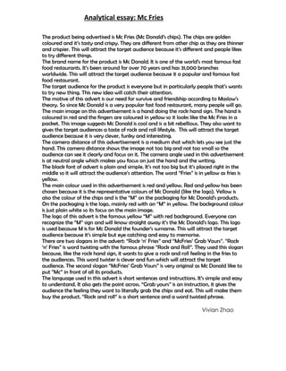
The main image on this advertisement is a hand doing the rock hand sign. The hand is
coloured in red and the fingers are coloured in yellow so it looks like the Mc Fries in a
packet. This image suggests Mc Donald is cool and is a bit rebellious. They also want to
gives the target audiences a taste of rock and roll lifestyle. This will attract the target
audience because it is very clever, funky and interesting.
The camera distance of this advertisement is a medium shot which lets you see just the
hand. This camera distance shows the image not too big and not too small so the
audience can see it clearly and focus on it. The camera angle used in this advertisement
is at neutral angle which makes you focus on just the hand and the writing.
The black font of advert is plain and simple. It’s not too big but it’s placed right in the
middle so it will attract the audience’s attention. The word “Fries” is in yellow as fries is
yellow.
The main colour used in this advertisement is red and yellow. Red and yellow has been
chosen because it is the representative colours of Mc Donald (like the logo). Yellow is
also the colour of the chips and is the “M” on the packaging for Mc Donald's products.
On the packaging is the logo, mainly red with an “M” in yellow. The background colour
is just plain white so its focus on the main image.
The logo of this advert is the famous yellow “M” with red background. Everyone can
recognize the “M” sign and will know straight away it’s the Mc Donald’s logo. This logo
is used because M is for Mc Donald the founder’s surname. This will attract the target
audience because it’s simple but eye catching and easy to memorise.
There are two slogans in the advert: “Rock ‘n’ Fries” and “McFries’ Grab Yours”. “Rock
‘n’ Fries” is word twisting with the famous phrase “Rock and Roll”. They used this slogan
because, like the rock hand sign, it wants to give a rock and roll feeling in the fries to
the audiences. This word twister is clever and fun which will attract the target
audience. The second slogan “McFries’ Grab Yours” is very original as Mc Donald like to
put “Mc” in front of all its products.
The language used in this advert is short sentences and instructions. It’s simple and easy
to understand. It also gets the point across. “Grab yours” is an instruction, it gives the
audience the feeling they want to literally grab the chips and eat. This will make them
buy the product. “Rock and roll” is a short sentence and a word twisted phrase.
Vivian Zhao