Anesthesia Analytics: How Smooth is Your Revenue Cycle?
•
0 likes•33 views

The KPI Dashboard is a set of measures speci cally for anesthesia practices. At a glance, the dashboard tells you what you need to know, giving you insight into where you are strong—but more importantly—where you need to focus. It allows you to compare year-over-year or trend/series performance for key measures such as payor mix and options to focus on procedures, cases and even your staff.

Recommended
Recommended
More Related Content
What's hot
What's hot (17)
Similar to Anesthesia Analytics: How Smooth is Your Revenue Cycle?
Similar to Anesthesia Analytics: How Smooth is Your Revenue Cycle? (20)
More from MiraMed: A Global Services Company
More from MiraMed: A Global Services Company (20)
Recently uploaded
Recently uploaded (20)
Anesthesia Analytics: How Smooth is Your Revenue Cycle?
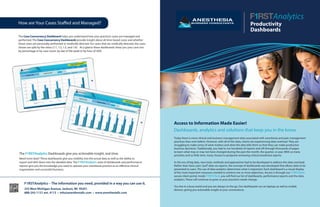
- 1. Productivity Dashboards F1RSTAnalytics – The information you need, provided in a way you can use it. 255 West Michigan Avenue, Jackson, MI 49201 888-242-1131 ext. 4113 • info@anesthesiallc.com • www.anesthesiallc.com Today there is more clinical and business management data associated with anesthesia and pain management practices than ever before. However, with all of this data, clients are experiencing data overload. They are struggling to make sense of what matters and what the data tells them so that they can make productive business decisions. Traditionally, you had to run hundreds of reports and sift through thousands of pages to learn what may or may not have changed during the past the month, the quarter, or year. With so many priorities and so little time, many choose to postpone reviewing critical anesthesia reports. In this era of big data, new tools, methods and approaches had to be developed to address this data overload. Rather than have users“pull”data via reports, the concept of dashboards was developed that allows data to be presented to users. The use of data analytics determines what is important. Each dashboard is a visual display of the most important measures needed to achieve one or more objectives. Access is through our F1RSTClient secure client portal. Inside F1RSTClient, you will find our list of dashboards, performance reports and the data analytics. These will continue to grow as your practice’s needs change. You live in a busy world and you are always on the go. Our dashboards run on laptops as well as mobile devices, giving you actionable insight at your convenience. Access to Information Made Easier! Dashboards, analytics and solutions that keep you in the know. How are Your Cases Staffed and Managed? The Case Concurrency Dashboard helps you understand how your practice’s cases are managed and performed. The Case Concurrency Dashboards provide insight about all time-based cases and whether those cases are personally performed or medically directed. For cases that are medically directed, the cases shown are split by the ratios (1:1, 1:2, 1:3, and 1:4). At a glance these dashboards show you your case mix by percentage or by case count, by day of the week or by hour of shift. The F1RSTAnalytics Dashboards give you actionable insight, real-time. Need more data? These dashboards give you visibility into the actual data as well as the ability to export and drill-down into the detailed data. The F1RSTAnalytics suite of dashboards and performance reports give you the knowledge you need to operate your anesthesia practice as an effective clinical organization and successful business. Analytics
- 2. How Efficient is Your Practice? ABC’s powerful, intuitive F1RSTAnalytics Productivity Suite provides a number of dashboards that help you quickly understand how well your practice operates. The Facility Productivity Dashboard helps you focus on production for each of your facilities. As a part of the Productivity Suite, this dashboard provides perspective into your day shift’s average production for average billed hours per room, average number of cases, average number of units and your productivity percentage with the data displayed on a per day of the week basis. The Facility Productivity Dashboard also spreads your billed hours by hour for the combined shift or by individual day of the week. Whether you’re looking at a facility, an area or a single operating room, at a glance the Facility Productivity Dashboard gives you detailed insight down to each hour of your defined shift. The Facility Productivity Dashboard also provides some“what-if”capabilities to change the number of rooms in use for both current and prior year data on both the“by facility”and“by area facility”tabs. Changing the number of room adjusts the average billed hours, cases, units and productivity percentage to give a sense what would be different if conditions changed. How Well are the ORs Being Utilized? The OR Utilization Dashboard helps you focus on operating room (OR) production across the spectrum of your schedule. As a part of the Productivity Suite, the OR Utilization Dashboard allows you to see how your average billed hours by day of the week and productivity percentage compare to the coverage you have committed to provide. The OR Utilization Dashboard allows you define your three shifts (days, off shift and weekends). Because this dashboard shows multiple shifts, you can also use this dashboard to model or explore the possibilities of changing your shift’s days, durations and/or the scheduled starts and finishes to optimize your staffing coverage based on actual billed hours whether you’re looking at a facility, an area or a single operating room. The F1RSTAnalytics dashboards give you actionable insight, real-time. Need more data? These dashboards give you visibility into the actual data as well as the ability to export and drill-down into the detailed data. The F1RSTAnalytics suite of dashboards and performance reports give you the knowledge you need to operate your anesthesia practice as an effective clinical organization and successful business.