3. Jun 2015 - Jul 2015
Anghami, Jounieh
Internship, Graphic Design
Jun 2014 - Sept 2014
Water Gate aquapark, Le Royal Dbayeh
First Aid and Basic Life Support
Feb 2014 - May 2014
Fine Arts Faculty, Holy Spirit University of Kaslik
Student job, Graphic Design
Jan 2013 - Jan 2014
Applebee’s, Dbayeh
Bartmaid
Nov 2012 - Nov 2013
Rock’n Bach, FunZone Antelias
Branch Manager
Jun 2011- Sept 2011
Applebee’s, Dbayeh
Hostess
Fluent in English, French and Arabic.
Adobe (Photoshop, Illustrator, InDesign, After Effects)
Microsoft Office
Windows and Mac platform
First Aider/Dispatcher at the Lebanese Red Cross since 2013
Swimming
Reading
Good music
Sunsets
2012 - 2015
USEK, Holy Spirit University of Kaslik
B.A. in Graphic Design
1997 - 2012
Collège de la Sainte Famille Française - Jounieh
Lebanese Baccalaureat in Sociology and Economy
French Baccalaureat in Litterature
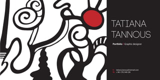
HOW TO CONTACT ME
WHERE I STUDIED
WHERE I PREVIOUSLY WORKED
THINGS I’M GOOD AT
THINGS I ENJOY
I have creativity and bright ideas
I like writing and poetry
I’m very picky and meticulous
I like drawing and painting
WHY I THINK YOU SHOULD HIRE ME
07-10-1994
+ 961 (70) 548 228
tatiana.tanous@hotmail.com
Champville Residence, Dik El Mehdi
Lebanese
Single
5. TRACKDISCOTHEQUE
The purpose was to come
up with a logo for a compa-
ny of our creation. Not only
we had to design the logo
and give it a meaning, we
also had to think of all its
applications and certainly,
give the company its
unique identity.
C: 60 M: 0 Y: 100 K: 0
K: 60
initiallogomeaning
typefacecolorcode
grid
black&white
revertedbackground
stationery
Frutiger CE 55 Roman
A B C D E F G H I J K L M N O P Q R S T U V W X Y Z
TRACK
DISCOTHEQUE, CEDETHEQUE
The green triangle, placed in the counter of the K, represents the“play forward”
button. Rotated up, it reveals the vision of the company: to keep moving
forward, and towards the best.
Dbayeh,MainHighway
T:04558946M:76854886
www.trackstudio.com.lb
Dbayeh,MainHighway
Metn,Lebanon
P.O.Box50-6250
CyrilTannous
BranchManager
T:04558946M:76854886
cyriltannous@track.com
Dbayeh,MainHighway
6. www.zenath.com
Zenath is an existing waste management company
settled in Dubai. I changed the logo and created a whole
new profile for the company and showed how to apply it
in the different places and aspects, presenting my project
in a style guide booklet.
WASTE
MANAGEMENT
COMPANY
IDENTITY
7. Pantone 7694 C
Pantone 7708 C
Pantone 313 C
Pantone 7701 C
Pantone 3135 C
Pantone 318 C
Pantone Black 6
C100 M77 Y34 K20
C100 M60 Y40 K20
C100 M22 Y18
C100 M61 Y35 K15
C100 M23 Y29 K1
C43 Y15
C81 M70 Y59 K75
G65 B106
G85 B111
G143 B190
G86 B119
G141 B168
R135 G218 B223
R17 G24 B32
Web 00 41 6A
Web 00 55 6F
Web 00 8F BF
Web 00 56
77
Web 00 8D A
8
Web 87 DA D
F
Web 11 18 20
9. Tannous Bldg., Allembi Street, Down Town Beirut P.O.Box: 16237 Beirut Phone: + 961 (1) 913 512 www.peaceofart.org.lb
P.O.Box: 16237 Beirut, Lebanon www.peaceofart.org.lb
Tatiana Tannous
General Manager
Down Town Beirut
Phone: + 961 (1) 913 512/13
www.peaceofart.org.lb
Tannous Bldg., Allembi Str.
Mobile: + 961 (3) 233 455
P.O.Box: 16237 Beirut Lebanon
Nahida Tannous
Chief Accountant
Tannous Bldg., Allembi Str. Down Town Beirut Lebanon
Mobile: + 961 (3) 233 455 Phone: + 961 (1) 913 512
P.O.Box: 16237 Beirut www.peaceofart.org.lb
Yara Antoun
Art Therapist
Tannous Bldg., Allembi Str. Down Town Beirut Lebanon
Mobile: + 961 (3) 233 455 Phone: + 961 (1) 913 512
P.O.Box: 16237 Beirut www.peaceofart.org.lb
Nadine Bou Khalil
Volunteer
Tannous Bldg., Allembi Str. Down Town Beirut Lebanon
Mobile: + 961 (3) 233 455 Phone: + 961 (1) 913 512
P.O.Box: 16237 Beirut www.peaceofart.org.lb
As part of my senior project,
the clinic I created,
Peace of Art, has its own
special identity bursting
in colors and life,
giving hope for a better
tomorrow through
the joy of art.
ART
THERAPY
CLINIC
10. Already existant brand, I tried to find a
specialty that characterise it and build
by identity accordingly and present it
inside a booklet.
FOOD
COMPANY
IDENTITY
Identitystyleguide
www.cortasfood.com
visual identity guidelines
1. Introduction
Cortas is the leading Lebanese food company. Founded in 1930, this
family business have been passed by from generation to generation,
maintening its name clean and known. Reputaded for its delicious
and healthy food, Cortas found its way worldwide.
Cortas Canning & Refrigerating Company aims to bring the finest
quality Lebanese gourmet products to every corner of the world.
11. The grid
visual identity guidelines
visual identity guidelines
2. Visual style
visual identity guidelines
2.1 The logo
Offering a wide range of food, mainly divided into 8 different
sections, Cortasʼs logo represents all those 8 green divisions,
showing us that the company is able to make good food out of all
different shades of green found in the nature.
2.1 Logo size
The Cortas logo has been designed to be reproduced at the
minimum height of 15mm.
There is no maximum reproduction of the logo.
15 mm
visual identity guidelines
2.3 Logo position
Cortas places its logo in the top center of the page, in a way that is
immediately recognized and well seen on any size of page. And if
not on the top, it always has to be centered.
visual identity guidelines
2.4 Isolation area
The Cortas logo should always be surrounded by a minimum area of
space. The area of isolation ensures that headlines, text or other
visual elements do not encroach on the logo.
The area is defined by using a third of the height of the logo which is
referred to as x.
It is an invisible boundary box that draws margins of clear space
that should be left all around the logo.
x
0.3x
0.3x
0.3x
visual identity guidelines
2.5 Colour
The Cortas identity is based mainly on a palette of different shades
of green. Other colours may be used where appropriate.
Pantone 627
Pantone 3435
Pantone 357
Pantone 363
Pantone 7737
Pantone 375
Pantone 374
Pantone 372
Pantone 580
Pantone Black 6
C83 M55 Y69 K63
C85 M45 Y78 K49
C85 M39 Y91 K38
C74 M23 Y100 K8
C63 M15 Y100
C46 Y100
C26 Y72
C19 Y56
C23 M5 Y42
C81 M70 Y59 K75
R18 G49 B43
R20 G71 B51
R29 G86 B50
R76 G139 B43
R108 G164 B57
R149 G214
R196 G235 B107
R212 G235 B141
R198 G213 B164
R17 G24 B32
Web 13 31 28
Web 14 47 33
Web 1D 56 32
Web 4C 8B 2B
Web 6C A4 39
Web 95 D6 00
Web C4 E8 6B
Web D4 EB 8D
Web C6 D5 A4
Web 11 18 20
visual identity guidelines
2.6 Typography
The typeface used for the logo is Aspen Regular DB.
The companyʼs identity uses the Futura typeface in its different
typestyles: medium, medium light, condensed extra bold.
Futura Medium: the subtitle and texts are written using this font
Futura Medium Light: the title is written using this font
Futura condensed extra bold: the website is written using this font
The labels are written using Campton both light and bold.
Ingredients:
Water, oils (soybean oil, extra virgin olive oil), vinegar, sugar, salt, lemon
juice, calcium disodium (used to protect quality), natural flavors,
oleoresin paprika.
14. Fries Box:
“I would sacri-fries my life for you”
Delivery Bag:
“Don’t leave me, I BAG!”
CREPAWAY
NEW
PACKAGE
CONCEPT
15. Christmas is at the doors! We had to
release 3 different bottles of wine,
that were like a special edition for
the holy season. Since the holidays
are full of ornaments and decora-
tions, I chose to keep it simple. Every
bottle had a different red item
wrapped around it, in addition to a
golden angel on which is engraved:
“Made for an angel”.
SPECIAL EDITION:
CHRISTMAS
WINE
BOTTLES
17. When the music festival approached, I was assigned the task to do social media posts
to celebrate it. Using the anghami mascott, the Anghaminator, and the style already
appropriated by the company, I came up with this simple post and adapted it on all
the variant social media platforms and strictly following their guidelines.
Facebook
Twitter
Instagram
Tango
ANGHAMI &
THE MUSIC
FESTIVAL
19. Making a newsletter was not just a
project where we can practice to
work following a certain grid we
design, but also learn about
newsletters in general, as to whom
we can address it to and what
contents go inside. The organiza-
tion I chose was the Lebanese Red
Cross, for I was a volunteer there
and it was a subject dear to my
heart.
We had to pick a raw material and
make a booklet about it, with the
freedom of choosing our audience,
style and format. My idea was to
make a storyline about a piece of
charcoal that travels throughout the
book in accordion, tracing its
history, process, and impacts. Even
though there is lack of color on
purpose, the booklet is addressed
to children.
KIDS
BOOKLET
ABOUT
CHARCOAL
RED
CROSS
YEARLY
NEWSLETTER
20. This project is about
designing few pages
of a magazine:
cover/back cover,
editorial, content,
opening page of an
article, and the article
itself. The topic is
related to a lebanese
town, and the
purpose is to show
some of its caracteris-
tics and unique traits.
HISTORY06
NOTABLE PEOPLE08
LADY HESTER STANHOPE JOUN TODAY09
HOME OF OLIVE AND PINE TREES10
Joun today
Joun today has a municipality of 15 mem-
bers; the head of the municipality Eng. Tony
Fawaz has resigned with 5 other members on
the 17th of November 2012.
Joun has a public Library (Michel Nab’aa
Public Library).
In Joun today there are three churches and
one mosque, also four schools: two public and
two private.
Joun is a village rich in olive trees and
grapes and is known for its olive oil and soap.
SPREADS
OF MAGAZINE
ABOUT JOUN,
LEBANESE TOWN
21. The assignment was to choose an album from the
70s-80s and to re-design its cover as if the album
has to be released nowadays. The trick was to keep
the identity of the band and the album, yet
modernize it and give it its own new style.
RE-LAUNCH
PINK FLOYD
CD COVER
& BOOKLET
23. The first and second picture are different visuals for the same concept.
They are both an ad for a faux bijoux store to be adapted either on
billboard or inside magazine pages.
The tag line is inspired by the famous saying“You’re never fully
dressed without a smile”. It’s like you’re only missing one piece, that
is only to be found at this shop.
The project was to represent ourself as a wanted person, so using a
photo that gives hints of my face seemed to grant the project a
mysterious atmosphere.
24. What was assigned in this project is to
create a poster, stamps and a
conceptual box following the same
idea. The subject had to do with
Lebanon. I mixed different concepts
that represent best our country:
the famous“dabke”, the big family, the
regular sunday lunch, the lebanese
food and mesa, and the folkloric
clothes. In the box, we can see a
representation of the lebanese
architecture through the arches, the
bricks and stones and the shapes of
the old windows.
lebanon
project
26. The first step of this project was to make a composition (1) using different
elements cut from magazines. Then, we had to simplify it by making it more
graphical. After that, we painted the composition using the following color
schemes: primary colors (2), secondary colors (3), complimentary colors (4),
black and white (5), free style (6).
Once more, this project allows us to see how color alternation can, in
consequence, change our perception of things. Indeed, chromatology, as per
its etymology, is a science by itself; the science of color.