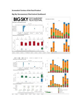
2. These are screenshots of our final dashboard. Each graph is enlarged and explained
below.
Offerings to Attendees by Day
This graph helps to show the films that were shown each day and how many
attendees viewed the movie by date. This is a helpful graph because it makes it easy
to see if the film is shown multiple times, how successful each showing was. The
films can also be sorted by what film had the most attendees by date. Currently the
graph is sorted by most popular films for 2/20/16.
4. This graph shows the revenue by venue by day. The venues are listed on the Y axis
and the X axis is the date in February 2016. This is a powerful graph when our team
makes the argument that the Wilma should not be used during the weekday and
instead more films should be shown in the other theaters. Our main point is that the
25th of February is a day when there were no films shown at the Wilma. The total
revenue is more on the 25th when the Wilma is not used than on the 24th when the
Wilma is used. This means that showing films at other theaters instead of the Wilma
has the potential to bring in just as much (or even more) revenue than utilizing the
Wilma during the week. This will help save costs because the Wilma is an expensive
venue and almost never filled to capacity this year.
5. Attendees By Venue
This graph shows the attendees by venue by date. The darker green squares signify
higher attendance where the lighter green squares signify lower attendance.
6. Count of amount of films shown per day per genre/Attendees by day by genre
The above graph shows the count of the amount of films shown per day per genre
and the attendees by day by genre. This is an important graph that our sponsor
wanted us to include. Initially we broke down the amount of attendees by genre, but
the graph was not giving accurate data because as you can see there is an
overwhelming amount of Biographical/Autobiographical data. This graph shows
how many particular films were shown for each genre per day in the first of the two
graphs. The second graph shows how many attendees watched specific genre films
per day. So on the 20th of February there were 18 biographical/autobiographical
films shown and a sum 2,649 people attended that specific genre of film.
7. True/False Dashboard
This is the final dashboard for True/False Film Festival. The graphs are
shown in larger images below.
8. 2015 Attendance & Capacity %
This shows the total attendees per film on the left side of the graph and on the right
side it shows for each venue the film was shown in, how many seats in the venue
was it full. The graph on the right shows percent capacity the showing generated.
This is an important graph because it shows that if films don’t do very well in a large
venue, they could move it to a smaller venue in order to reach higher percent
capacity. This can also be applied in the opposite manner. If a film does really well in
a small venue, than they can move the film to a larger venue to see if it can get close
to 100% capacity in the larger venue.
9. 2016 Attendance & Capacity %
This graph is very similar to the other graph in the True/False dashboard but this is
for the 2016 film festival data set.