SlideShare a Scribd company logo
1 of 1
Analysis of 3Similar Products to Ancillary 1
                                                                                                          Colour Scheme
Layout Conventions
                                                                                                          The two main colours used
This advert uses the rule of thirds; the first thing that catches the                                     in this advert are red and
eye of the audience is the image of the girl. This will attract the                                       white. These colours are
attention of young people, and then they will see the two quotes on                                       bold which will be bright
the other side of the board which will attract them more to the                                           and attractive to the viewer.
newspaper. The layout is attractive to the audience.                                                      The colour white makes the
                                                                                                          paper look quite fresh and
                                                                                                          young to attract the
                                                                                                          customers. The colour red is
                                                                                                          used to look exciting and
                                                                                                          bright.


                              Typography

                              The main bit of text ‘news made exciting’ stands out on the white
                              background as it is red. It shows that it is aimed at a young target as
                              they are aiming to make news exciting; this is backed up by another
                              piece of text saying ‘for young minds’. This again backs up that this
                              paper is aimed at a young target audience.

More Related Content

More from Steve_Royle

Foundation portfolio evaluation
Foundation portfolio evaluationFoundation portfolio evaluation
Foundation portfolio evaluationSteve_Royle
 
Evaluation written
Evaluation writtenEvaluation written
Evaluation writtenSteve_Royle
 
Image minipulation
Image minipulationImage minipulation
Image minipulationSteve_Royle
 
Pictures used for magazine
Pictures used for magazinePictures used for magazine
Pictures used for magazineSteve_Royle
 
Powerpoint evaluation writting
Powerpoint evaluation writtingPowerpoint evaluation writting
Powerpoint evaluation writtingSteve_Royle
 
Abbey moss foundation portfolio powepoint
Abbey moss foundation portfolio powepointAbbey moss foundation portfolio powepoint
Abbey moss foundation portfolio powepointSteve_Royle
 
Foundation portfolio evaluation
Foundation portfolio evaluationFoundation portfolio evaluation
Foundation portfolio evaluationSteve_Royle
 
Questionnaire for music mag
Questionnaire for music magQuestionnaire for music mag
Questionnaire for music magSteve_Royle
 
Results of questionnaire
Results of questionnaireResults of questionnaire
Results of questionnaireSteve_Royle
 
Front cover comparison dan media
Front cover comparison dan mediaFront cover comparison dan media
Front cover comparison dan mediaSteve_Royle
 

More from Steve_Royle (16)

Foundation portfolio evaluation
Foundation portfolio evaluationFoundation portfolio evaluation
Foundation portfolio evaluation
 
Evaluation written
Evaluation writtenEvaluation written
Evaluation written
 
Focus group
Focus groupFocus group
Focus group
 
Article draft
Article draftArticle draft
Article draft
 
Image minipulation
Image minipulationImage minipulation
Image minipulation
 
Pictures used for magazine
Pictures used for magazinePictures used for magazine
Pictures used for magazine
 
Mastheads
MastheadsMastheads
Mastheads
 
Powerpoint evaluation writting
Powerpoint evaluation writtingPowerpoint evaluation writting
Powerpoint evaluation writting
 
Abbey moss foundation portfolio powepoint
Abbey moss foundation portfolio powepointAbbey moss foundation portfolio powepoint
Abbey moss foundation portfolio powepoint
 
Foundation portfolio evaluation
Foundation portfolio evaluationFoundation portfolio evaluation
Foundation portfolio evaluation
 
Raw images
Raw imagesRaw images
Raw images
 
Masthead design
Masthead designMasthead design
Masthead design
 
Raw images
Raw imagesRaw images
Raw images
 
Questionnaire for music mag
Questionnaire for music magQuestionnaire for music mag
Questionnaire for music mag
 
Results of questionnaire
Results of questionnaireResults of questionnaire
Results of questionnaire
 
Front cover comparison dan media
Front cover comparison dan mediaFront cover comparison dan media
Front cover comparison dan media
 

Advanced portfolio research ancillary 1 2

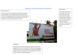
  • 1. Analysis of 3Similar Products to Ancillary 1 Colour Scheme Layout Conventions The two main colours used This advert uses the rule of thirds; the first thing that catches the in this advert are red and eye of the audience is the image of the girl. This will attract the white. These colours are attention of young people, and then they will see the two quotes on bold which will be bright the other side of the board which will attract them more to the and attractive to the viewer. newspaper. The layout is attractive to the audience. The colour white makes the paper look quite fresh and young to attract the customers. The colour red is used to look exciting and bright. Typography The main bit of text ‘news made exciting’ stands out on the white background as it is red. It shows that it is aimed at a young target as they are aiming to make news exciting; this is backed up by another piece of text saying ‘for young minds’. This again backs up that this paper is aimed at a young target audience.