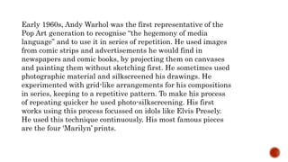
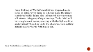
Andy Warhol was an early pioneer of Pop Art in the 1960s. He would find images in newspapers and comic books and use techniques like silkscreening to replicate them on canvas without preliminary sketches. This allowed him to quickly produce repetitive series focused on popular icons like Marilyn Monroe. His most famous works used this method to create multiple identical prints of icons like Marilyn Monroe that mimicked commercial aesthetics.

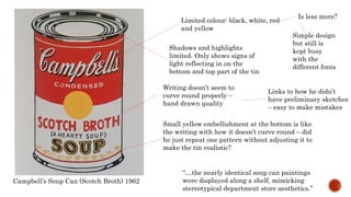
![Coca-Cola [1] 1961
Rough textures – very
contrasting against the
polished original coke
label
Did he use pens that
were running out? Or
is it crayon
A repeated part of
the neck of the
bottle next to the
complete bottle
Meant to be a
reflection?
Wanted to draw
it there first?
Comes across as a sketch because of
the roughness. Very different to
Campbell’s soup can
Blocks of white to show
reflection of light to give a
sense of form and material
You can see
the curves of
the bottle
and that it is
made of glass
Limited colours are used
– red, gold](https://image.slidesharecdn.com/andywarhol-160510140554/85/Andy-warhol-5-320.jpg)
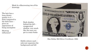
![Block colours placed
on top of details
from the silk screen
Lavender Marilyn [2] 1962
Doesn’t even fit
it properly, for
instance on the
hair line and
slightly on the
lips.
Simplified the
amount of details to
show No subtle shadows or
much of the nose
Blocked coloured
background Brings focus just on face
Extremely dark
shadows under
chin and on
cheek.
Clearly separates neck from
chin and gives depth to face
Exaggerates
shadows like they
do in comics](https://image.slidesharecdn.com/andywarhol-160510140554/85/Andy-warhol-6-320.jpg)


![[Assignment/Research] Andy warhol](https://cdn.slidesharecdn.com/ss_thumbnails/andywarhol-160724212104-thumbnail.jpg?width=640&height=640&fit=bounds)


![[Assignment/Research] cmpbell's soup](https://cdn.slidesharecdn.com/ss_thumbnails/andyscmpbellssoup-160724212322-thumbnail.jpg?width=640&height=640&fit=bounds)


