
Recommended
More Related Content
What's hot
Viewers also liked
Similar to Pitch Presentation Powerpoint
Similar to Pitch Presentation Powerpoint (20)
Recently uploaded
Recently uploaded (20)
Pitch Presentation Powerpoint
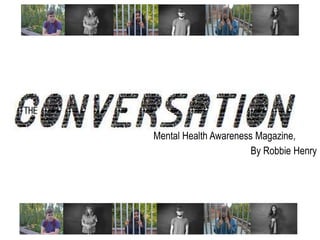
- 1. Mental Health Awareness Magazine, By Robbie Henry
- 2. Introduction: Hello my name is Robbie Henry and I am here today to convince you that my ideas for a new (mental health awareness) magazine fit your brief and present the best solution for your organisation’s needs.
- 4. Client Research: You have been commissioned by the Northern Echo to produce a new magazine or newspaper product. Your product could be in any style of genre but it must be self-financed through sales or advertising. You must also produce your magazine for a specified audience segment within the 16 to 25 age group. ” “ My Brief:
- 5. Introduction: What is my product and what are it’s intentions? My product is a mental health awareness magazine which focuses on informing the public about mental health, giving them accurate knowledge which can affect their daily life. Why mental health? There are various reasons why I have chosen mental health, firstly I have first and second hand experience of the issue and have seen how it affects daily life and therefore want to focus on this to hopefully stop negative stereotypes surrounding the issue, which is another intention. I want to demolish all negative connotations associated with the issue. Also I feel due to the recent government cuts for mental health hospitality, which could escalate in increasing suicide rates. Another outcome I want to create is starting a conversation, which will hopefully make the issue less of a taboo subject, progressing ‘democratic Britain’ will engage a conversation (a clear reference to the title).
- 6. Client Research: • Ensure my product is accessible to all socioeconomic groups, predominantly the ABC1, however I also plan on being accessible to all social groupings. • Make sure that the quality of my product is of a high quality content. • Create the ‘first of it’s kind’ mental health awareness magazine, filling a gap in the market and commercially viable to the 16-25 year old demographic. • Make my product self-financed, through advertising. • Create an innovative and refreshing product bound to gain mass regional attention. How I will meet this brief:
- 7. Client Research: I believe I met these guide lines by producing a product which is confident in it’s attention, which I believe young people will flock to but most importantly mental health is a major talking point amongst young people due to puberty, coming of age and progressive media representations. Therefore I believe the 16+ market are to be more open- minded to the topic, whilst also relating to the content in some cases. By having the freedom of style, I have been allowed to explore a completely new genre, which at a push could be described as a lifestyle magazine. I feel the only major problem was the fact that I had to not only appease my primary market of 16-24 year olds, but also secondary market of middle aged readers whom regularly read the Northern Echo and therefore this meant I had to make my product accessible to all ages, genders and social classes, despite older people remaining silent on the subject. As for Newsquest, I had to apply all of the journalistic morals I had learnt so far by creating accurate, substantial and interesting pieces which don’t show preference to a certain political party, hinder a minority or use distasteful speech, amongst many other rules. Also I remember Peter Barron discussing how he wanted to use the Northern Echo as a vehicle for campaign and change in the North East and I too want to follow this theme, by fighting against the negative stigmatization mental illness and it’s victims endure. I am more than confident that my product not only fills a gap in the market, but revolutionizes it. I feel this because firstly, it’s the first of it’s kind. Despite Psychologies, my main style model being an inspiration it doesn’t focus whole-heartedly on mental health, but instead hybridizes with a female lifestyle magazine also which I feel only prolongs the avoidance of the issue. Secondly It covers many issues a newspaper would such as the current state of mental health and this to me is more favourable in a weekly/fortnightly/monthly format because it allows the information to be summarized over a period of time rather than update daily which can change constantly and sometimes require a skewed and misleading view of an issue. Thirdly I believe this is not just a magazine, but a staring point for conversation. my magazine is not for profit, but for sheer determination and passion.
- 9. Things To Consider: • Due to being published with the Northern Echo, as well as my primary audience, my magazine will also be eligible and accessible of my secondary audience of regular Northern Echo readers who are usually middle aged, mainly males and in the ABC1 socioeconomic groups. Therefore I have to make my product more accessible to both audiences, however focus more so on my primary audience as they are more likely to digest my product. However parents and siblings of the primary audience are more than welcome to experience my product, alongside regular Northern Echo readers. In order to make my audience appeased I should apply all the 16 main IPSO regulations including accuracy, discrimination and cases which involve minors for example. I will also exclude inappropriate content including taboo language, nudity and pieces which may be indirectly favourable of radicalised or offensive views.
- 10. Things To Consider: Originally The PCC (Press Compliments Committee), after the phone-hacking scandal and Leveson Enquiry, the IPSO (Independent Press Standards Organisation) who are the current British independent regulator of print media, handling complaints from the general public. There are sixteen main codes that must be followed including accuracy, reporting of crime, discrimination, children in sex cases and harassment to name a few.
- 11. One of my main golden rules is to maintain accuracy throughout my journalism, doing persistent research into facts, statistics and figures, which will help build an honest relationship with my audience. Another one of my main golden aims is to promote social change through journalism, much like Peter Barron’s past efforts. I believe this is important as it makes my product a movement and not just a magazine. The third main point I hope to abide by is the legalisation and respecting privacy, which is an important factor considering the subject matter of my magazine. I will allow my interviewees and models to have freedom in their involvement and in the final cut. I want to help the reader throughout and create a genuine relationship with my audience, creating a support system for individuals who may be lacking it. The fifth and final main rule I hope to abide by is discrimination which I feel is incredibly important when covering mental illness, because it is such a sensitive topic. Therefore I will have to ensure none of my work is offensive or unethically written. Things To Consider:
- 12. Unique Selling Points: I believe there are various unique selling points to my product: Passionate Could affect NHS and political changes
- 13. Briefing my Idea: Some of the comments I received from my TA: “might not be a wide audience” “No competition – Something new” “really good different idea” “really good idea, gap in the market” “mental health is an interesting topic, could include more personal articles”
- 14. Genre Research:Influences – Front Covers Dazed & Confused In Publication since 1991 TIME (Magazine) In Publication since 1923 Psychologies In Publication since 1970 Psychology Today In Publication since 1967
- 15. Genre Research:Influences – Front Cover Analysis Psychologies In Publication since 1970 • Colour Scheme of Red, White and Grey/Black • Positive – Branding. • Self Reflective Imagery. • Butterfly Lighting. • Linear, neat layout. • Capitalisation of important words: Love, Special and Competition. • Celebrity Feature (Window to Future Self). • Variety of Sans Serif and Serif Fonts. • Use of Dimension via composition of model • Iconic Masthead at the top – Branding. • Positive and Motivational use of Lexis. …All of these visual features will affect my layout, colour, language, narrative voice, stylistic and model choices…
- 16. Genre Research:Influences - DPS Dazed & Confused DPS Example TIME (Magazine) DPS ExamplePsychologies DPS Example Psychology Today DPS Example
- 17. Genre Research:Influences – DPS Analysis • Dense active layout, four wide columns. Drop Cap and no Breakout Box. Text- Heavy but bland also. • Serif Font – Informal & Light hearted. • Splashes of colour – maroon red – connotations of independence. Black and White throughout – Serious. Smaller Imagery positioned centrally • Positive and Motivational use of Language • Female based models due to TA. …All of these visual features will affect my layout, colour, language, narrative voice, stylistic and model choices… TIME (Magazine) DPS ExamplePsychologies DPS Example • Active Layout, one columned article. Drop Cap and no Breakout Box. Large amount of text. • Sans Serif Font, Emboldened connotes power. • Black and White colour scheme– Newspaper, Serious. • Black and White Imagery – Formal – Politics. • Humour / Irony in use of Headline’s Lexis. • Celebrity Feature.
- 18. Mock Ups: 1.
- 19. Mock Ups: 1. During the mock up process, I learnt how to make my DPS cohesive and serious, which I intended as I want this style to look more professional and information based. Elements from this Mock Up I plan to take forward include the tone of depth, diagnoses and clear visual connotations of my subject matter. The Positives: • Strong Visualization. • Quotations, Diagnoses and arguments made. • Imagery held relevant connotations. • The title was clear and “allowed the audience to understand the true subject of the article • The tone of register and depth was strong and well received. • The main masthead contained relevant connotations. The Negatives: • Article text too “serious” and “informative” • Text and image ratio, unbalanced • Looked too much like a newspaper which “young people may find boring”
- 20. Mock Ups: 2.
- 21. Mock Ups: 2. During the second mock up, I found this much easier because I had a clear intention that this second mock up was to be more emotionally intense and image-heavy. Elements I plan to take forward are the breakout box, the ‘True Lies’ font and the left side image. The Positives: • The left page of my second mock up was favored the most. • “A really good balance” of text to image ratio. • Referred to as “a bit more creative which younger people would relate to.” • The model’s body language/ facial expressions were also applauded. • The photography portrayed “the severity of mental illness.” • The “crazed’ masthead font text also had connotations related to mental illness. • The visual element of the DPS was praised, particularly the left sided page and was referred to as “professional.” The Negatives: • The right page was referred to as “too distracting.”
- 22. The Name: • Relevant to ‘mental health’ and urgency for the topic to be discussed. • ‘The’ projects an image of authority. • Relates to intention of creating spoken conversation from my product. • Font has thematic connotations – visually appealing. • Relates to unisex audience as communication is universal, much like the subject matter.
- 23. Overall Aims: • Inform and educate the audience of the reality of mental health, creating an honest and non-offensive representation of the reality of mental health. • Defeating negative stereotypes and stigma’s associated with mental health. • Create a starting point of conversation which people can translate into spoken conversation allowing society to progress. • Discussing various arguments, perspectives and debates currently affecting mental health including political, social, philosophical and ethical debates. • Provide an intellectual and reflective product, which challenges preconceived notions and makes mental health less of a taboo subject.
- 24. Fonts and Colours: Article One (& Front cover/Contents) Colours: Article Two Colours: Article Three Colours:
- 25. Overall Product: • Front Cover • Contents Page • Article 1 (Informative) - ‘An Introduction Into Mental Health…’ • Article 2 (Emotional) – ‘ A Tale of Two Sisters: How Bipolar Affects The Family!’ • Article 3 (Educational) - ‘The History and Current Status of Mental Health Within The UK’
- 26. Article Overview and Observation: Front Cover • Images- Relative to Mental Health, Emotional, Passive, Metaphorical, Mid- Range. • Layout- Formal, Layered, Headlines to the side and Main Headline at the bottom. • Fonts- ‘News papers font’ for Masthead, very vibrant, have connotations of product and topic, both sans serif/serif, capitalized. • Colours- Black, red, white, grey, nude.
- 27. Article Overview and Observation: Contents Page • Images- Active, Variation of close ups and medium shots, abstract, cohesive to product and other article imagery. • Layout- Explosive, Abstract, Dimensional, Imagery – Interesting. Vertical list of articles and Support contacts towards bottom. • Fonts- ‘Crazy Eyes’ Font – Relevant connotations, Bold, Enlarged. • Colours- Purple, Nude, White, Black, and Various Pastels.
- 28. Article Overview and Observation: Article 1 (Informative) - ‘An Introduction Into Mental Health…’ • Images- Symbolic, black and white with red tinge, medium shots, documentary-like. • Layout- Explosive, symmetrical, breakout boxes and statistical quotes. • Fonts- ‘True Lies’ font for Main Title, Bold, Connote Mental Health, Arial for Main Article Text. • Colours- Red, Nude, Black, Grey, White, Quite Symbolic Colours
- 29. Article Overview and Observation: • Images- Static, Documentary Styled, Grim Hue (In Post-Production), Realistic, Mirrored. • Layout- Clear and set out, organized, split into two representing each sister. • Fonts- ‘Crazy Cock’ font for Headline and Sisters’ names, Bold, Serif and Sans Serif. • Colours- Pink, Grey, Black, Pastel and Dark Blues Article 2 (Emotional) – ‘ A Tale of Two Sisters: How Bipolar affects The Family!’
- 30. Article Overview and Observation: Article 3 (Educational) – ‘The History and Current Status of Mental Health Within The UK’ • Images- Small metaphorical images, relevant to the piece, Current, Close Ups. • Layout- Organized, Horizontally driven, Abstract, Explosive, Segregated. • Fonts- ‘Wrong Place Right Time’ main headline font, Italicised, understandable, more serious than previous fonts. • Colours- Red, Pink, Purple, White, Grey and Black.
- 31. Conclusion: • 16 Pages including my front cover, contents page and three DPS. • A4 Paper Size. • Glossy Paper for Exterior (Front and Back Cover) and Matt Budget Paper for Content Pages. • Free as Mental Health is a universal topic and being deserve to be educated. • 5 Pages (including the Back Cover) dedicated to advertisements, which primarily funds the product. • Distribution copies: 30, 000+ as I plan for my product to be released alongside the Northern Echo, which on average sells around 33, 00+ copies across the North East.
- 32. Printing Expenditure: Total Printing Expenditure: £14, 755 (also) 30, 000+ Pieces in Quantity. 16 Pages. 2 Pages of Glossy Paper for Front Cover and Back Cover. 14 Pages of Matt Budget Paper for Content Pages.
- 33. Personnel Editorial Staff Rates: Journalist/Researcher - £25 per hour Photographer - £20 per hour Model 1 - £10 per hour Model 2 - £10 per hour Model 3 - £10 per hour Model 4 - £10 per hour Sub Editor - £14 per hour Layout Artist / Graphic Designer - £20 per hour Make Up Artist- £15 per hour Lighting Assistant - £15 per hour
- 34. Personnel Expenditure: Journalist/ Researcher, 575 Photgrapher, 200 Model 1, 100 Model 2, 40 Model 3, 30 Sub Editor, 140 Layout Artist, 160 Make Up Artist, 150 Lighting Assistant, 150 Journalist/Researcher - £25 per hour (23 Hours = £575) Photographer - £20 per hour (10 Hours = £200) Model 1 - £10 per hour (10 Hours = £100) Model 2 - £10 per hour (4 Hours = £40) Model 3 - £10 per hour (3 Hours = £30) Sub Editor - £14 per hour (10 Hours = £140) Layout Artist - £20 per hour (8 Hours = £160) Make Up Artist- £15 per hour (10 Hours = £150) Lighting Assistant - £15 per hour (10 Hours = £150) Total Personnel Expenditure = £1, 545
- 35. Equipment Costs: Studio Space Rental Hire- £100 per hour Canon Camera - £40 per hour Backdrop Hire - £40 per hour Flash Lighting Studio Kit - £90 per hour Indemnity Insurance- £100 per hour Risk Assessment Technical Support- £10 per hour
- 36. Equipment Costs: Studio , 600 Camera, 440 Backdrop, 240 Lighting , 540 Insurance, 900 Risk Ass. Support, 450 Studio Space Rental Hire - £100 per hour (6 Hours = £600) Canon Camera – £40 per hour (11 Hours = £440) Backdrop Hire – £40 per hour (6 Hours = £240) Flash Lighting Studio Kit – £90 per hour (6 Hours = £540) Indemnity Insurance- £100 per hour (9 Hours = £900) Risk Assessment Support- £50 per hour (9 Hours = £450) Total Equipment Expenditure = £3, 170
- 37. Total Expenditure Costs: Total Printing Expenditure = £14, 755 + Total Personnel Expenditure = £1, 545 + Total Equipment Expenditure = £3, 170 = £19,470
- 38. Advertising Prices: Advertising Prices 1 Insert 2-3 Inserts 4-6 Inserts 7+ Inserts DPS £2800 £2350 £1800 £1350 Full Page £1600 £1300 £1000 £750 Half Page £1400 £1150 £900 £650 Quarter Page £1200 £1000 £700 £450 Town Feature 1/8 Page £400 £250 £170 £120 Restaurant Feature 1/8 Page £400 £250 £170 £120 Page Behind Front Cover £3000 £2600 £2200 £1800 Page on Back Cover £3200 £2900 £2500 £1500
- 39. Advertising Sales: Back Cover Ad, 5200 Behind Front Cover Ad, 13200 Page 6 Ad, 3900 Page 10 Ad, 6000 Page 14 Ad, 1600 Advertisement on Back Cover - £2600 rate (2 Inserts = £5200) Advertisement behind Front Cover - £2200 rate (6 Inserts = £13200) Full Page (Page 6) - £1300 rate (3 inserts = £3900) Full Page (Page 10) - £750 rate (8 inserts = £6000) Full Page (Page 14) £1600 rate (1 insert = £1600) Total Equipment Expenditure = £29, 990
- 40. Total Income: £10,430 Advertisement Sales = £29, 990 - Editorial, Equipment and Printing Costs (19, 470) = …which could be used on the next issue’s budget
- 41. Conclusion: • Ensure my product is accessible to all socioeconomic groups, predominantly the ABC1, however I also plan on being accessible to all social groupings. • Make sure that the quality of my product is of a high quality content. • Create the ‘first of it’s kind’ mental health awareness magazine, filling a gap in the market and commercially viable to the 16-25 year old demographic. • Make my product self-financed, through advertising. • Create an innovative and refreshing product bound to gain mass regional attention. My Original brief: I believe I have met my brief by making a refreshing and creative product which fills a stark gap in the market. Various USP include: being a support system for readers, informing people of mental illness and defeating negative stereotypes. I believe I have succeeded in creating a credible and sufficient product and am pleased with the outcome which I believe would be successful in today’s current print media climate. After word:
- 42. Thank you for listening… Any Questions?