"Stitch" - The Story of Gap Inc's Design System
•Download as PPTX, PDF•
1 like•1,220 views

This is a story about collaboration. How Gap Inc. transformed it's way of working in the digital space with Design Systems that enabled product teams to innovate quickly and deliver on customer needs with impact.

Recommended
Recommended
More Related Content
What's hot
What's hot (20)
Similar to "Stitch" - The Story of Gap Inc's Design System
Similar to "Stitch" - The Story of Gap Inc's Design System (20)
Recently uploaded
Recently uploaded (20)
"Stitch" - The Story of Gap Inc's Design System
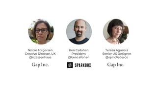
- 1. Nicole Torgersen Creative Director, UX @nzassenhaus Ben Callahan President @bencallahan Teresa Aguilera Senior UX Designer @spindledesco
- 5. Image credit: The LEGO Group
- 6. Image credit: Brad Frost
- 8. THIS IS A STORY ABOUT
- 10. SIGN
- 12. LOGO
- 15. Design systems are living codebases of frontend components.
- 16. Design systems are living codebases of frontend components.
- 17. $15.9 Billion SALES 2017 *hitwise.com $3.2 Billion ONLINE 832 Million ANNUAL UNIQUE VISITS 3rd Highest Conversion in Retail 2017 CYBER MONDAY (9.2%)* 50% Mobile CONVERSION 30% INDUSTRY AVG
- 20. THIS IS A STORY ABOUT COLLABORATION
- 21. UX
- 24. STORE EXPERIENCE
- 25. STORE EXPERIENCE
- 26. STORE EXPERIENCE
- 27. STORE EXPERIENCE
- 31. 9px verdana, arial, sans-serif #333333 9px arial, verdana, sans-serif #333333 9px verdana, sans-serif #999999 9px verdana #00000 9px verdana, arial, sans-serif #fffff 10px verdana, arial, sans-serif black uppercase bold 10px verdana, arial, sans-serif white uppercase bold 10px verdana, arial, sans-serif #999999 10px verdana, arial, sans-serif #000000 10px arial, helvetica, sans-serif #fff 11px arial, verdana, sans-serif #000 uppercase 11px verdana, arial, sans-serif #000 uppercase 11px verdana, arial, sans-serif #4d5d8a bold 12px arial #000 uppercase .75em arial, verdana sans-serif #333333 bold 18px verdana, arial, sans-serif #333333 22px verdana, arial, sans-serif #999999 bold 24px verdana, sans-serif #333333 uppercase bold Pleated stripe skirt Pleated stripe skirt Pleated stripe skirt Pleated stripe skirt Pleated stripe skirt Pleated stripe skirt PLEATED STRIPE SKIRT Pleated stripe skirt Pleated stripe skirt Pleated stripe skirt PLEATED STRIPE SKIRT Pleated stripe skirt PLEATED STRIPE SKIRT Pleated stripe skirt Pleated stripe skirt Pleated stripe skirt Pleated stripe skirt
- 36. WHERE WE WERE ✖ 30+ Style Sheets ✖ Bloated Code / Page Load ✖ No Shared Terminology ✖ Updates Near Impossible ✖ Brands Expression Hampered CSS JS JS JS JS JS JS JS ASSETS
- 37. MAKING A
- 38. Image credit: Brad Frost THE ELEVATOR PITCH ✓ What’s a Design System? ✓ How will it help us? ✓ Where can it be applied?
- 39. THE ELEVATOR PITCH ✓ What’s a Design System? ✓ How will it help us? ✓ Where can it be applied?
- 40. THE ELEVATOR PITCH ✓ What’s a Design System? ✓ How will it help us? ✓ Where can it be applied? TRANSACTIONALMARKETING
- 42. DESIGN STRATEGY BASED ON NEED POINT OF NO RETURN PARTNERS WITH SKIN IN THE GAME
- 43. DESIGN STRATEGY BASED ON NEED POINT OF NO RETURN PARTNERS WITH SKIN IN THE GAME
- 44. DESIGN STRATEGY BASED ON NEED POINT OF NO RETURN PARTNERS WITH SKIN IN THE GAME
- 47. “Wait, which one? _final-final or _v14-final?”
- 48. “I don’t trust PDFs.”
- 49. TRIBAL KNOWLEDGE
- 50. TRIBAL KNOWLEDGE SINGLE SOURCE OF TRUTH
- 51. LEAN CYCLE
- 63. 100% ON-BRAND
- 65. SUCCESSFUL DESIGN SYSTEMS ARE...
- 66. SUCCESSFUL DESIGN SYSTEMS ARE...
- 67. SUCCESSFUL DESIGN SYSTEMS ARE...
- 68. SUCCESSFUL DESIGN SYSTEMS ARE...
- 70. Nicole Torgersen Creative Director, UX @nzassenhaus Ben Callahan President @bencallahan Teresa Aguilera Senior UX Designer @spindledesco THANK YOU
Editor's Notes
- It’s cheating to start your presentation off with a picture of your kid… But this is my son and I sprawled out on the floor working on [NEXT]
- This. The LEGO Millennium Falcon! My son is obsessed with LEGOs. So everytime one of his cousins or uncles or grandparents or friends had an opportunity to buy him a present, they get him LEGOs. And every once in a while, someone goes and buys him one with [NEXT]
- Over 1000 pieces. And when that happens, he recruits me to give him a hand. And where I really help out is in areas like this: [NEXT]
- We’re looking at pages 128 and 129 from the official LEGO instructions. There are 13 of these little flaps that all attach to create the top of the millennium falcon. So, he gets me to come help him make an assembly line. The process looks a bit like this [NEXT]
- We dump out all the pieces. We organize them by type, size, similarity. Create a component. [NEXT]
- We put the components together to create the final piece! Today we want to share how the work we do on the web is not so different from the process my son and I use to build these massive LEGO sets. [NEXT]
- Today, we want to tell you a story about SYSTEMS Back in 2012 and 2013 we noticed a big push toward organizations building internal teams to do the work that we do at Sparkbox Over the years, we’ve seen that folks are finally coming to grips with the fact that we are all software companies—most of our businesses wouldn’t run very well without some kind of customized software to run them Gap was way ahead of the curve on this, when we first met they already had a very large team of designers and developers and they were already tackling some of the hard problems We began working together just as they were planning for a responsive redesign of their product detail page and we were really just there to provide an outside perspective to their process
- Eventually we ended up working alongside their team to help build that responsive product detail page which is now in use for all of their brands Our default approach to this kind of large-scale work has always been very modular in nature, and so the product detail page work we did together essentially served as a jumping off point for what is now Stitch—Gap’s multi-brand design system Nicole and Teresa will dive into the details of this system, but before I hand it over I’d like to make sure we’re all on the same page regarding what a design system is Lucky for me, you all have been thinking about systems for a LONG time...
- If I said to you, “Hey, people are getting lost in my building. Can you design a sign for me?” You’d say, [NEXT]
- “Ha ha ha, silly client… You don’t need a sign, you need a wayfinding system!”
- And if I said to you, “Hey, my logo feels a little old, can you make me a new one?” You’d say: [NEXT]
- “Absolutely! But you’re gonna need a lot more than just a logo...”
- AND, not only would you think through the design elements themselves, You would also provide guidance around how those elements can and cannot be used.
- Design systems are same thing, but they include a living codebase of frontend components. These components can be assembled—just like LEGO’s—to construct entire digital experiences. “They address everything from color and typography, to grids and navigation, to documentation and guiding principles—promote the reuse of code and patterns, making the web more consistent, efficient, accessible, and (believe it or not) more creative.”
- We believe in this approach so strongly, that almost every single project we take on these days has a Design System as part of the deliverable. We’re doing research on the topic (which I’ll share more about later) and we’re even offering workshops and internal trainings on design systems—because they are so critical to the long-term success of digital products, but they don’t maintain themselves... Now I’d like to invite Nicole to come tell you all about design systems at Gap.
- Thanks Ben. Let me tell you a little bit about Gap as a business
- Big company, culture is changing Embracing “Test & Learn” culture Driving connection between physical and digital Only U.S. Based Retailer named to Bloomberg’s inaugural gender-equality index Women make up >70% Gap Inc.’s worldwide employee base; 3 of 5 brands have female CEOs. Leader in Equal Pay
- Big company, culture is changing Embracing “Test & Learn” culture Driving connection between physical and digital Only U.S. Based Retailer named to Bloomberg’s inaugural gender-equality index Women make up >70% Gap Inc.’s worldwide employee base; 3 of 5 brands have female CEOs. Leader in Equal Pay
- I’d like to tell you a story about collaboration.
- 2013, invited to join Gap inc. centralized UX team - 4 brand on one ecom platform 1 Interaction Designer, 1 UX Director + 2 designers at agency First person with Graphic Design and Front End dev bkg
- Ecom experience designed, developed and managed Brand teams (design, marketing production among others) dev - marketing messages Eng org - architecture, framework, front end of transactional Product management - we partner with on strategy, priority of execution of initiatives to support org’s Long Range Plan
- Look at sites 2013 same framework = same layout across brands with exception to logo, product imagery and button color overrides Pages look same Unique brand voice getting lost
- Juxtapose to our in-store experiences Customers fully immersed rich brand experience Had years to perfect this experience, since 1969 How might we bring this rich brand voice to digital? how can we extend the brand consistently across touch points?
- My answer was a design system Needed a tool, a source of truth for all teams to share and contribute to To define a shared language a shared design strategy and shared code
- How to get there? How do we bring together all of these teams and create a system that they can use Gather support to contribute Visually communicate opportunity
- Conducting my own evaluation. one page, one brand. Where we are today. Where we need to go. Aesthetic layer first. No brand fonts, too many colors. non-brand colors. Looked under hood at code I noticed lots of bloated, code and re-classed elements indicating a lack of a global style sheet or any re-usable code 13 colors 8 font styles It looked like developers were starting new with each change to the page.
- Conducting my own evaluation. one page, one brand. Where we are today. Where we need to go. Aesthetic layer first. No brand fonts, too many colors. non-brand colors. Looked under hood at code I noticed lots of bloated, code and re-classed elements indicating a lack of a global style sheet or any re-usable code 13 colors 8 font styles It looked like developers were starting new with each change to the page.
- Simplified handful re-usable brand-right type styles limited colors to those in brand style guide
- Simplified handful re-usable brand-right type styles limited colors to those in brand style guide
- I then looked at buttons - elements found throughout the site There are 82 variants total Varying shapes, sizes, colors and type usage All with text rendered as an image Difficult to maintain and a challenge with ADA compliance
- Painted a vision with broad strokes. We needed to more clearly tie in the brand aesthetic We also needed to create visual elements that lend themselves to re-usable code and consistency
- Talk with our development partners. How our code was formed? 30 style sheets - JS and assets, Developed by product or feature Create design strategy, will support opportunity for dev strategy I don’t own this decision If we align design strategy to code strategy, we have a lot to gain.
- Completed my own evaluation Now it was time to help my partners visualize what I found and where I believe we should go.
- I needed to explain what a design system is, I used the lego analogy - Brad Frost (Atmomic Design) Legos - you can create small bits of code which have design embedded Available to you at any given moment to re-use in various configurations throughout your experience. People understood this metaphor, and they got excited about it
- It could save us time - we estimated roughly 60-80% in savings dev time designers redlines and specs - that are not read Supports developers without experience writing front end - provides tools off the shelf Bring brand experience full circle across touch points - instilling trust and creating more loyal customers We also found - employee retention and attracting talent.
- Where can it be used? Common expectation for transational areas - cat page, prod, bag, cart Can be used earlier, all the way to home marketing moments and storytelling
- Created design strategy How might I start putting one foot in front of the other This effort was not on a roadmap, it wasn’t funded as an initiative I decided it was time to start working differently in UX
- Established what elements should be patterns Began documenting them and sitting with brand creative directors and dev partners Small elements first: important Identifying what is a pattern list them in a spreadsheet prioritize. design, spec, talk with partners. move on. Start small fonts, colors, and buttons. There is a lot of work in those details. Designers want to boil the ocean - don’t do it.
- Established a cut off, a point - All ux designs from here on will be design and delivered with componentized specs. We killed redlines Find partners with a new project or feature - discuss working differently
- Find partners with a new project or feature - discuss working differently
- In 2014, overhaul front end code and design - responsive “Design Systems 101” - never create the patterns first Create pages then extract Ben’s team at Sparkbox & Teresa hired to lead Stitch I’ll let Teresa tell you about how we created the system
- Ultimately we wanted the whole org invested but we started close to home – start with what you know, what you can control Address pain points UX was experiencing At the same time starting to shift culture by delivering specs and assets in a modular way How many of you have created one of these style guides or cheat sheets? These are great, a no-brainer
- But then this happens. Every day you’re answering this question and curating your files. If you’ve felt this pain, you may be ready for something more dynamic Keep up with the fast-pace digital products and distributed teams require today We thought, if we control this asset and we’re frustrated, what must our partners be feeling? So we asked.
- And guess what: Developers – at least our developers – don’t like PDFs much either This started our lean cycle of learning. We made an assumption: If we’re annoyed, so are they. We validated that assumption: Yes! Same problems, and different ones Second-guessing, low confidence in accuracy, uncertainty who to ask Revealed organization-wide struggle with tribal knowledge; confusing jargon and lack of shared language; and overall lack of trust. Now we had a “north star” problem to solve: we had to make the design system credible and trustworthy. Over the next several months, every sprint we undertook, was rooted in that fundamental driving principle: be a single source of truth.
- Revealed organization-wide struggle with tribal knowledge; confusing jargon and lack of shared language; and overall lack of trust.
- We latched onto this as a guiding “north star” problem to solve: we had to make the design system credible and trustworthy. Over the next several months, every sprint we undertook, was rooted in that fundamental driving principle: be a single source of truth.
- One simple path of inquiry uncovered all that. Adopted a lean cycle of learning: identify an assumption; form a hypothesis that can be tested then validate the assumption and feed that new knowledge back into the cycle. Keep things speedy, no time to linger on details – 1 week.
- Dedicated cross-functional team, everyone participates – devs conduct interviews, sketching. Remote team using wacky online tools so everyone can contribute ideas.
- The toolkit site was a big focus of our investigation since it would be the “living style guide” website would be the universal portal into Stitch. People from all disciplines and levels of expertise would access it in a time of need. Everything in Stitch had to earn its place, from the components themselves to toolkit features like code snippets and search functionality. Sometimes the thing we tested would be a prototype, simulating a real task.
- But sometimes we just needed to validate a concept, and building something would be too big an assumption / investment. At a company our size, we had to start by validating that the system was even warranted. Everyone said so, but what did they *mean* when they said “design system” ?
- Card sort worked great for that Spoken goal through this: learning Unspoken goal: collaboration through listening, building trust
- Sometimes UI is distracting - get feedback on the wrong things. This is the result of an exercise in naming conventions. Choose whatever methods enable you to learn more and validate some aspect of the system or UI. There’s no such thing as moving “backwards” as long as you’re learning. The result was a collection of tested, guiding user data. The one week schedule ensured we didn’t try to do too much or be too precious – our goal at this stage wasn’t a polished end product, but a vehicle of learning.
- Over the course of 15 weekly experiments, each testing a discrete part of the content, documentation, or interface, a Design System voice began to take shape. It was reassuring and accommodating – not exclusive to any particular user group, too technical nor too designy – but also authoritative and orderly.
- And finally, we gave it a name. I probably don’t need to tell anyone in this room how powerful branding can be to instill trust but we found it pivotal to adoption and engagement, especially for an internal tool. Stickers helped. Everyone loves some swag.
- So where are we today, a year and a half after our beta release, and nearly 5 years after Nicole’s first conception of the idea?
- Today Stitch is a proprietary software product Broad base of stakeholders accessing UI Devs, Designers but also product managers, third party vendors Visual Style – Colors and Typography Foundations like grid, and Core Components Complex components including javascript Build Right – Accessibility, Browser Support, and Unit tests = Confidence in product
- Proven success 50-80% reduction in time on tasks, everything from spec’ing designs to prototyping new features institutionalized – stakeholders say if Stitch went away, they’d recreate it within their own teams. It’s how we do things now.
- That translates to a 300% return on investment Every dollar we invest in terms of labor saves the company 3 dollars or more, year over year
- A good design system should be invisible to our customers outside of reinforcing brand equity Enables innovation / evolution since we can update the brands more easily. Already updated fonts site-wide for 3 brands and it takes a week or less where it used to take months
- That’s the product. But the real win is the gathering-together of people. Teams now unified around a single vision, guided by same north star Our work and deliverables are integrated – institutionalized – stakeholders say if Stitch went away, they’d recreate it within their own teams. It’s how we do things now. Stitch is trusted as a method, a toolset, and most importantly as a partner. If something goes wrong, we hear about it and are trusted to make it better. This is how things went for us. I want to acknowledge that all design system journeys will be different… but also suggest our path, especially our emphasis on collaboration, was not really so unique. I’m going to hand it back to Ben to tell you more about the industry trends that could be helpful to you.
- As I mentioned earlier, we’ve been conducting some research into design systems and I wanted to share just a few high-level assessments we’ve made so far.
- The first is that successful design systems are robust. They tended to include more elements—e.g. color systems, HTML code, typography, and voice and tone guidelines—and they explained how to use those elements.
- A large majority of folks who felt their design systems were successful also shared that they were well-maintained And, they are maintained by a dedicated team. But also that these teams were made up of folks with different expertise—design, UX, development—all working together toward a common goal. Which leads us to the last point I’ll share today… [NEXT]
- Design Systems have the power to unify the various roles inside your organization around a common vision. They build trust. You may notice Nicole and Teresa didn’t talk much about the technological challenges—and there are some. That’s because the hard work here is the people work, not the tech. It’s the 4 years of pounding the pavement Nicole put in that really tilled the soil and allowed Stitch to grow.
- If you’re interested in learning more about design systems (or maybe in convincing some folks on your team that this is something you should consider) checkout the results of the survey which we are releasing today. There’s also further reading and resources for you as well as information about trainings and workshops. All of this and more is at this URL.
- From Gap and Sparkbox, Thank you for being here. We’re happy to continue the conversation after this presentation. Reach out to us on twitter or... we will be just outside this ballroom to chat with any folks who would like to.