Cloud Frontiers: A Deep Dive into Serverless Spatial Data and FME
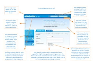
Evaluating Websites- Water Aid
1. The campaign logo is They have a scroll down
Evaluating Websites- Water Aid at the top for different
right at the top, and
stands out because of countries, which makes
its size it convenient for all the
people who wish to go
on this website
Has only one image; They have a donate
however it doesn’t now button at the top,
show up on the which is great as it will
website. But, it must be allow you to make a
something related to donation immediately
the campaign
There is very limited
They have a place along amount of text on the
the side which tells you homepage, but what
how your donations they do have is good as
will help people. This is it persuades you to
really good as it help people, and
informs people and donate to this charity
tells them how their
money that they
donated is making a
One thing I don’t like about the way
change
they make you donate is that you
The tabs to different pages are along They have two different types of donations you can do: have a certain options that you pick
the top. They also have text on them regular/one off gift. This is good because it’s giving more of a from, because they’ve already
which tells you which page is what. choice to the people who want to donate. Also, by having it on the decided the amount you pick from to
That’s useful because it will help homepage it will make people want to do it more, as that’s one of give, so you don’t get to make that
people to get to what they want to the first things they see when you go on the site decision yourself.
know quicker