![January 1, 1955
c/o Howard “Bud” Kettler
Re: courier typeface
Designed by Howard “Bud” Kettler in 1955, Courier, originally called “Messenger,”
was sought to be acquired by IBM for use in their typewriters due to its nature as
a monospaced slab-serif. IBM failed to gain the right to Courier, and eventually
it was released publicly and became the standard typewriter font. Until February of
2004, Courier was the standard typeface used by the United States Government, found
on classified U.S. State Department documents and other papers. Today it is also
the Hollywood industry standard for typing screenplays and scripts.
Aa Bb Cc Dd
Ee Ff Gg Hh
Ii
Jj Kk Ll
Mm Nn Oo Pp Qq
Rr Ss
Tt Uu Vv
Ww Xx
Yy & Zz
Case # 012 3456789
courier
----- FOR YOUR EYES ONLY -----
SIGNED,
----- FOR YOUR EYES ONLY -----
cap height[
]x height
descender
]
bowl
]
ascender
]
terminal (slab serif)
]](data:image/gif;base64,R0lGODlhAQABAIAAAAAAAP///yH5BAEAAAAALAAAAAABAAEAAAIBRAA7)
Recommended
More Related Content
More from Natalie Singleton
Recently uploaded
Recently uploaded (20)
Type Specimen Posters
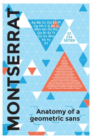
- 1. 01 234 56789 BOWL MONTSERRAT With the help of a kickstart fundraising campaign, Julieta Ulanovsky launched the Montserrat type series in 2012. She was inspired by the revival of classic signage and early twentieth century typographic influence in her hometown of Montserrat, Buenos Aires. There are currently three available families of Montserrat, and each variant incorporates the character of these once hand-lettered signs within her neighborhood. Its geometric simplicity and legibility ensures Montserrat lends itself to most all design styles. It’s available on Google Fonts as a free “dupe” for Tobias Frere-Jones’ typeface, “Gotham.” Aa Bb Cc Dd Ee Ff Gg Hh Ii Jj Kk Ll Mm Nn Oo Pp Qq Rr Ss Tt Uu Vv Ww Xx Yy Zz Anatomy of a geometric sans CAP HEIGHT ASCENDER X HEIGHT TERMINAL DESCENDER
- 2. January 1, 1955 c/o Howard “Bud” Kettler Re: courier typeface Designed by Howard “Bud” Kettler in 1955, Courier, originally called “Messenger,” was sought to be acquired by IBM for use in their typewriters due to its nature as a monospaced slab-serif. IBM failed to gain the right to Courier, and eventually it was released publicly and became the standard typewriter font. Until February of 2004, Courier was the standard typeface used by the United States Government, found on classified U.S. State Department documents and other papers. Today it is also the Hollywood industry standard for typing screenplays and scripts. Aa Bb Cc Dd Ee Ff Gg Hh Ii Jj Kk Ll Mm Nn Oo Pp Qq Rr Ss Tt Uu Vv Ww Xx Yy & Zz Case # 012 3456789 courier ----- FOR YOUR EYES ONLY ----- SIGNED, ----- FOR YOUR EYES ONLY ----- cap height[ ]x height descender ] bowl ] ascender ] terminal (slab serif) ]