
Recommended
More Related Content
Similar to Data Visualization.docx
Similar to Data Visualization.docx (20)
More from MuhammadKhalil502533
More from MuhammadKhalil502533 (20)
Recently uploaded
Recently uploaded (20)
Data Visualization.docx
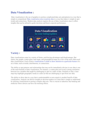
- 1. Data Visualization : Data visualization is the use of graphics to portray complicated data sets and patterns in a way that is simple to comprehend. Data visualization aims to portray data in a way that makes it simple to spot trends and connections. Modern data analysis requires the use of data visualization since it offers insights that can be utilized to guide decisions and boost corporate performance. Variety : Data visualizations come in a variety of forms, each having advantages and disadvantages. Bar charts, line graphs, scatter plots, heat maps, and geographical maps are a few of the most often-used data visualizations. Each of these visualizations is made to draw attention to a particular feature of a set of data, such as trends, distributions, or connections. The ability to spot patterns and relationships that may not be immediately obvious in raw data is one of the main benefits of data visualization. For instance, a scatter plot can reveal a strong correlation between two variables that might be challenging to spot in a table of data. Similarly to that, a heat map may highlight geographic trends in a data set that are challenging to spot from raw data. The ability to show data in a way that is understandable to non-experts is another benefit of data visualization. Analysts can deliver insights to decision-makers in a form that is simple to understand by utilizing visualizations to portray complex data sets. This is crucial in industries like banking and medicine where choices can have far-reaching effects.
- 2. Advantage : Effective data visualization is based on a number of important factors. Clarity is one of the most crucial of these. Good data visualization should include descriptive labeling, a logical layout, and be simple to grasp and interpret. Additionally, it should be visually appealing, using fonts and colors that make it simple to tell apart the various components of the visualization. Context is yet another essential element of successful data visualization. Effective data visualization should give viewers access to sufficient context so they can comprehend the importance of the data being displayed. A line graph might, for instance, depict variations in sales over time, but it should also include details on the causes of those changes, such as shifts in the economy or modifications to marketing tactics. Relevance is a third essential element of a successful data visualization strategy. Instead of attempting to portray every facet of the data set at once, good data visualization should concentrate on the most crucial components. In order to create visualizations that effectively convey these insights, analysts must carefully examine the information that decision-makers need to know. Conclusion : In conclusion, data visualization is an effective method for displaying intricate data sets in a manner that is simple to comprehend. Analysts can offer insights that help guide choices and enhance corporate performance by highlighting patterns and linkages in data through visualizations. Data visualizations must be clear, contextualized, and relevant in order to be useful, and they must be created with the decision-makers needs in mind.