Mike Stephenson 
(727) 422-4714 mike.stephenson.33609@gmail.com 
A MANAGEMENT CASE STUDY: DASHING TO A DASHBOARD 
Johns Hopkins All Children’s Hospital had spent months developing a new tool to 
aggregate, evaluate and analyze patient safety and quality information. As so often 
happens, those involved in the project thought of the communication piece late in the 
game. The VP of Marketing and Communications received the email on Nov. 12, 2019: 
 
“... As I mentioned, we would like to create an educational video (2-3 mins) for the … 
Dashboard ASAP.” 
 
Because I led the Editorial Team, my boss pulled me into the project the next day. 
 
 
The goal  
 
Create an introductory video for a broad internal audience to showcase an important 
new monitoring tool that would be used throughout the clinical operation and beyond. 
 
 
Strategy, tactics and execution   
The keys in this project were understanding what we were trying to achieve and then 
conveying the information clearly to a broad internal audience. 
 
The script proposed by the Health Informatics director of predictive analytics arrived 
Nov. 20. It was technical and a bit overwhelming. It got into the weeds, speaking of 54 
measures, 19 broken down by location and a total of 182 combinations. It talked about 
data sources and platforms such as REDCap and Tableau that didn’t need to be 
mentioned in the introduction to a broad audience. 
 
After reading it, I sent the patient safety and quality and health informatics teams a 
series of questions, including: 
● Who is the audience? There is a reference toward the end to “staff and 
board members.” Is that clinical staff? Broader staff? 
● As for board members, are they familiar with this type of terminology 
and these measures or do we need to educate them on what terms mean 
and why they matter? 
● What is the goal? Are we teaching people something completely new or 
are we introducing a new tool that helps them manage information 
they’re familiar with in a more efficient way? 
● Are we walking people through information on a standard computer 
screen or is there some other sort of monitor involved? Is the data 
currently in a form we can capture from a screen to showcase examples? 
● Is this video an introduction with more training to follow or is it the 
totality of training? 
● Do we envision this script becoming a voiceover or do we envision text 
on a screen? If it’s a voiceover, do we have a voice in mind? 
Next was making sure the right people were in the room. The initial meeting invite 
included the VP of Marketing and Communications, the Director of Creative and Brand 
(my boss), the graphic design manager, the data scientist and me. On Dec. 3, I received 
answers to my questions from the patient safety and quality team. I sent my bosses 
the script they had proposed, the answers to my questions and a suggestion to expand 
the meeting to include more representation from the patient safety and quality team 
and from our internal communications team. They agreed, and we met Dec. 5. 
The meeting provided clarity and a sense of who should take hands-on roles. I would 
draft a whole new script and work with a multimedia specialist from my team who was 
experienced at screen captures and instructional videos. I drafted the bulk of a new 
script that day while the information was fresh in my head, marking certain areas for 
follow-up and clarification. I received access to the tool a few days later and explored 
it before making some script revisions. We shared the new script with the senior 
director of health informatics and the director of predictive analytics at a  
Dec. 10 meeting, making some minor updates and revisions. 
 
Our multimedia specialist moved into the production phase, sometimes working with 
Health Informatics at his side. 
 
The video came together quickly. We delivered it Dec. 17 and there were only minor 
revisions. 
 
 
The results 
 
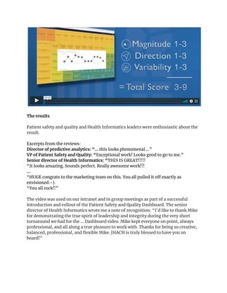
Patient safety and quality and Health Informatics leaders were enthusiastic about the 
result.  
Excerpts from the reviews: 
Director of predictive analytics: “... ​this looks phenomenal …” 
VP of Patient Safety and Quality: “​Exceptional work! Looks good to go to me.” 
Senior director of Health Informatics: “​THIS IS GREAT!!!!! 
“It looks amazing. Sounds perfect. Really awesome work!!! 
… 
“HUGE congrats to the marketing team on this. You all pulled it off exactly as 
envisioned:-). 
“You all rock!!” 
 
The video was used on our intranet and in group meetings as part of a successful 
introduction and rollout of the Patient Safety and Quality Dashboard. The senior 
director of Health Informatics wrote me a note of recognition: “I'd like to thank Mike 
for demonstrating the true spirit of leadership and integrity during the very short 
turnaround we had for the ... Dashboard video. Mike kept everyone on point, always 
professional, and all along a true pleasure to work with. Thanks for being so creative, 
balanced, professional, and flexible Mike. JHACH is truly blessed to have you on 
board!” 
 

Mike Stephenson Case Study Promoting a Dashboard

  • 1.
      Mike Stephenson  (727) 422-4714mike.stephenson.33609@gmail.com  A MANAGEMENT CASE STUDY: DASHING TO A DASHBOARD  Johns Hopkins All Children’s Hospital had spent months developing a new tool to  aggregate, evaluate and analyze patient safety and quality information. As so often  happens, those involved in the project thought of the communication piece late in the  game. The VP of Marketing and Communications received the email on Nov. 12, 2019:    “... As I mentioned, we would like to create an educational video (2-3 mins) for the …  Dashboard ASAP.”    Because I led the Editorial Team, my boss pulled me into the project the next day.      The goal     Create an introductory video for a broad internal audience to showcase an important  new monitoring tool that would be used throughout the clinical operation and beyond.      Strategy, tactics and execution    The keys in this project were understanding what we were trying to achieve and then  conveying the information clearly to a broad internal audience.    The script proposed by the Health Informatics director of predictive analytics arrived  Nov. 20. It was technical and a bit overwhelming. It got into the weeds, speaking of 54  measures, 19 broken down by location and a total of 182 combinations. It talked about  data sources and platforms such as REDCap and Tableau that didn’t need to be  mentioned in the introduction to a broad audience.    After reading it, I sent the patient safety and quality and health informatics teams a  series of questions, including:  ● Who is the audience? There is a reference toward the end to “staff and  board members.” Is that clinical staff? Broader staff? 
  • 2.
    ● As forboard members, are they familiar with this type of terminology  and these measures or do we need to educate them on what terms mean  and why they matter?  ● What is the goal? Are we teaching people something completely new or  are we introducing a new tool that helps them manage information  they’re familiar with in a more efficient way?  ● Are we walking people through information on a standard computer  screen or is there some other sort of monitor involved? Is the data  currently in a form we can capture from a screen to showcase examples?  ● Is this video an introduction with more training to follow or is it the  totality of training?  ● Do we envision this script becoming a voiceover or do we envision text  on a screen? If it’s a voiceover, do we have a voice in mind?  Next was making sure the right people were in the room. The initial meeting invite  included the VP of Marketing and Communications, the Director of Creative and Brand  (my boss), the graphic design manager, the data scientist and me. On Dec. 3, I received  answers to my questions from the patient safety and quality team. I sent my bosses  the script they had proposed, the answers to my questions and a suggestion to expand  the meeting to include more representation from the patient safety and quality team  and from our internal communications team. They agreed, and we met Dec. 5.  The meeting provided clarity and a sense of who should take hands-on roles. I would  draft a whole new script and work with a multimedia specialist from my team who was  experienced at screen captures and instructional videos. I drafted the bulk of a new  script that day while the information was fresh in my head, marking certain areas for  follow-up and clarification. I received access to the tool a few days later and explored  it before making some script revisions. We shared the new script with the senior  director of health informatics and the director of predictive analytics at a   Dec. 10 meeting, making some minor updates and revisions.    Our multimedia specialist moved into the production phase, sometimes working with  Health Informatics at his side.    The video came together quickly. We delivered it Dec. 17 and there were only minor  revisions. 
  • 3.
        The results    Patient safetyand quality and Health Informatics leaders were enthusiastic about the  result.   Excerpts from the reviews:  Director of predictive analytics: “... ​this looks phenomenal …”  VP of Patient Safety and Quality: “​Exceptional work! Looks good to go to me.”  Senior director of Health Informatics: “​THIS IS GREAT!!!!!  “It looks amazing. Sounds perfect. Really awesome work!!!  …  “HUGE congrats to the marketing team on this. You all pulled it off exactly as  envisioned:-).  “You all rock!!”    The video was used on our intranet and in group meetings as part of a successful  introduction and rollout of the Patient Safety and Quality Dashboard. The senior  director of Health Informatics wrote me a note of recognition: “I'd like to thank Mike  for demonstrating the true spirit of leadership and integrity during the very short  turnaround we had for the ... Dashboard video. Mike kept everyone on point, always  professional, and all along a true pleasure to work with. Thanks for being so creative,  balanced, professional, and flexible Mike. JHACH is truly blessed to have you on  board!”