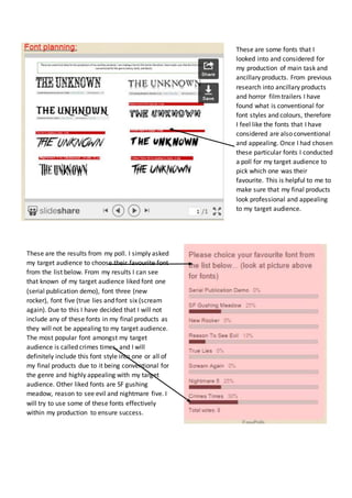
1. These are the results from my poll. I simply asked
my target audience to choose their favourite font
from the list below. From my results I can see
that known of my target audience liked font one
(serial publication demo), font three (new
rocker), font five (true lies and font six (scream
again). Due to this I have decided that I will not
include any of these fonts in my final products as
they will not be appealing to my target audience.
The most popular font amongst my target
audience is called crimes times, and I will
definitely include this font style into one or all of
my final products due to it being conventional for
the genre and highly appealing with my target
audience. Other liked fonts are SF gushing
meadow, reason to see evil and nightmare five. I
will try to use some of these fonts effectively
within my production to ensure success.
These are some fonts that I
looked into and considered for
my production of main task and
ancillary products. From previous
research into ancillary products
and horror film trailers I have
found what is conventional for
font styles and colours, therefore
I feel like the fonts that I have
considered are also conventional
and appealing. Once I had chosen
these particular fonts I conducted
a poll for my target audience to
pick which one was their
favourite. This is helpful to me to
make sure that my final products
look professional and appealing
to my target audience.