Different layouts and styles in which you could present your guide
1. Different layouts and styles in which you could present your
guide
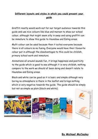
Graffiti mostly would work out for our target audience towards this
guide and use nice colours like blue and maroon to show our school
colour, although that might seem silly in away and using graffiti can
be immature to show this guide to Hounslow and Ealing areas.
Multi-colour can be used because then it suites everyone because
there is all colours so no fusing. Everyone would have their favourite
colour put in although the disadvantages to this could be childish,
primary school work and immature.
Animations all around sounds fun, it brings happiness and positivity
to the guide which is good to see although it is very childish, nothing
compare to the work we should of been doing and doesn’t relate to
Hounslow and Ealing areas.
Black and white can be good as it is basic and simple although very
boring no atmosphere is there in the leaflet and brings nothing
which is very negative towards the guide. The guide should be simply
but not as simple as plain (black and white).
By Michael McCauley