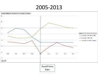
Prime rate, unemployment, and inflation by year

There are historical unemployment numbers here: http://www.multpl.com/unemployment/table And Inflation numbers here: http://www.usinflationcalculator.com/inflation/historical-inflation-rates/ I put these into Excel then used the unemployment year to lookup the average inflation rate for that year from 1948 to 2012. I added historical Prime Rate numbers. Finally used the Pivot Table with x axis (year), Prime Rate, Inflation and Employment as the Values. The result is a graph that shows a correlation with significant fluctuation. However, since 2008, the prime rate has been held constant, that means one variable has been removed from the equation. What the charts show is that unemployment rate leads inflation rate, but over this time frame both track together, not in reverse. Changes in unemployment lead changes in inflation.

Recommended
Recommended
More Related Content
Recently uploaded
Recently uploaded (17)
Featured
Featured (20)