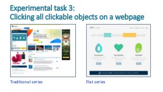
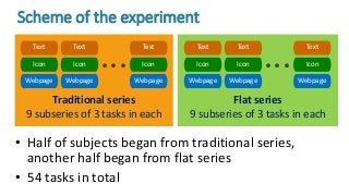
IvanBurmistrov ▪ TatianaZlokazova
AnnaIzmalkova ▪ AnnaLeonova
Flat design vs
rich design:
Experimental
comparison
Lomonosov
Moscow State
University
Flat design dominance in
modern UI design
Introduced by Microsoft in
their Windows Phone (2010)
and Windows 8 (2012)
operating systems, flat design
became the predominant visual
style of all digital products:
desktop applications, websites
and mobile apps
Flat design principles
• elimination of all UI features that remind real world
3D objects: no shadows, embossing, gradients
• minimalism, simplification of UI elements
• focus on typography: large font sizes, unusual typefaces,
ALL CAPS, ultralight and condensed fonts, low contrast
• focus on color: bright, pure colors
• intense use of negative space: low density of UI
objects on screen
Mixed reaction to flat style
• Flat design was enthusiastically hailed by graphic
designers who began to speak about “flat
revolution” and “flat design era”
• Many users liked flat design too but others did not
• However, reaction of HCI/usability experts was
mostly negative
Experts’ criticism of flat style
• Flat design lacks visual affordances
that allow users to differentiate
between interactive (clickable) and
non-interactive (non-clickable) UI
objects
• “Childish” look of flat Uis
• Flat style is boring and all websites
now look the same
“I really do hate it”
- Jakob Nielsen
Experiment
“Traditional” series
Experimental task 1:
Search for a target word in a text 1/2
“Flat” series
Fonts used for “traditional” and “flat” tasks
Experimental task 1:
Search for a target word in a text 2/2
“Traditional” fonts Helvetica Neue
Normal
Arial Normal Tahoma Normal
“Flat” fonts Helvetica Neue
Condensed Normal
Helvetica Neue
Light
Helvetica Neue
UltraLight
Realistic series
Experimental task 2:
Search for a target icon in a matrix of icons
Flat series
Traditional series
Experimental task 3:
Clicking all clickable objects on a webpage
Flat series
Traditional series
9 subseries of 3 tasks in each
Flat series
9 subseries of 3 tasks in each
• Half of subjects began from traditional series,
another half began from flat series
• 54 tasks in total
Scheme of the experiment
Webpage
Icon
Text
Webpage
Icon
Text
Webpage
Icon
Text
• • •
Webpage
Icon
Text
Webpage
Icon
Text
Webpage
Icon
Text
• • •
EyeLink 1000 eyetracker for
measuring cognitive load indicators:
• fixation duration
• saccadic amplitude
• saccadic peak velocity
Morae screen recording software for
measuring performance times and
recording mouse clicks
Equipment and data registration
• 20 university students
• age 18-28 (M = 21,2)
• 19 female, 1 male
• all were experienced web,
smartphone and tablet users
• experiment was conducted in
November 2014, so flat design was
already familiar to all participants
Subjects
Results
• no statistically significant
difference in search time
• higher cognitive load in case of flat
design:
 increase in fixation duration
(p < 0,001)
 decrease in saccadic amplitude
(p < 0,001)
 decrease in saccadic peak velocity
(p < 0,001)
Text search
vs
• search time for flat icons was almost
two times longer than search for
realistic icons (p < 0,001)
• higher cognitive load in case of flat
icons
Icon search
vs
0 5 10 15 20
Flat
Realistic
• performance time per screen area was
higher for flat webpages (p = 0,002)
• more errors in case of flat design
(p < 0,001):
Webpages: clickable objects search 1/2
vs
Misses
False alarms
Traditional Flat
26%
36%
17%
28%
Conclusions
• Our experiment showed that flat design means
higher cognitive load, longer performance times
and more errors
• Flat design approach should be reconsidered in
favor of the design principles developed over
decades of research and practice of HCI and
usability engineering
• Of course, this is from usability, not aesthetics
point of view
Conclusions
Thank you!
Contact:
ivan@interux.com

Flat design vs rich design: Experimental comparison

  • 1.
    IvanBurmistrov ▪ TatianaZlokazova AnnaIzmalkova▪ AnnaLeonova Flat design vs rich design: Experimental comparison Lomonosov Moscow State University
  • 2.
    Flat design dominancein modern UI design Introduced by Microsoft in their Windows Phone (2010) and Windows 8 (2012) operating systems, flat design became the predominant visual style of all digital products: desktop applications, websites and mobile apps
  • 3.
    Flat design principles •elimination of all UI features that remind real world 3D objects: no shadows, embossing, gradients • minimalism, simplification of UI elements • focus on typography: large font sizes, unusual typefaces, ALL CAPS, ultralight and condensed fonts, low contrast • focus on color: bright, pure colors • intense use of negative space: low density of UI objects on screen
  • 4.
    Mixed reaction toflat style • Flat design was enthusiastically hailed by graphic designers who began to speak about “flat revolution” and “flat design era” • Many users liked flat design too but others did not • However, reaction of HCI/usability experts was mostly negative
  • 5.
    Experts’ criticism offlat style • Flat design lacks visual affordances that allow users to differentiate between interactive (clickable) and non-interactive (non-clickable) UI objects • “Childish” look of flat Uis • Flat style is boring and all websites now look the same “I really do hate it” - Jakob Nielsen
  • 6.
  • 7.
    “Traditional” series Experimental task1: Search for a target word in a text 1/2 “Flat” series
  • 8.
    Fonts used for“traditional” and “flat” tasks Experimental task 1: Search for a target word in a text 2/2 “Traditional” fonts Helvetica Neue Normal Arial Normal Tahoma Normal “Flat” fonts Helvetica Neue Condensed Normal Helvetica Neue Light Helvetica Neue UltraLight
  • 9.
    Realistic series Experimental task2: Search for a target icon in a matrix of icons Flat series
  • 10.
    Traditional series Experimental task3: Clicking all clickable objects on a webpage Flat series
  • 11.
    Traditional series 9 subseriesof 3 tasks in each Flat series 9 subseries of 3 tasks in each • Half of subjects began from traditional series, another half began from flat series • 54 tasks in total Scheme of the experiment Webpage Icon Text Webpage Icon Text Webpage Icon Text • • • Webpage Icon Text Webpage Icon Text Webpage Icon Text • • •
  • 12.
    EyeLink 1000 eyetrackerfor measuring cognitive load indicators: • fixation duration • saccadic amplitude • saccadic peak velocity Morae screen recording software for measuring performance times and recording mouse clicks Equipment and data registration
  • 13.
    • 20 universitystudents • age 18-28 (M = 21,2) • 19 female, 1 male • all were experienced web, smartphone and tablet users • experiment was conducted in November 2014, so flat design was already familiar to all participants Subjects
  • 14.
  • 15.
    • no statisticallysignificant difference in search time • higher cognitive load in case of flat design:  increase in fixation duration (p < 0,001)  decrease in saccadic amplitude (p < 0,001)  decrease in saccadic peak velocity (p < 0,001) Text search vs
  • 16.
    • search timefor flat icons was almost two times longer than search for realistic icons (p < 0,001) • higher cognitive load in case of flat icons Icon search vs 0 5 10 15 20 Flat Realistic
  • 17.
    • performance timeper screen area was higher for flat webpages (p = 0,002) • more errors in case of flat design (p < 0,001): Webpages: clickable objects search 1/2 vs Misses False alarms Traditional Flat 26% 36% 17% 28%
  • 18.
  • 19.
    • Our experimentshowed that flat design means higher cognitive load, longer performance times and more errors • Flat design approach should be reconsidered in favor of the design principles developed over decades of research and practice of HCI and usability engineering • Of course, this is from usability, not aesthetics point of view Conclusions
  • 20.