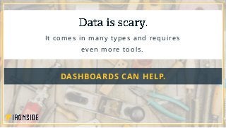
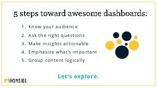
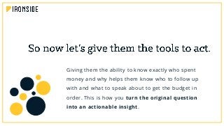
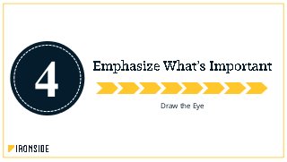
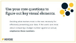
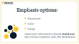
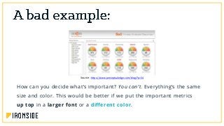
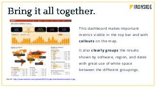
5 Steps to Get Started
IRONSIDEGROUP.COM
It comes in many types and requires
even more tools.
DASHBOARDS CAN HELP.
1. Know your audience
2. Ask the right questions
3. Make insights actionable
4. Emphasize what’s important
5. Group content logically
Let’s explore.
See from Their Perspective
1
you have to see from your audience’s perspective. This
means you first need to figure out who your audience is.
Too much clutter
A dashboard that’s confusing for everyone
OR WORSE
A dashboard that’s completely ineffective
in reaching user goals
Say you build a dashboard for a more vocal user who’s
concerned with operational efficiency, but the real main
user of the dashboard is the marketing manager…
A marketing manager needs to know where to focus their resources.
That means you need to give them metrics like conversion rates, sales
opportunities, or how much is spent on advertising. That way, you can
give them the tools to be successful.
Make sure you’re talking to the right
people to get the dashboard to
answer the right questions.
Find the Why
2
- Stephen Few
Founde r, P e rc e ptual Edge
It’s very important to make sure you understand how
the audience is really going to be using your dashboard
in order to build it correctly.
This means asking follow-up questions.
Avoid too many unrelated questions
Tell a cohesive story
Fit all the pieces together
Always ask WHY
If your main user is a tech manager and they tell
you they’re looking to see how much of the budget
was spent in each department…
Most likely, they really want to know who spent the money and why, not
what department and how much. Ask them why they want the
information and what they hope to accomplish. If you figure out why
they want to ask the questions they’re asking, you’ll find the root desire
behind the question is really what you need to answer.
Search for the motivation behind
the initial questions you get.
Discover desires, not metrics.
Drive Real-World Results
3
you also need to make sure people can act on the
answers they get. Lay the groundwork for this in step 2 by
constantly asking why instead of how. Keeping this focus
will get you to what actions should result from your
dashboard findings.
Continuing with our tech manager from step 2, we already know
we’ve uncovered the why behind their dashboard question…
Giving them the ability to know exactly who spent
money and why helps them know who to follow up
with and what to speak about to get the budget in
order. This is how you turn the original question
into an actionable insight.
Give dashboard users the power to
turn their data into plans and tasks.
Make a measurable impact.
Draw the Eye
4
- Edward Tufte
P rof e s sor Eme ritus /S tatistic ian, Yale
Deciding what matters most is the next necessity for
effectively presenting your data. If the users care most
about comparing a budget number against an actual,
emphasize those numbers.
Placement
Color
Sizing
Important information should stand out
the minute someone sees the dashboard.
How can you decide what’s important? You can’t. Everything’s the same
size and color. This would be better if we put the important metrics
up top in a larger font or a different color.
Source: https://www.perceptualedge.com/blog/?p=54
The key metrics draw the eye first through bright colors, large size, and
position. Visual priority even extends to the charts: the most important
one is the largest and close to the top. It gives clear direction.
Source: http://www.responsivemiracle.com/collective/best-responsive-html5-admin-dashboard-panel-templates-2014/
Get people looking where they need to
before they have to think about what
they’re seeing.
Tell a Story
5
you want the different pieces of content in your dashboard
to fit together in a way that makes sense. All the pieces
should be organized logically.
If your dashboard’s for a CEO, you’d add an executive
summary component to answer questions like:
Where have we been (past data)?
Where are we now (current data)?
Where are we going (forecast data)?
by department or by functional area, such as putting
finance data on one tab, pipeline data on another, and
operational data on a third.
If you mix departments on a single page, similar
departments should be grouped together physically.
Also make sure to use white space and symmetry.
Source: http://www.matillion.com/uploads/2015/01/good-dashboard-examples-2.jpg
This dashboard makes important
metrics visible in the top bar and with
callouts on the map.
It also clearly groups the results
shown by software, region, and dates
with great use of white space
between the different groupings.
Build a logical narrative for your
audience to follow.
Aimee Carvalho is one of Ironside’s foremost
advisors in the areas of design, visualization,
and dashboarding. Combining analytics know-
how with creativity and aesthetic sophistication,
she generates displays that unlock data for our
clients every day.
IronSense gives you the building blocks to create
actionable, intuitive, and beautiful dashboards
that put information where it’s needed most.
Get Started

Dashboard Design DL

  • 1.
    5 Steps toGet Started IRONSIDEGROUP.COM
  • 2.
    It comes inmany types and requires even more tools. DASHBOARDS CAN HELP.
  • 3.
    1. Know youraudience 2. Ask the right questions 3. Make insights actionable 4. Emphasize what’s important 5. Group content logically Let’s explore.
  • 4.
    See from TheirPerspective 1
  • 5.
    you have tosee from your audience’s perspective. This means you first need to figure out who your audience is.
  • 6.
    Too much clutter Adashboard that’s confusing for everyone OR WORSE A dashboard that’s completely ineffective in reaching user goals
  • 7.
    Say you builda dashboard for a more vocal user who’s concerned with operational efficiency, but the real main user of the dashboard is the marketing manager…
  • 8.
    A marketing managerneeds to know where to focus their resources. That means you need to give them metrics like conversion rates, sales opportunities, or how much is spent on advertising. That way, you can give them the tools to be successful.
  • 9.
    Make sure you’retalking to the right people to get the dashboard to answer the right questions.
  • 10.
  • 11.
    - Stephen Few Founder, P e rc e ptual Edge
  • 12.
    It’s very importantto make sure you understand how the audience is really going to be using your dashboard in order to build it correctly. This means asking follow-up questions.
  • 13.
    Avoid too manyunrelated questions Tell a cohesive story Fit all the pieces together Always ask WHY
  • 14.
    If your mainuser is a tech manager and they tell you they’re looking to see how much of the budget was spent in each department…
  • 15.
    Most likely, theyreally want to know who spent the money and why, not what department and how much. Ask them why they want the information and what they hope to accomplish. If you figure out why they want to ask the questions they’re asking, you’ll find the root desire behind the question is really what you need to answer.
  • 16.
    Search for themotivation behind the initial questions you get. Discover desires, not metrics.
  • 17.
  • 18.
    you also needto make sure people can act on the answers they get. Lay the groundwork for this in step 2 by constantly asking why instead of how. Keeping this focus will get you to what actions should result from your dashboard findings.
  • 19.
    Continuing with ourtech manager from step 2, we already know we’ve uncovered the why behind their dashboard question…
  • 20.
    Giving them theability to know exactly who spent money and why helps them know who to follow up with and what to speak about to get the budget in order. This is how you turn the original question into an actionable insight.
  • 21.
    Give dashboard usersthe power to turn their data into plans and tasks. Make a measurable impact.
  • 22.
  • 23.
    - Edward Tufte Prof e s sor Eme ritus /S tatistic ian, Yale
  • 24.
    Deciding what mattersmost is the next necessity for effectively presenting your data. If the users care most about comparing a budget number against an actual, emphasize those numbers.
  • 25.
    Placement Color Sizing Important information shouldstand out the minute someone sees the dashboard.
  • 26.
    How can youdecide what’s important? You can’t. Everything’s the same size and color. This would be better if we put the important metrics up top in a larger font or a different color. Source: https://www.perceptualedge.com/blog/?p=54
  • 27.
    The key metricsdraw the eye first through bright colors, large size, and position. Visual priority even extends to the charts: the most important one is the largest and close to the top. It gives clear direction. Source: http://www.responsivemiracle.com/collective/best-responsive-html5-admin-dashboard-panel-templates-2014/
  • 28.
    Get people lookingwhere they need to before they have to think about what they’re seeing.
  • 29.
  • 30.
    you want thedifferent pieces of content in your dashboard to fit together in a way that makes sense. All the pieces should be organized logically.
  • 31.
    If your dashboard’sfor a CEO, you’d add an executive summary component to answer questions like: Where have we been (past data)? Where are we now (current data)? Where are we going (forecast data)?
  • 32.
    by department orby functional area, such as putting finance data on one tab, pipeline data on another, and operational data on a third. If you mix departments on a single page, similar departments should be grouped together physically. Also make sure to use white space and symmetry.
  • 33.
    Source: http://www.matillion.com/uploads/2015/01/good-dashboard-examples-2.jpg This dashboardmakes important metrics visible in the top bar and with callouts on the map. It also clearly groups the results shown by software, region, and dates with great use of white space between the different groupings.
  • 34.
    Build a logicalnarrative for your audience to follow.
  • 35.
    Aimee Carvalho isone of Ironside’s foremost advisors in the areas of design, visualization, and dashboarding. Combining analytics know- how with creativity and aesthetic sophistication, she generates displays that unlock data for our clients every day.
  • 36.
    IronSense gives youthe building blocks to create actionable, intuitive, and beautiful dashboards that put information where it’s needed most. Get Started