2. • Color is what we see when light, striking an object, is
reflected back to the eye
– Learning color mixing and relationships will allow you to utilize
color in your work effectively
– Color can be used to create specific visual effects or to assign a
mood to a piece
• Color has three properties: Hue, Intensity, and Value
– Hue – simply the name we assign to a color, i.e. Red, Blue, etc.
– Intensity – How bright or dull a color is, sometimes referred to
as saturation
– Value – The lightness or darkness of a color
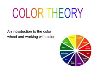
3. • The primary colors are Red, Yellow, and Blue.
• These colors can be mixed to make any other
color (along with white and black) but can’t be
mixed themselves (they are natural)
• Primary colors are the origin of all of the colors
on the color wheel
4. • The secondary colors are Green, Orange and
Violet.
• These colors are made by mixing one primary
color with another
5. • Tertiary colors are made by mixing one primary
color with one secondary color
Red + Orange = Red-Orange
Red + Violet = Red-Violet
Yellow + Green = Yellow-Green
Yellow + Orange = Yellow-Orange
Blue + Green = Blue-Green
Blue + Violet = Blue-Violet
6. Warm colors are reds, oranges,
and yellows. These colors suggest
heat, love, anger, violence, etc.
Cool colors are blues, greens and
violets. These colors suggest
sadness, night, the ocean, winter, etc.
Warm Colors & Cool Colors
8. Complementary Colors
• Complementary colors
are high contrast colors
directly opposite each
other on the color wheel.
• Complementary colors
appear stronger and
more vivid when placed
next to each other in a
work of art.
• Complementary colors
can be mixed to create
neutral tones.
9. Vincent van Gogh uses a complementary color scheme
in this painting titled La Berceuse (1889; Oil on canvas).
10. Color Schemes
• Color Scheme defintion
– a group of colors that work together visually
• Artists choose color schemes for their work to:
– heighten the emotional content of the work
– achieve a specific desired visual effect
– Create visual unity within their piece
11. • Monochromatic – a color scheme with multiple values
of a single color
• Monochromatic color schemes are often used in place of
black and white work or to establish a mood.
Tint = color + white (to make the color lighter)
Shade = color + black (to make the color darker)
Monochromatic Color Scheme
12. Analogous Color Scheme
• Analogous colors are next to each other on the
color wheel. They are naturally harmonious but
lack contrast.
13. Triadic Color Scheme
• A triadic color
scheme uses colors
at the points of an
equilateral triangle
(three colors spaced
equally on the color
wheel).
• Sometimes referred
to as a balanced
color scheme
– i.e. yellow-green, red-
orange, and blue-violet