
Recommended
More Related Content
More from EmilyNewson
Recently uploaded
Recently uploaded (20)
Textual Analysis – Print work of 'Britain's Forgotten Children'
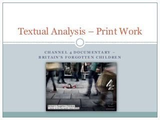
- 1. Textual Analysis – Print Work CHANNEL 4 DOCUMENTARY – B R I T A I N ’ S F O R G O T T E N C H I L D R E N
- 2. Background Information ‘Britain’s Forgotten Children’ is a week-long series featured on Channel 4 in the United Kingdom. The documentary uses the uses and gratifications theory to educate and inform audiences about the issues faced by children living the care system in the UK today. The documentary also uses the uses and gratifications theory by aiming to entertain audiences through different documentary conventions, such as interviews, reconstructions and archive footage. The documentary’s purpose is to encourage attitudinal change amongst it’s viewers. For this textual analysis, I will be analysing the print work of the documentary; this will help me understand codes and conventions which I will need to consider in my own documentary print work. Furthermore, it will also give me a good understanding of how to lay out my own print work in a professional and effective way.
- 3. The advertisement shows people passing by and ignoring the child in need of help. This has been done to connote that the people of Britain are oblivious to the children who are being put into Britain’s care system everyday. Visual Image The people passing by appear to be adults. This is done to represent the documentary’s view that it is adults who are ignoring the children. The location appears to be an average street in Britain. This is done to connote that this is happening throughout the country, rather than one specific location. The image shows the child sinking into the ground around him as he tries to hold on. This representation links to the purpose of the documentary ‘Britain’s Forgotten Children’ and connotes how many children in today’s society are being forgotten about and are essentially disappearing into today’s care system. The image of the child remains in sharp focus, while the surrounding adults are blurred. This helps to connote how the adults are quickly walking past the child and are unaware of the issue taking place. This is unusual to see in society; most adults would help a child in need. This alternative representation helps to make the advertisement more shocking. This is a striking section of the image and immediately draws the audience’s attention. This section of the image dominates the advertisement, making the child unnoticed and irrelevant in the background.
- 4. Lighting & Colour The child is wearing a bright red, a colour which immediately helps to catch the audience’s attention. This colour helps to show the focal point of the documentary, the children of Britain. This is also a powerful colour, which can be used to connote danger. This gives the audience the impression that the child is in danger. The floor tiles and surrounding people consist of dark and dull colours and tones, such as grey. This is done to connote sadness, as well as the fact that the documentary is going to be covering a serious or saddening topic. The lighting used in the advertisement is slightly low-key, which also connotes that the documentary is going to be covering a serious/saddening topic. Nevertheless, the lighting around the child is slightly higher-key, helping to draw the audience’s attention towards the focal point.
- 5. Codes & Conventions Adverts must match the requirements of specific television channels. For Channel 4, the requirements are an A4 landscape poster. A convention of documentary advertisements is that they often show the title and scheduling information of the program. This is important to inform audiences of the name of the documentary and when it is going to be aired to the public on television. It is a convention for documentary advertisements that the institutional logo of the documentary is visible to audiences. For Channel 4, the institutional logo of the documentary is always on the right hand side. In this case, the institution logo has been placed over a section of the poster consisting of dark colours and a blurred image. This helps the white channel 4 logo to visibly stand out to audiences. This text has been put in colour block to help it stand out against the rest of the advertisement. Channel 4 has also the same house style and font to connote that the program is a Channel 4 production.
- 6. Language Very little text has been used on this advertisement to enhance the audience. The only text featured has been used to inform the audience what the documentary is about and when it’s going to be aired on television. This leaves the audience guessing about what happens in the documentary and encourages them to watch it to find out. It is an important feature of print advertisements that the title is simple and can easily be seen and understood from a quick glance. Large amounts of texts may put audiences off the advertisement; they may not want to read it or may not have the time.
- 7. Space, Sizing & Positioning The rule of thirds is a concept in which the frame is divided into 9 imaginary sections. It is used as a guideline which applies to the process of composing visual images. This process works by creating reference points which can act as guidelines for framing images. In this particular advertisement, the focal point, being the child, has been placed in this third. Points of interest, such as the child in this advertisement, should occur at 1/3 or 2/3 of the way up (or across the frame), rather than directly placed in the centre. This is not a necessary or desirable feature, but it is a rule to go by to help create effective visual images.
- 8. Emily Newson