
Recommended
Recommended
More Related Content
What's hot
What's hot (7)
Similar to Improve Yappy with Default Messaging, Material Design & Contacts Integration
Similar to Improve Yappy with Default Messaging, Material Design & Contacts Integration (20)
Improve Yappy with Default Messaging, Material Design & Contacts Integration
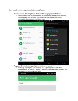
- 1. Here are a few of my suggestions for improving Yappy. Have the option of making Yappy the default messaging app on Android. o I noticed that after installing Yappy, although it has the option of viewing messages and also replying, you can’t make it as the default app for messaging. There’s some confusion here. Yappy app does not autosuggest phone numbers or names. o In Yappy, tapping the new message icon (+) brings the user to New Conversation. In Send to #, typing a contacts name or number does not give suggestions from your contacts list.
- 2. Contacts view is overly large; space can be better used. o In the web UI, the each contact is overly large and there is unused space all to the right. There are no view list options. Google’s new Contacts Preview has this down pretty well. Add shadow under (+) new text icon in Yappy app. Web UI does not match Yappy Android app. Unify look so Yappy has better branding. The current Android app looks fine in my opinion. Are there any plans for a Material Design UI? I’m sure this will be huge for Lollipop users. Many app review sites like to pickup on Material Design UI apps and like to feature them. Feature suggestion for Chrome extension o Have the Yappy extension find phone numbers on the current webpage and give the option of texting the number directly from there. This is really useful for times when someone isn’t in the web UI. Yappy web dialer uses poor quality font. I suggest using a more modern font and removing the image of a Nexus 5 all together. Instead, use a stylized graphic of an Android phone so it matches the current look of the web UI. Integrate Contacts and Phone Dialer in web UI o The contacts page and phone dialer could best be put together on the same page (side-by-side). It removes the need for a separate page all-together and makes the web UI cleaner (also fixes what the blank space next to the contacts can be currently used for). o Feature suggestion for Chrome extension: have the option for replying from a text message with the use of a notification alert (similar to what PushBullet does with texts) Yappy vs. Competitors like MightyText / PushBullet / AirDroid o Yappy works A LOT better than MightyText. Fewer messages are stuck in “sending” and plenty of former MightyText users have switched to Yappy (including me). MightyText is NO competition. o PushBullet has SMS-to-PC added in as of last year. It’s nowhere as nearly fully featured as Yappy (no conversation views, no contacts views, etc.), but it works and Android users don’t mind having it enabled as part of PushBullet. o AirDroid is a fully featured suite that does Android remote management very well. I can compare this to the “missing app” for Android that brings features for Apple’s iPhone and OSX ecosystem to Android users. Texting from a computer is done just as well as Yappy. Yappy does not have as many features as AirDroid, but the target user is different. Branding and Look o PushBullet and AirDroid have better branding and their apps match what users use and see on their desktop. Basically, you know it’s PushBullet and AirDroid when you see it because they have a unified look across PC and Android.