SlideShare a Scribd company logo
1 of 1
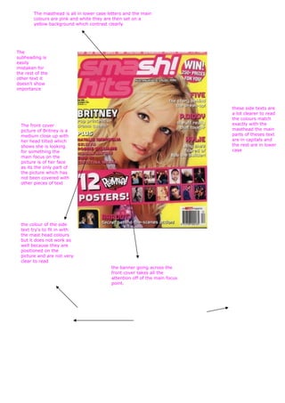
The masthead is all in lower case letters and the main
        colours are pink and white they are then set on a
        yellow background which contrast clearly


The
subheading is
easily
mistaken for
the rest of the
other text it
doesn't show
importance


                                                                             these side texts are
                                                                             a lot clearer to read
                                                                             the colours match
  The front cover                                                            exactly with the
  picture of Britney is a                                                    masthead the main
  medium close up with                                                       parts of theses text
  her head tilted which                                                      are in capitals and
  shows she is looking                                                       the rest are in lower
  for something the                                                          case
  main focus on the
  picture is of her face
  as its the only part of
  the picture which has
  not been covered with
  other pieces of text


  the colour of the side
  text try's to fit in with
  the mast head colours
  but it does not work as
  well because they are
  positioned on the
  picture and are not very
  clear to read
                                           the banner going across the
                                           front cover takes all the
                                           attention off of the main focus
                                           point.

More Related Content

More from Charis Creber (20)

Contents take 2
Contents take 2Contents take 2
Contents take 2
 
Double page spread....
Double page spread....Double page spread....
Double page spread....
 
Media question 5
Media question 5Media question 5
Media question 5
 
Zombie makeup
Zombie makeupZombie makeup
Zombie makeup
 
Storyboard
StoryboardStoryboard
Storyboard
 
Soundtrack
SoundtrackSoundtrack
Soundtrack
 
Script
ScriptScript
Script
 
Magazine film cover analysis
Magazine film cover analysisMagazine film cover analysis
Magazine film cover analysis
 
Story board + script
Story board + scriptStory board + script
Story board + script
 
Cover page
Cover pageCover page
Cover page
 
Contents take 2
Contents take 2Contents take 2
Contents take 2
 
%Magzine cover
%Magzine cover%Magzine cover
%Magzine cover
 
Double page spread....
Double page spread....Double page spread....
Double page spread....
 
Wills double page spread
Wills double page spreadWills double page spread
Wills double page spread
 
Evaluation 7
Evaluation 7Evaluation 7
Evaluation 7
 
Evaluation 6
Evaluation 6Evaluation 6
Evaluation 6
 
Evaluation 5
Evaluation 5Evaluation 5
Evaluation 5
 
Evaluation 3
Evaluation 3Evaluation 3
Evaluation 3
 
Evaluation 4
Evaluation 4Evaluation 4
Evaluation 4
 
Evaluation 2
Evaluation 2Evaluation 2
Evaluation 2
 

Pop magazine cover analysis 3

  • 1. The masthead is all in lower case letters and the main colours are pink and white they are then set on a yellow background which contrast clearly The subheading is easily mistaken for the rest of the other text it doesn't show importance these side texts are a lot clearer to read the colours match The front cover exactly with the picture of Britney is a masthead the main medium close up with parts of theses text her head tilted which are in capitals and shows she is looking the rest are in lower for something the case main focus on the picture is of her face as its the only part of the picture which has not been covered with other pieces of text the colour of the side text try's to fit in with the mast head colours but it does not work as well because they are positioned on the picture and are not very clear to read the banner going across the front cover takes all the attention off of the main focus point.