SlideShare a Scribd company logo
1 of 1
The column is
evenly set out
with good use
of colours the
page numbers
for each story
are nice and
bold


                 This contents page has a good use of main colours which are black
                 yellow and white the whole page has good lay out and is not confusing clearly
                                                                           the pictures
                 to understand                                             stand out with the page
                                                                           references on them

More Related Content

More from Charis Creber (20)

Webiste analysis
Webiste analysisWebiste analysis
Webiste analysis
 
Moodboard
MoodboardMoodboard
Moodboard
 
Evalution (1)
Evalution (1)Evalution (1)
Evalution (1)
 
Q3
Q3Q3
Q3
 
Contents take
Contents take Contents take
Contents take
 
Contents take 2
Contents take 2Contents take 2
Contents take 2
 
Double page spread....
Double page spread....Double page spread....
Double page spread....
 
Media question 5
Media question 5Media question 5
Media question 5
 
Zombie makeup
Zombie makeupZombie makeup
Zombie makeup
 
Storyboard
StoryboardStoryboard
Storyboard
 
Soundtrack
SoundtrackSoundtrack
Soundtrack
 
Script
ScriptScript
Script
 
Magazine film cover analysis
Magazine film cover analysisMagazine film cover analysis
Magazine film cover analysis
 
Story board + script
Story board + scriptStory board + script
Story board + script
 
Cover page
Cover pageCover page
Cover page
 
Contents take 2
Contents take 2Contents take 2
Contents take 2
 
%Magzine cover
%Magzine cover%Magzine cover
%Magzine cover
 
Double page spread....
Double page spread....Double page spread....
Double page spread....
 
Wills double page spread
Wills double page spreadWills double page spread
Wills double page spread
 
Evaluation 7
Evaluation 7Evaluation 7
Evaluation 7
 

Pop magazine contents analysis 2

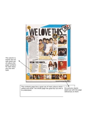
  • 1. The column is evenly set out with good use of colours the page numbers for each story are nice and bold This contents page has a good use of main colours which are black yellow and white the whole page has good lay out and is not confusing clearly the pictures to understand stand out with the page references on them