
Recommended
More Related Content
Similar to Providing Emergency Support: A Brand Manual for PORT
Similar to Providing Emergency Support: A Brand Manual for PORT (20)
Recently uploaded
Recently uploaded (20)
Providing Emergency Support: A Brand Manual for PORT
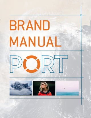
- 1. manual brand
- 3. 3 1 brand
- 4. 4 brand 1 that is where port comes in. the rise of high-intensity storms made it necessary for people to have the right tools and effective support
- 5. 5 1brand PORT is an emergency service and supply company Informed Prepared Safe Friendly Dependable We currently have 164 physical locations in 41 states and offer on-site support in 30 states. We also produce a daily podcast that gives listeners advice and Our mission is to provide as much information and support before a storm strikes, and to offer immediate assistance during a storm. keywords and updated weather reports.
- 6. 6 1brand Our customers depend on us to give clear directions and concise information. All of our branding language should be in a simple and easy to understand style. A catastrophic category 5 Tropical storm is 200 miles off the coast of Florida. Preparations should be rushed to completion along and near its projected path. Locate your nearest PORT store for all necessary gear and evacuate area for higher elevation. Category 5 Tropical storm expected to hit land within 24 hours. Find nearest PORT store for supplies and move to higher ground. example language
- 7. 7 2 basics
- 8. 8 basics 2 Our logo is the foundation of our brand. It shows our commitment to helping others and conveys our focus on fundamentals. PMS 314C C70 M15 Y0 K33 #3391AB PMS 152C C5 M67 Y100 K0 #F25400 The color specifications of the logo are to the left. These are the true and original colors of the logo. The logo’s letterforms were designed using the font Pontiac Regular, created by the S&C Type Foundry. logo
- 9. 9 basics 2 PMS 314C Contact us for help with setting the logo against a darker background. The core colors should be used as much as possible, however legibility is paramount. If the logo must be reproduced in a single color, the only three permitted options are the core blue, black and white as shown to the left. Our logo should not be set against a patterened background.
- 10. 10 basics 2 Minimum size 0.5” Just as the logo should always include a border of clear space to be readable, it should also never be scaled below 0.5 inches (36 px). This secures crisp lines and edges. The logo must be surrounded by an area of clear space at least the height of the arm of the T. This ensures the reabability and prominece of the logo. alternate logos This alternate version can be used when in process or construction signage is needed. The O or life preserver can be used as an alternate logo when appropriate. This version is useful for text-heavy graphics and digital spaces (e.g. favicon or app icons). This version can either be reproduced in the core orange or white.
- 11. basics 2 The core blue should be used for most accents and text headings. The core orange must be used thoughtfully and saved for the most important accents. The dark blue is the backbone color as it is used for most body text. The grey is used for supporting accents. Tints are used as supporting and background colors but should never replace the original primary color. color primary palette 11
- 12. 12 pms 314c c70 m15 y0 k33 #3391ab pms 7698c c40 m0 y0 k77 #233b3b pms 152c c5 m67 y100 k0 #f25400 pms 443c c47 m31 y35 k1 #86aea4
- 13. 13 basics 2 secondary palette This secondary palette should be used sparingly and only when the primary palette has been exhausted (e.g. complex graphics). The secondary palette is primarily used as a classification code for Hurricanes and Tornadoes. The intensity scale for both types of storms runs from top to bottom or highest to lowest number. Tints are used as supporting and background colors but should never replace the original primary color. 5 4 3 2
- 14. 14 pms 115u c0 m18 y91 k0 #ffd117 pms 7598c c14 m85 y100 k4 #d32500 pms 145u c16 m58 y90 k2 #d26919 pms 110u c20 m36 y100 k1 #caa200
- 15. 15 basics 2 We use a limited type palette to keep all collateral consistent. Our type choices reflect a streamlined yet approachable style. Pontiac Regular is only used for the logo wordmark. Contact us if you find there may be another appropriate use for the font. Conduit SCITC TT (small caps) is used for all major headings. ABCDEFGHIJKLMNOPQRSTUVWXYZ abcdefghijklmnopqrstuvwxyz ABCDEFGHIJKLMNOPQRSTUVWXYZ 1234567890 Pontiac Regular Conduit SCITC TT (small caps) TYPOGRAPHY
- 16. 16 basics 2 ABCDEFGHIJKLMNOPQRSTUVWXYZ abcdefghijklmnopqrstuvwxyz 1234567890 ABCDEFGHIJKLMNOPQRSTUVWXYZ abcdefghijklmnopqrstuvwxyz 1234567890 ABCDEFGHIJKLMNOPQRSTUVWXYZ abcdefghijklmnopqrstuvwxyz 1234567890 ABCDEFGHIJKLMNOPQRSTUVWXYZ abcdefghijklmnopqrstuvwxyz 1234567890 Conduit ITC Pro Light Conduit ITC Pro Bold Trade Gothic LT Trade Gothic LT Bold Conduit ITC Pro Light and Bold are used on most body text and some headings. Trad Gothic LT Light and Bold is an alternate font and is recommended for use on corporate and associated body text.
- 18. 18 3 application
- 19. 19 application 3
- 20. 20 application 3
- 22. 22 4 contact
- 23. 23 contact 4 We hope these guidelines are helpful and instructive. Every creative project involving the PORT brand must align with these guidelines. All designs using the brand logo must be submitted for clearance. Mark Squall 617-369-3802 msquall@port.com Patty Twister 617-369-3599 ptwister@port.com Please contact either person below for the correct approval process. thank you