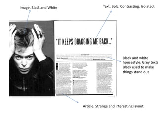
1. Image. Black and White Text. Bold. Contrasting. Isolated.
Black and white
housestyle. Grey texts
Black used to make
things stand out
Article. Strange and interesting layout
2. Main image
Collage of images to
Caption depicting
showcase artist
featured artist.
Side feature to
present
something a bit
different to main
text.
Quote placed
Continued housestyle + layout interestingly
3. Bold, stylistic font. Saturated. Bright purple.
Old, grainy Saturation.
image.
Aesthetic choice
Blank space
Various font
colours to add to
housestyle
Bright, engaging
letters to start
paragraphs.
Housestyle consistent.
Quirky layout for quotes.
Bright, bold housestyle.
4. Well structured and
clearly laid out contents
page. Consistent image
size and fonts. Colour
scheme is definite, not a
lot of variety in colours.
Plenty of taken images to
support the quality of the
magazine. Main features
and selling points clearly
laid out to draw in target
audience. Great example
of a contents page which
can be used for a style
model.