SlideShare a Scribd company logo
1 of 12
Download to read offline
Where Kinzie Corridor Workers Live by Census Tract, 2011
Workers Per Tract
1 - 9
10 - 18
19 - 35
36 - 57
Kinzie Industrial Corridor
Source: U.S. Census Longitudinal Employer-Household Dynamics, 2011. http://onthemap.ces.census.gov/.
PCS: NAD 1983 State Plane Illinois East.
0 2 41
Miles
¹
!
!
!
!
!
!
!
!
!
!
!
!
!
!
!
!
!
!
!
!
!
!
!
!
!
!
!
!
!
!
!
!
!
!
!
!
!
!
!
!
!
!
!
!
!
!
!
!
!
!
!
!
!
!
!
!
!
!
!
!
!
!
!
!
!
!
!
!
!
!
!
!
!
!
!
!
!
!
!
!
!
!
!
!
!
!
!
!
!
!
!
!
!
!
!
!
!
!
!
!
!
!
!
!
!
Workers Aged 18 to 29,
Per Tract
0
1 - 5
6 - 10
11 - 19
20 - 41
Workers Aged 30 to 54,
Per Tract
0
1 - 5
6 - 10
11 - 20
21 - 41
Workers Aged 55 and Over,
Per Tract
0
1 - 5
6 - 10
11 - 16
17 - 41
Kinzie Industrial Corridor
! Proposed BRT Stops
Where Kinzie Corridor Workers Live, By Age and Census Tract, 2011
0 7 143.5
Miles
¹Source: U.S. Census Longitudinal Employer-Household Dynamics, 2011. http://onthemap.ces.census.gov/.
PCS: NAD 1983 State Plane Illinois East.
!
!
!
!
!
!
!
!
!
!
!
!
!
!
!
!
!
!
!
!
!
!
!
!
!
!
!
!
!
!
!
!
!
!
!
!
!
!
!
!
!
!
!
!
!
!
!
!
!
!
!
!
!
!
!
!
!
!
!
!
!
!
!
!
!
!
!
!
!
!
!
!
!
!
!
!
!
!
!
!
!
!
!
!
!
!
!
!
!
!
!
!
!
!
!
!
!
!
!
!
!
!
!
!
!
Workers Earning
$1250/month or Less
0
1 - 5
6 - 10
11 - 20
21 - 41
Workers Earning
$1251 to $3333/month
0
1 - 5
6 - 10
11 - 20
21 - 41
Workers Earning
Over $3333/Month
0
1 - 5
6 - 10
11 - 20
21 - 41
Kinzie Industrial Corridor
! Proposed BRT Stops
Where Kinzie Corridor Workers Live, by Income and Census Tract, 2011
0 7 143.5
Miles
¹Source: U.S. Census Longitudinal Employer-Household Dynamics, 2011. http://onthemap.ces.census.gov/.
PCS: NAD 1983 State Plane Illinois East.
!(
!(
!(
!(
!(
!(
!(
!(
!(
!(
!(
!(
!(
!(
!(
!(
!(
!(
!(
!(
!(
!(
!(
!(
!(
!(
!(
!(
!(
!(
!(
!(
!(
!(
!(
LAKE
POLK
ARCHER
CERMAK
ROSCOE
CHICAGO
PERSHING
DIVERSEY
CORTLAND
91ST STREET
47TH STREET
79TH STREET
63RD STREET
69TH STREET
51ST STREET
74TH STREET
IRVING PARK
Proposed Ashland Avenue Bus Rapid Transit Stations
Project Slated to Begin 2015
0 2 41
Miles
¹
!( Proposed BRT Stops
Sources: Chicago Transit Authority: http://www.transitchicago.com/ashlandbrt/.
Chicago Data Portal: https://data.cityofchicago.org/
PCS: NAD 1983 State Plane Illinois East
Ben Spies UPP 461 Wednesday FINAL PROJECT PAPER 1
Would Ashland Avenue Bus Rapid Transit
Benefit Kinzie Corridor Workers?
UPP 461 Final Project
The advantage of GIS (Geographic Information Systems) lies in its ability to make complex
problems more understandable through visual projection and spatial analysis. Some data are not clear
when presented in a table or in a written format. When presented on a map, however, the data's
relationship to the real-world environment becomes known, trends can appear, and in the case of data
supporting public initiatives, mandates to action may become clear. Before I became familiar with GIS
methodology, I had been searching for just this kind of direction regarding the Chicago Transit
Authority's proposed Bus Rapid Transit (BRT) system for Ashland Avenue.
I work for a nonprofit economic development agency and business association called the
Industrial Council of Nearwest Chicago (ICNC). We work in the neighborhood known as the Kinzie
Industrial Corridor on Chicago's Near West Side, an area of about one and a half square miles that is
home to about 900 businesses and 16,000 primary jobs. In addition to a suite of free business
development services, we offer our 400-plus member companies our advocacy on issues affecting their
operations and their ability to remain located in Chicago. These issues may be as small as getting a
pothole filled in or a no parking sign replaced, or as wide as regional land use and transit planning.
One major proposal we have considered for several months is the aforementioned Ashland BRT. Our
members have voiced serious concerns about BRT's potential to hinder truck traffic, and many have
asked us to oppose the project. The counterargument from project advocates is that BRT service will
benefit workers commuting to the Kinzie Corridor, where careful land use planning has created a major
employment center with very little nearby residential. ICNC has gotten conflicting anecdotal reports
from our members as to where the Kinzie workforce actually does live: some believe the majority of
Kinzie commuters have clustered south and west in the Orange Line corridor, while others think that as
businesses and employees begin to skew younger our workforce base is moving to “hip” northwest
neighborhoods like Logan Square. Jobs in the Kinzie Corridor have become an interesting mix of blue-
collar industrial and high-tech, innovative design; as such, the questions of where our workforce lives,
and therefore what kind of transit plans would serve them best, have become important. The potential
for GIS to explore these questions was immediately apparent to me.
For this project, I sought to answer the dual questions of: 1) “Where do commuters to the
Kinzie Corridor live?” (looking at City of Chicago only); and 2) “Would Ashland BRT serve a
Ben Spies UPP 461 Wednesday FINAL PROJECT PAPER 2
significant portion (ten percent or more) of these commuters?” I built my hypothesis on the second
question: I believed a less-than-significant (ten percent or less) portion of workers in the Kinzie
Corridor would be able to directly benefit from Ashland BRT in their work commutes. I would employ
geospatial analysis of the commuters' home locations in relation to proposed BRT service to explore
my hypothesis. First, I would map the concentrations of Kinzie commuter residences across Chicago
to the most accurate geographies possible. Next, I would map the proposed BRT stations on Ashland.
Finally, I would create a buffer of walking-access around each station, and use GIS tools to select
geographies within that buffer and add up the total of Kinzie workers within that proximity.
Thankfully, the raw data I sought to answer these questions was indeed available, but it would take
careful implementation of GIS tools to arrive at my conclusion.
My first objective was acquiring the mappable information I would need to complete the
analysis: my “smart geography” and “dumb data” (see appendix). Virtually all of my “smart
geography” came from the Chicago Data Portal (https://data.cityofchicago.org/). To geographically
illustrate the concepts I would be exploring, I downloaded a polygon shapefile of Chicago's 2010
Census Tracts, taken directly from U.S. Census TIGER, another polygon of the city's Industrial
Corridors, a point-data shapefile of all existing CTA bus stops, a line-data shapefile of existing CTA rail
lines, and a point-data shapefile of existing CTA rail stops. In order to illustrate the proposed BRT
stops, I would have to do some selection work on the shapefile of existing bus stops, which I will cover
later.
My “dumb data” would be the actual information on the number of Kinzie Corridor commuters
who live in various geographies throughout the city. The challenge would be defining only those
people who work in the Kinzie Corridor area, but examining where they live city-wide. At first, I was
unsure if a resource for finding information this specific would be available, but after some searching I
made an incredible find: the U.S. Census's Longitudinal Employer-Household Dynamics (LEHD) “On
the Map” explorer (http://onthemap.ces.census.gov/). This fantastic tool collects and displays data on
the relationship between where people work and where they live. LEHD is administered by the U.S.
Census, which aggregates data from all fifty states taken from Unemployment Insurance earnings, the
Quarterly Census on Employment and Wages, and the decennial Census itself. With these robust
sources, LEHD has information on where all people both work and live, at least in most states, and can
visualize the relationships between them. That is, a user can define a geography (for instance a city,
census tract, or a custom geography by drawing a shape or uploading a shapefile), and define this as
Ben Spies UPP 461 Wednesday FINAL PROJECT PAPER 3
either the “work” or the “live” location. The user can then get a visualization of the of the opposite
definition, for instance where all of the people who work in the selected geography live. This data is
accurate to the census tract level.
I pulled my data by first defining a “work” geography of the Kinzie Corridor itself: I uploaded
the Industrial Corridors shapefile, taken from the Chicago Data Portal, directly to the LEHD On the
Map interface. I then clicked the Kinzie Corridor polygon on the map to define only that particular
industrial corridor as my geography of interest. I set my analysis options to recognize that this was a
“work” geography, and to look at “destinations” of workers in this geography to find their home
locations. I chose “primary jobs” only, not wishing to count second and third jobs whose multiple
commute variables might skew my results. I chose the most accurate geography result possible, which
was census tracts. In an ideal world, the results would be accurate to at least the census block level, to
get the best readout on the households that would actually be within walking distance of BRT, but this
was not possible. Likewise with the data vintage: I chose to use 2011 data, the most recent available.
On the Map returned 2970 total census tracts in which Kinzie commuters live, stretching from
southwest Wisconsin to well into Indiana, and 16,026 total primary jobs (or “commuters”). I noted that
for my analysis I would only be interested in those census tracts located within the City of Chicago, on
the assumption that anyone commuting from outside the city would not be taking CTA. With my data
properly selected, I exported it as a CSV file I called HomeTracts. I was fortunate in that I had few
problems wrangling my data, though I did have to clean up the column aliases in HomeTracts for
compatibility with ArcGIS, and format the census tract ID column for text rather than numbers.
The first goal was to create a map that answered my first question: Where does the Kinzie
workforce live? I knew that the GIS could create a map showing this distribution visually, which
would be useful both for discussion on BRT and for ICNC's own gratification. I would have to join my
HomeTracts “dumb data” with the census tract shapefile “smart geography”, which I did based on the
census tract ID column that both files had in common. Again, the only real difficulty with the data that
I had was formatting both columns for text, which I fixed easily enough. I found that, symbolizing on
Jenks method after I completed my join, the default five classification levels were a bit too graded and
difficult to read. I reduced this to four classifications, and the results became clearer: though Kinzie
does seem to draw a number of commuters from a narrow swath on the southwest side, the main
employment base seems to reside on the North Side of the city west of the Chicago River (see map one,
“Where Kinzie Corridor Workers Live by Census Tract, 2011”). A significant portion also seems to
Ben Spies UPP 461 Wednesday FINAL PROJECT PAPER 4
live in the tracts surrounding the east end of the Kinzie Corridor, in the West Town/West Loop areas.
One surprising finding was that the Kinzie Corridor does not seem to draw many workers from the
South Side of the city at all, mostly just between one and nine commuters per tract. The data contained
in this map will have a direct bearing on our BRT analysis results, but is also important to ICNC on its
own. I next broke this analysis down by worker age and income, creating six distinct maps that
illustrate living patterns for workers in three different age categories, and three different income levels
(see maps two and three, “Where Kinzie Corridor Workers Live, by Age and Census Tract” and “By
Income and Census Tract”). While these maps on their own may illustrate some trends regarding
work-live patterns as related to these demographic indicators, they would require more in-depth
geospatial analysis to draw meaningful conclusions, like how commute distance relates to income
level, which falls outside the scope of this project.
To illustrate the proposed BRT station locations, I started with the point-data shapefile of
existing CTA bus stops and wrote a complicated SQL query under “Select by Attributes”, which
included the name of each cross street to house a proposed BRT stop. This information was taken from
the Ashland BRT marketing materials on the CTA's website
(http://www.transitchicago.com/ashlandbrt/). With those in place as a separate layer, I created a half-
mile buffer around each station, dissolved into one polygon, under the assumption that a half-mile
would be an acceptable distance for commuters to walk to transit access (see map four, “Tracts Within
Walking Distance of Ashland BRT”). To actually pull data on the number of commuters affected, I ran
a “Select by Location” on my census tracts file, defining the selection on tracts that had their centroid
within the buffer. This method, though as accurate as possible given the circumstances, illustrates one
shortcoming of the LEHD data: because it was only accurate to the census tract level, and because my
buffer cuts through several tracts, I would necessarily have parts of some tracts that were within my
buffer but not included in the selection, and would likewise have some parts of tracts that were
included in the selection but outside of the buffer. I had to assume that these inaccuracies would
balance each other out, and give us a roughly accurate total, at least for discussion purposes. With my
selection in place, I ran statistics on the selected records in my tract attribute table, arriving at 1031
commuters in my selected tracts (or roughly within the half-mile buffer), out of a total of 16,026
commuters. This comes to an effective rate of 6.43% of Kinzie commuters living within walking
distance of Ashland BRT, which appeared to confirm my hypothesis.
I did realize, however, that this analysis on its own was perhaps a bit myopic. BRT might not
Ben Spies UPP 461 Wednesday FINAL PROJECT PAPER 5
only be useful to commuters living within walking distance of BRT itself, but to commuters living near
rapid transit which might transfer to BRT. I would have to expand my analysis to include transfers
from other transit modes. I decided to limit this to CTA rail connections, accepting that it would not be
plausible to analyze all possible mode split options that could feed into a BRT commute. I made a few
more assumptions: 1) commuters would transfer from rail to BRT, but not from bus to BRT; 2)
commuters would only tolerate a single transfer; and 3) commuters would not travel away from their
ultimate destination (the Kinzie Corridor) in order to make a BRT transfer. These assumptions, though
perhaps generous, were necessary in order to scale my analysis of BRT effectiveness to something that
might be useful. If I included every possible mode split, no matter how implausible, we would end up
with an unrealistic idea of BRT's effectiveness.
I added a point-data shapefile of the CTA's rail stations, and manually deselected those stations
which were not on a rail leg that could reasonably be expected to connect to Ashland BRT on a trip to
the Kinzie Corridor. I also removed stops on lines that did not connect at all, and those which traveled
to the Kinzie Corridor directly thus negating Ashland BRT, like the Harlem branch of the Green Line. I
then created a half-mile buffer around the remaining stations, and executed a union to combine this
buffer with my existing BRT stations buffer. With one large, non-contiguous walkability buffer in
place, I ran another Select By Location on the census tracts with centroids within the shape (subject to
the same limitations as the last analysis). Again running statistics on the selected attributes in the table,
I found 2247 commuters living in tracts within walking distance of BRT or a rail station on a line
which might transfer to BRT towards the Kinzie Corridor (see map five, “Tracts Within Walking
Distance of Ashland BRT”). This amounts to 14.02% of Kinzie commuters, nullifying my hypothesis.
Spatial analysis this complicated could only be done with GIS. Distance cannot be drawn on an
Excel table; residential clustering patterns cannot be clearly defined without a map. In working with
data that is tethered to geography, to answer questions related to location and distance, GIS proved to
be a reliable tool not only to accrue new data, but to visualize it for the purposes of discussion. Indeed,
ICNC now has some useful data as to BRT's efficacy to the neighborhood workforce's commute, which
we will discuss as we continue to cultivate our position on the project. Given the robustness of the
LEHD data, we could even break this out further to analyze BRT's efficacy based on worker age or
income, as shown on the supplemental maps. While we are not ready to draw hard and fast conclusions
on BRT, having concrete, reliable data on how it could serve our workforce, thanks to GIS, puts us in a
much better position to make decisions.
Ben Spies UPP 461 Wednesday Sources
4/21/14 through 4/28/14
ArcGIS Ver. 10.1, Build 3035
Windows 7 Operating System
Data Sources
1. U.S. Census Longitudinal Employer-Household Dynamics “On The Map”. Online
interface with data for export on where workers live and work. Collected from U.S. Census, the
Quarterly Census on Employment and Wages, and Unemployment Insurance reports. Available
http://onthemap.ces.census.gov/. Retrieved 4/21/14.
2. Chicago Data Portal. Searchable online database containing, among many other things,
shapefiles on geographies and geographic features within the City of Chicago, including census
tracts, transit amenities, and industrial corridors. Available https://data.cityofchicago.org/.
Retrieved 4/21/14.

More Related Content

Viewers also liked

GrabPoints Presidential Survey
GrabPoints Presidential SurveyGrabPoints Presidential Survey
GrabPoints Presidential SurveyVik Tailor
 
Vet Meditech products list 2015
Vet Meditech products list 2015Vet Meditech products list 2015
Vet Meditech products list 2015Miss.Alicia Zhang
 
Updated Profile - Muheeb Final
Updated Profile - Muheeb FinalUpdated Profile - Muheeb Final
Updated Profile - Muheeb Finalmuheeb ali
 
Wine tasting in Magasin du Nord, Copenhagen
Wine tasting in Magasin du Nord, CopenhagenWine tasting in Magasin du Nord, Copenhagen
Wine tasting in Magasin du Nord, CopenhagenMelinda Dothan
 
Interpreting in antiquity
Interpreting in antiquityInterpreting in antiquity
Interpreting in antiquityrulo0412
 
Korail App Tutorial
Korail App TutorialKorail App Tutorial
Korail App TutorialDavid Lee
 
01- Conociendo el Aula Virtual (Profesores)
01- Conociendo el Aula Virtual (Profesores)01- Conociendo el Aula Virtual (Profesores)
01- Conociendo el Aula Virtual (Profesores)siulollitsac
 
我coauther第一篇paper
我coauther第一篇paper我coauther第一篇paper
我coauther第一篇paperYiming Chai
 
Selection Presentation #1 2016 05 TNFC
Selection Presentation #1 2016 05 TNFCSelection Presentation #1 2016 05 TNFC
Selection Presentation #1 2016 05 TNFCEli Sun
 

Viewers also liked (14)

GrabPoints Presidential Survey
GrabPoints Presidential SurveyGrabPoints Presidential Survey
GrabPoints Presidential Survey
 
Propiedades del arándano
Propiedades del arándanoPropiedades del arándano
Propiedades del arándano
 
Constitutional provision on RTI
Constitutional provision on RTIConstitutional provision on RTI
Constitutional provision on RTI
 
Smsrt sity
Smsrt sitySmsrt sity
Smsrt sity
 
Vet Meditech products list 2015
Vet Meditech products list 2015Vet Meditech products list 2015
Vet Meditech products list 2015
 
Voleibol pedro alcala
Voleibol pedro alcalaVoleibol pedro alcala
Voleibol pedro alcala
 
Updated Profile - Muheeb Final
Updated Profile - Muheeb FinalUpdated Profile - Muheeb Final
Updated Profile - Muheeb Final
 
Wine tasting in Magasin du Nord, Copenhagen
Wine tasting in Magasin du Nord, CopenhagenWine tasting in Magasin du Nord, Copenhagen
Wine tasting in Magasin du Nord, Copenhagen
 
Interpreting in antiquity
Interpreting in antiquityInterpreting in antiquity
Interpreting in antiquity
 
Korail App Tutorial
Korail App TutorialKorail App Tutorial
Korail App Tutorial
 
Age and Labor Market Matching
Age and Labor Market MatchingAge and Labor Market Matching
Age and Labor Market Matching
 
01- Conociendo el Aula Virtual (Profesores)
01- Conociendo el Aula Virtual (Profesores)01- Conociendo el Aula Virtual (Profesores)
01- Conociendo el Aula Virtual (Profesores)
 
我coauther第一篇paper
我coauther第一篇paper我coauther第一篇paper
我coauther第一篇paper
 
Selection Presentation #1 2016 05 TNFC
Selection Presentation #1 2016 05 TNFCSelection Presentation #1 2016 05 TNFC
Selection Presentation #1 2016 05 TNFC
 

Similar to SpiesFinalUPP461

The End of Transport Behaviour Modelling
The End of Transport Behaviour ModellingThe End of Transport Behaviour Modelling
The End of Transport Behaviour ModellingAndrew Nash
 
Stefan Michalak - Portfolio - January 2016
Stefan Michalak - Portfolio - January 2016Stefan Michalak - Portfolio - January 2016
Stefan Michalak - Portfolio - January 2016stefan michalak
 
Analysis Of Mobility Patterns For Urban Taxi Cabs
Analysis Of Mobility Patterns For Urban Taxi CabsAnalysis Of Mobility Patterns For Urban Taxi Cabs
Analysis Of Mobility Patterns For Urban Taxi CabsDustin Pytko
 
Intro to Big Data in Urban GIS Research
Intro to Big Data in Urban GIS ResearchIntro to Big Data in Urban GIS Research
Intro to Big Data in Urban GIS ResearchRobert Goodspeed
 
NDGeospatialSummit2022 - A Geographic Approach to Public Works
NDGeospatialSummit2022 - A Geographic Approach to Public WorksNDGeospatialSummit2022 - A Geographic Approach to Public Works
NDGeospatialSummit2022 - A Geographic Approach to Public WorksNorth Dakota GIS Hub
 
lecture 8.pdf civil deffffdffģgggggggggggggg
lecture 8.pdf civil deffffdffģgggggggggggggglecture 8.pdf civil deffffdffģgggggggggggggg
lecture 8.pdf civil deffffdffģggggggggggggggDoctor Sadaf Qasim
 
Using deep learning and Google Street View to estimate the demographic makeup...
Using deep learning and Google Street View to estimate the demographic makeup...Using deep learning and Google Street View to estimate the demographic makeup...
Using deep learning and Google Street View to estimate the demographic makeup...eraser Juan José Calderón
 
scott_shaffer_board_final
scott_shaffer_board_finalscott_shaffer_board_final
scott_shaffer_board_finalScott Shaffer
 
Economic benefits-of-hrrc-passenger-service stephan sheppard 2010
Economic benefits-of-hrrc-passenger-service stephan sheppard 2010Economic benefits-of-hrrc-passenger-service stephan sheppard 2010
Economic benefits-of-hrrc-passenger-service stephan sheppard 2010Barrington Institute
 
Cities in Motion: Mapping Singapore’s Night-time Economy through Taxi Data
Cities in Motion: Mapping Singapore’s Night-time Economy through Taxi DataCities in Motion: Mapping Singapore’s Night-time Economy through Taxi Data
Cities in Motion: Mapping Singapore’s Night-time Economy through Taxi DataAkshay Regulagedda
 
WDE08 Visualizing Web of Data
WDE08 Visualizing Web of DataWDE08 Visualizing Web of Data
WDE08 Visualizing Web of DataSatoshi Kikuchi
 
Analytic Journalism: Investing in an Intellectual Portfolio to Secure Journal...
Analytic Journalism: Investing in an Intellectual Portfolio to Secure Journal...Analytic Journalism: Investing in an Intellectual Portfolio to Secure Journal...
Analytic Journalism: Investing in an Intellectual Portfolio to Secure Journal...J T "Tom" Johnson
 
July 2016 Newsletter
July 2016 NewsletterJuly 2016 Newsletter
July 2016 Newslettergscplanning
 
20150211 transitvslanduse
20150211 transitvslanduse20150211 transitvslanduse
20150211 transitvslanduseMike Dahmus
 

Similar to SpiesFinalUPP461 (20)

COH GIS POC
COH GIS POCCOH GIS POC
COH GIS POC
 
The End of Transport Behaviour Modelling
The End of Transport Behaviour ModellingThe End of Transport Behaviour Modelling
The End of Transport Behaviour Modelling
 
Stefan Michalak - Portfolio - January 2016
Stefan Michalak - Portfolio - January 2016Stefan Michalak - Portfolio - January 2016
Stefan Michalak - Portfolio - January 2016
 
Analysis Of Mobility Patterns For Urban Taxi Cabs
Analysis Of Mobility Patterns For Urban Taxi CabsAnalysis Of Mobility Patterns For Urban Taxi Cabs
Analysis Of Mobility Patterns For Urban Taxi Cabs
 
Intro to Big Data in Urban GIS Research
Intro to Big Data in Urban GIS ResearchIntro to Big Data in Urban GIS Research
Intro to Big Data in Urban GIS Research
 
NDGeospatialSummit2022 - A Geographic Approach to Public Works
NDGeospatialSummit2022 - A Geographic Approach to Public WorksNDGeospatialSummit2022 - A Geographic Approach to Public Works
NDGeospatialSummit2022 - A Geographic Approach to Public Works
 
Esri arc gis cafm spring 2019
Esri arc gis cafm spring 2019Esri arc gis cafm spring 2019
Esri arc gis cafm spring 2019
 
lecture 8.pdf civil deffffdffģgggggggggggggg
lecture 8.pdf civil deffffdffģgggggggggggggglecture 8.pdf civil deffffdffģgggggggggggggg
lecture 8.pdf civil deffffdffģgggggggggggggg
 
pkpadmin,+1008-4741-1-CE.pdf
pkpadmin,+1008-4741-1-CE.pdfpkpadmin,+1008-4741-1-CE.pdf
pkpadmin,+1008-4741-1-CE.pdf
 
GIS
GISGIS
GIS
 
Using deep learning and Google Street View to estimate the demographic makeup...
Using deep learning and Google Street View to estimate the demographic makeup...Using deep learning and Google Street View to estimate the demographic makeup...
Using deep learning and Google Street View to estimate the demographic makeup...
 
scott_shaffer_board_final
scott_shaffer_board_finalscott_shaffer_board_final
scott_shaffer_board_final
 
The Map
The MapThe Map
The Map
 
Economic benefits-of-hrrc-passenger-service stephan sheppard 2010
Economic benefits-of-hrrc-passenger-service stephan sheppard 2010Economic benefits-of-hrrc-passenger-service stephan sheppard 2010
Economic benefits-of-hrrc-passenger-service stephan sheppard 2010
 
Cities in Motion: Mapping Singapore’s Night-time Economy through Taxi Data
Cities in Motion: Mapping Singapore’s Night-time Economy through Taxi DataCities in Motion: Mapping Singapore’s Night-time Economy through Taxi Data
Cities in Motion: Mapping Singapore’s Night-time Economy through Taxi Data
 
WDE08 Visualizing Web of Data
WDE08 Visualizing Web of DataWDE08 Visualizing Web of Data
WDE08 Visualizing Web of Data
 
MSc_summary
MSc_summaryMSc_summary
MSc_summary
 
Analytic Journalism: Investing in an Intellectual Portfolio to Secure Journal...
Analytic Journalism: Investing in an Intellectual Portfolio to Secure Journal...Analytic Journalism: Investing in an Intellectual Portfolio to Secure Journal...
Analytic Journalism: Investing in an Intellectual Portfolio to Secure Journal...
 
July 2016 Newsletter
July 2016 NewsletterJuly 2016 Newsletter
July 2016 Newsletter
 
20150211 transitvslanduse
20150211 transitvslanduse20150211 transitvslanduse
20150211 transitvslanduse
 

SpiesFinalUPP461

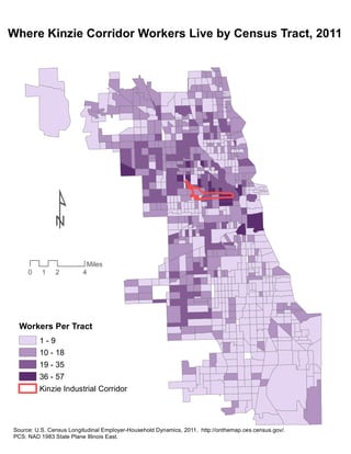
  • 1. Where Kinzie Corridor Workers Live by Census Tract, 2011 Workers Per Tract 1 - 9 10 - 18 19 - 35 36 - 57 Kinzie Industrial Corridor Source: U.S. Census Longitudinal Employer-Household Dynamics, 2011. http://onthemap.ces.census.gov/. PCS: NAD 1983 State Plane Illinois East. 0 2 41 Miles ¹
  • 2. ! ! ! ! ! ! ! ! ! ! ! ! ! ! ! ! ! ! ! ! ! ! ! ! ! ! ! ! ! ! ! ! ! ! ! ! ! ! ! ! ! ! ! ! ! ! ! ! ! ! ! ! ! ! ! ! ! ! ! ! ! ! ! ! ! ! ! ! ! ! ! ! ! ! ! ! ! ! ! ! ! ! ! ! ! ! ! ! ! ! ! ! ! ! ! ! ! ! ! ! ! ! ! ! ! Workers Aged 18 to 29, Per Tract 0 1 - 5 6 - 10 11 - 19 20 - 41 Workers Aged 30 to 54, Per Tract 0 1 - 5 6 - 10 11 - 20 21 - 41 Workers Aged 55 and Over, Per Tract 0 1 - 5 6 - 10 11 - 16 17 - 41 Kinzie Industrial Corridor ! Proposed BRT Stops Where Kinzie Corridor Workers Live, By Age and Census Tract, 2011 0 7 143.5 Miles ¹Source: U.S. Census Longitudinal Employer-Household Dynamics, 2011. http://onthemap.ces.census.gov/. PCS: NAD 1983 State Plane Illinois East.
  • 3. ! ! ! ! ! ! ! ! ! ! ! ! ! ! ! ! ! ! ! ! ! ! ! ! ! ! ! ! ! ! ! ! ! ! ! ! ! ! ! ! ! ! ! ! ! ! ! ! ! ! ! ! ! ! ! ! ! ! ! ! ! ! ! ! ! ! ! ! ! ! ! ! ! ! ! ! ! ! ! ! ! ! ! ! ! ! ! ! ! ! ! ! ! ! ! ! ! ! ! ! ! ! ! ! ! Workers Earning $1250/month or Less 0 1 - 5 6 - 10 11 - 20 21 - 41 Workers Earning $1251 to $3333/month 0 1 - 5 6 - 10 11 - 20 21 - 41 Workers Earning Over $3333/Month 0 1 - 5 6 - 10 11 - 20 21 - 41 Kinzie Industrial Corridor ! Proposed BRT Stops Where Kinzie Corridor Workers Live, by Income and Census Tract, 2011 0 7 143.5 Miles ¹Source: U.S. Census Longitudinal Employer-Household Dynamics, 2011. http://onthemap.ces.census.gov/. PCS: NAD 1983 State Plane Illinois East.
  • 4.
  • 5.
  • 6. !( !( !( !( !( !( !( !( !( !( !( !( !( !( !( !( !( !( !( !( !( !( !( !( !( !( !( !( !( !( !( !( !( !( !( LAKE POLK ARCHER CERMAK ROSCOE CHICAGO PERSHING DIVERSEY CORTLAND 91ST STREET 47TH STREET 79TH STREET 63RD STREET 69TH STREET 51ST STREET 74TH STREET IRVING PARK Proposed Ashland Avenue Bus Rapid Transit Stations Project Slated to Begin 2015 0 2 41 Miles ¹ !( Proposed BRT Stops Sources: Chicago Transit Authority: http://www.transitchicago.com/ashlandbrt/. Chicago Data Portal: https://data.cityofchicago.org/ PCS: NAD 1983 State Plane Illinois East
  • 7. Ben Spies UPP 461 Wednesday FINAL PROJECT PAPER 1 Would Ashland Avenue Bus Rapid Transit Benefit Kinzie Corridor Workers? UPP 461 Final Project The advantage of GIS (Geographic Information Systems) lies in its ability to make complex problems more understandable through visual projection and spatial analysis. Some data are not clear when presented in a table or in a written format. When presented on a map, however, the data's relationship to the real-world environment becomes known, trends can appear, and in the case of data supporting public initiatives, mandates to action may become clear. Before I became familiar with GIS methodology, I had been searching for just this kind of direction regarding the Chicago Transit Authority's proposed Bus Rapid Transit (BRT) system for Ashland Avenue. I work for a nonprofit economic development agency and business association called the Industrial Council of Nearwest Chicago (ICNC). We work in the neighborhood known as the Kinzie Industrial Corridor on Chicago's Near West Side, an area of about one and a half square miles that is home to about 900 businesses and 16,000 primary jobs. In addition to a suite of free business development services, we offer our 400-plus member companies our advocacy on issues affecting their operations and their ability to remain located in Chicago. These issues may be as small as getting a pothole filled in or a no parking sign replaced, or as wide as regional land use and transit planning. One major proposal we have considered for several months is the aforementioned Ashland BRT. Our members have voiced serious concerns about BRT's potential to hinder truck traffic, and many have asked us to oppose the project. The counterargument from project advocates is that BRT service will benefit workers commuting to the Kinzie Corridor, where careful land use planning has created a major employment center with very little nearby residential. ICNC has gotten conflicting anecdotal reports from our members as to where the Kinzie workforce actually does live: some believe the majority of Kinzie commuters have clustered south and west in the Orange Line corridor, while others think that as businesses and employees begin to skew younger our workforce base is moving to “hip” northwest neighborhoods like Logan Square. Jobs in the Kinzie Corridor have become an interesting mix of blue- collar industrial and high-tech, innovative design; as such, the questions of where our workforce lives, and therefore what kind of transit plans would serve them best, have become important. The potential for GIS to explore these questions was immediately apparent to me. For this project, I sought to answer the dual questions of: 1) “Where do commuters to the Kinzie Corridor live?” (looking at City of Chicago only); and 2) “Would Ashland BRT serve a
  • 8. Ben Spies UPP 461 Wednesday FINAL PROJECT PAPER 2 significant portion (ten percent or more) of these commuters?” I built my hypothesis on the second question: I believed a less-than-significant (ten percent or less) portion of workers in the Kinzie Corridor would be able to directly benefit from Ashland BRT in their work commutes. I would employ geospatial analysis of the commuters' home locations in relation to proposed BRT service to explore my hypothesis. First, I would map the concentrations of Kinzie commuter residences across Chicago to the most accurate geographies possible. Next, I would map the proposed BRT stations on Ashland. Finally, I would create a buffer of walking-access around each station, and use GIS tools to select geographies within that buffer and add up the total of Kinzie workers within that proximity. Thankfully, the raw data I sought to answer these questions was indeed available, but it would take careful implementation of GIS tools to arrive at my conclusion. My first objective was acquiring the mappable information I would need to complete the analysis: my “smart geography” and “dumb data” (see appendix). Virtually all of my “smart geography” came from the Chicago Data Portal (https://data.cityofchicago.org/). To geographically illustrate the concepts I would be exploring, I downloaded a polygon shapefile of Chicago's 2010 Census Tracts, taken directly from U.S. Census TIGER, another polygon of the city's Industrial Corridors, a point-data shapefile of all existing CTA bus stops, a line-data shapefile of existing CTA rail lines, and a point-data shapefile of existing CTA rail stops. In order to illustrate the proposed BRT stops, I would have to do some selection work on the shapefile of existing bus stops, which I will cover later. My “dumb data” would be the actual information on the number of Kinzie Corridor commuters who live in various geographies throughout the city. The challenge would be defining only those people who work in the Kinzie Corridor area, but examining where they live city-wide. At first, I was unsure if a resource for finding information this specific would be available, but after some searching I made an incredible find: the U.S. Census's Longitudinal Employer-Household Dynamics (LEHD) “On the Map” explorer (http://onthemap.ces.census.gov/). This fantastic tool collects and displays data on the relationship between where people work and where they live. LEHD is administered by the U.S. Census, which aggregates data from all fifty states taken from Unemployment Insurance earnings, the Quarterly Census on Employment and Wages, and the decennial Census itself. With these robust sources, LEHD has information on where all people both work and live, at least in most states, and can visualize the relationships between them. That is, a user can define a geography (for instance a city, census tract, or a custom geography by drawing a shape or uploading a shapefile), and define this as
  • 9. Ben Spies UPP 461 Wednesday FINAL PROJECT PAPER 3 either the “work” or the “live” location. The user can then get a visualization of the of the opposite definition, for instance where all of the people who work in the selected geography live. This data is accurate to the census tract level. I pulled my data by first defining a “work” geography of the Kinzie Corridor itself: I uploaded the Industrial Corridors shapefile, taken from the Chicago Data Portal, directly to the LEHD On the Map interface. I then clicked the Kinzie Corridor polygon on the map to define only that particular industrial corridor as my geography of interest. I set my analysis options to recognize that this was a “work” geography, and to look at “destinations” of workers in this geography to find their home locations. I chose “primary jobs” only, not wishing to count second and third jobs whose multiple commute variables might skew my results. I chose the most accurate geography result possible, which was census tracts. In an ideal world, the results would be accurate to at least the census block level, to get the best readout on the households that would actually be within walking distance of BRT, but this was not possible. Likewise with the data vintage: I chose to use 2011 data, the most recent available. On the Map returned 2970 total census tracts in which Kinzie commuters live, stretching from southwest Wisconsin to well into Indiana, and 16,026 total primary jobs (or “commuters”). I noted that for my analysis I would only be interested in those census tracts located within the City of Chicago, on the assumption that anyone commuting from outside the city would not be taking CTA. With my data properly selected, I exported it as a CSV file I called HomeTracts. I was fortunate in that I had few problems wrangling my data, though I did have to clean up the column aliases in HomeTracts for compatibility with ArcGIS, and format the census tract ID column for text rather than numbers. The first goal was to create a map that answered my first question: Where does the Kinzie workforce live? I knew that the GIS could create a map showing this distribution visually, which would be useful both for discussion on BRT and for ICNC's own gratification. I would have to join my HomeTracts “dumb data” with the census tract shapefile “smart geography”, which I did based on the census tract ID column that both files had in common. Again, the only real difficulty with the data that I had was formatting both columns for text, which I fixed easily enough. I found that, symbolizing on Jenks method after I completed my join, the default five classification levels were a bit too graded and difficult to read. I reduced this to four classifications, and the results became clearer: though Kinzie does seem to draw a number of commuters from a narrow swath on the southwest side, the main employment base seems to reside on the North Side of the city west of the Chicago River (see map one, “Where Kinzie Corridor Workers Live by Census Tract, 2011”). A significant portion also seems to
  • 10. Ben Spies UPP 461 Wednesday FINAL PROJECT PAPER 4 live in the tracts surrounding the east end of the Kinzie Corridor, in the West Town/West Loop areas. One surprising finding was that the Kinzie Corridor does not seem to draw many workers from the South Side of the city at all, mostly just between one and nine commuters per tract. The data contained in this map will have a direct bearing on our BRT analysis results, but is also important to ICNC on its own. I next broke this analysis down by worker age and income, creating six distinct maps that illustrate living patterns for workers in three different age categories, and three different income levels (see maps two and three, “Where Kinzie Corridor Workers Live, by Age and Census Tract” and “By Income and Census Tract”). While these maps on their own may illustrate some trends regarding work-live patterns as related to these demographic indicators, they would require more in-depth geospatial analysis to draw meaningful conclusions, like how commute distance relates to income level, which falls outside the scope of this project. To illustrate the proposed BRT station locations, I started with the point-data shapefile of existing CTA bus stops and wrote a complicated SQL query under “Select by Attributes”, which included the name of each cross street to house a proposed BRT stop. This information was taken from the Ashland BRT marketing materials on the CTA's website (http://www.transitchicago.com/ashlandbrt/). With those in place as a separate layer, I created a half- mile buffer around each station, dissolved into one polygon, under the assumption that a half-mile would be an acceptable distance for commuters to walk to transit access (see map four, “Tracts Within Walking Distance of Ashland BRT”). To actually pull data on the number of commuters affected, I ran a “Select by Location” on my census tracts file, defining the selection on tracts that had their centroid within the buffer. This method, though as accurate as possible given the circumstances, illustrates one shortcoming of the LEHD data: because it was only accurate to the census tract level, and because my buffer cuts through several tracts, I would necessarily have parts of some tracts that were within my buffer but not included in the selection, and would likewise have some parts of tracts that were included in the selection but outside of the buffer. I had to assume that these inaccuracies would balance each other out, and give us a roughly accurate total, at least for discussion purposes. With my selection in place, I ran statistics on the selected records in my tract attribute table, arriving at 1031 commuters in my selected tracts (or roughly within the half-mile buffer), out of a total of 16,026 commuters. This comes to an effective rate of 6.43% of Kinzie commuters living within walking distance of Ashland BRT, which appeared to confirm my hypothesis. I did realize, however, that this analysis on its own was perhaps a bit myopic. BRT might not
  • 11. Ben Spies UPP 461 Wednesday FINAL PROJECT PAPER 5 only be useful to commuters living within walking distance of BRT itself, but to commuters living near rapid transit which might transfer to BRT. I would have to expand my analysis to include transfers from other transit modes. I decided to limit this to CTA rail connections, accepting that it would not be plausible to analyze all possible mode split options that could feed into a BRT commute. I made a few more assumptions: 1) commuters would transfer from rail to BRT, but not from bus to BRT; 2) commuters would only tolerate a single transfer; and 3) commuters would not travel away from their ultimate destination (the Kinzie Corridor) in order to make a BRT transfer. These assumptions, though perhaps generous, were necessary in order to scale my analysis of BRT effectiveness to something that might be useful. If I included every possible mode split, no matter how implausible, we would end up with an unrealistic idea of BRT's effectiveness. I added a point-data shapefile of the CTA's rail stations, and manually deselected those stations which were not on a rail leg that could reasonably be expected to connect to Ashland BRT on a trip to the Kinzie Corridor. I also removed stops on lines that did not connect at all, and those which traveled to the Kinzie Corridor directly thus negating Ashland BRT, like the Harlem branch of the Green Line. I then created a half-mile buffer around the remaining stations, and executed a union to combine this buffer with my existing BRT stations buffer. With one large, non-contiguous walkability buffer in place, I ran another Select By Location on the census tracts with centroids within the shape (subject to the same limitations as the last analysis). Again running statistics on the selected attributes in the table, I found 2247 commuters living in tracts within walking distance of BRT or a rail station on a line which might transfer to BRT towards the Kinzie Corridor (see map five, “Tracts Within Walking Distance of Ashland BRT”). This amounts to 14.02% of Kinzie commuters, nullifying my hypothesis. Spatial analysis this complicated could only be done with GIS. Distance cannot be drawn on an Excel table; residential clustering patterns cannot be clearly defined without a map. In working with data that is tethered to geography, to answer questions related to location and distance, GIS proved to be a reliable tool not only to accrue new data, but to visualize it for the purposes of discussion. Indeed, ICNC now has some useful data as to BRT's efficacy to the neighborhood workforce's commute, which we will discuss as we continue to cultivate our position on the project. Given the robustness of the LEHD data, we could even break this out further to analyze BRT's efficacy based on worker age or income, as shown on the supplemental maps. While we are not ready to draw hard and fast conclusions on BRT, having concrete, reliable data on how it could serve our workforce, thanks to GIS, puts us in a much better position to make decisions.
  • 12. Ben Spies UPP 461 Wednesday Sources 4/21/14 through 4/28/14 ArcGIS Ver. 10.1, Build 3035 Windows 7 Operating System Data Sources 1. U.S. Census Longitudinal Employer-Household Dynamics “On The Map”. Online interface with data for export on where workers live and work. Collected from U.S. Census, the Quarterly Census on Employment and Wages, and Unemployment Insurance reports. Available http://onthemap.ces.census.gov/. Retrieved 4/21/14. 2. Chicago Data Portal. Searchable online database containing, among many other things, shapefiles on geographies and geographic features within the City of Chicago, including census tracts, transit amenities, and industrial corridors. Available https://data.cityofchicago.org/. Retrieved 4/21/14.