Design project documentation 2010
•
0 likes•408 views

Documentation of Design prooject, Prospectus Design for MGM college of Fine Art..!!

Recommended
More Related Content
What's hot
What's hot (20)
Similar to Design project documentation 2010
Similar to Design project documentation 2010 (20)
Recently uploaded
Recently uploaded (20)
Design project documentation 2010
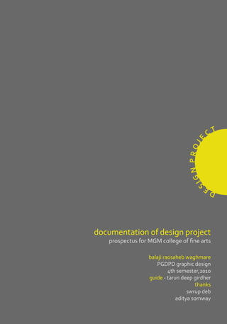
- 1. CT E N P R OJ G SI DE documentation of design project prospectus for MGM college of fine arts balaji raosaheb waghmare PGDPD graphic design 4th semester,2010 guide - tarun deep girdher thanks swrup deb aditya somway
- 2. INTRODUCTION I was very exited to start the ‘design project’ when I learnt that it was to be project of a short duration. As it would be only 5 weeks long, I was unsure about what I wanted it to be. I could do a publication, image making or a branding project. My previous project was also a publication. However I felt that there was a lot more that I could learn. Hence I chose to make this a publication project too. I then met my guide Tarun deep Girdher who gave me important insights about doing a publication. Recently I visited my previous college, Mahatma Gandhi Mission (MGM) col- lege of fine arts, and was offered to make their prospectus. My guide also ap- proved of this as an interesting opportunity and encouraged me to take it up. The MGM college of fine arts had never had a prospectus. This gave me fur- ther impetus to do a good job for them.
- 3. MAHATMA GANDHI MISSION Having already studied at the MGM college of fine arts, I had a good under- standing of the institute, its goals and ideals. Ever since the Golden Age of the Gupta Empire, the Marathwada Region is known for its rich and glorious background in the fields of art and literature. Marathwada was the cradle to the world famous heritage sites at Ajanta and Ellora. It was here that great saint Dnyaneshwar was inspired to write his commentary on The Bhagwat Geeta, known as The Dnyaneshwary. This land is the birthplace of the great Empires that form an integral part of Indian history. The temples, mosques, gurudwaras and numerous historical monu- ments echo the great cultural heritage even to this day. Mahatma Gandhi Mission was founded in the year 1983 as a public charitable trust with the motto of promoting and elevating Technical Education, Medi- cal Education and health care in Maharashtra and outside of the state. It now runs about 30 educational and other institutions at Aurangabad, Mumbai, Nanded, Parbhani and Noida (New Delhi). Apart from the Medical College, Hospitals, Engineering Colleges and College of Business Administra- tion, Architecture, Journalism, Computer Science, Information Technology and other under graduate and post graduate degree courses, performing arts and visual arts are also. These institutions have acquired a prominent place in society. In keeping with this rich tradition, MGM started, MGM College of Fine Art in the academic year 2003-04. Situated in MGM’S nature-friendly campus at N-6, CIDCO, Aurangabad. The College is affiliated to Dr. Babasaheb Ambed- kar Marathwada University, Aurangabad.
- 4. Content analysis A content B size C print production D layout E font F colour G front cover H conclusion I
- 5. First of all I collected prospectuses analysis A of a few Fine Art colleges and studied them. I took a note of, the use of graphic fundamentals in them as shown below. 1. Govt. School of Art, Aurangabad 2. Delhi College of Fine Art 3. Abhinav Kala Mahavidhyalaya, Pune 4. M. S. Univercity, Baroda 5. MIT College of Pune 6. Seth C.N. College of Fine Art, Ahmedabad 7. National Institute of Design, Ahmedabad 8. School of VISUAL ART, New york
- 6. After studying the graphic fundamental used in the various prospectus; I listed down all their elements. I then transferred all this information into digital for- matted chart ( Attached here )
- 7. Every college’s prospectus carries content came out to be information about B a lot of content, as a prospectus the fee structure and future pros- is the informative identity of the pects of the student after course college, at the same time it is the completion. means to attract the students and their guardians. After studying After considering the above- quite a few prospectuses I found mentioned expectations, I some colleges’ prospectus carry a decided to give priority to the lot of redundant content but lacks important information as given the basic important information below. student or their guardians seek at the time of admissions. Address of College About college MGM college being a newly setup college had very limited Objective & vision and to the point information to be conveyed. So I inquired a About Courses few students regarding there Number of seat expectations in a college pro- spectus at the time of admission. Admission Procedure Some wanted to get a feel of Fees Structure the campus life hence expected photographs, while some ex- Academic Calender pected an idea about the facilities available at the campus and some Facilities Available wanted to know clearly the course content. When I enquired some “ The Above Points should be the most viable elements parents regarding their expecta- of a prospectus” tions, one of their major concerns
- 8. After studying the graphic fun- damentals, I went on to analyse the content of each. I can broadly classify my study of the as physi- cal study (paper gsm, size of pro- spectus, number of pages, type of binding etc.), content study and visual layout study. The chart attached here dem- onstrates the above and their relationship with each other.
- 9. size C The size of a book depends upon student carries around the pro- the extent of its handling and the spectus only until the admission subject of the book. For example procedure. Hence while designing some books are meant to be just a prospectus one must ensure for reference, to be studied in that apart from being attractive the library or to read sitting back looking, the prospectus is com- comfortably like books on History fortable to be held in one’s hand or Encyclopedia etc. These books at the same time also fits in one’s are usually big in size to allow bag. Another important aspect a enough space for the content and designer needs to keep in mind is can also be heavy. the size of printing paper that will decide the size of the prospectus But in the case of a prospectus without wasting paper. it is important to note that a
- 10. Keeping all these points in mind I decided the size of this prospec- tus to be 5.5 “x 11 “, because with this size printing paper doesn’t get wasted. Moreover using the 23”x 36” printing paper sheet I can accommodate 24 pages (without front cover) that makes one full prospectus inner pages set. For the cover pages I used sheet of higher GSM in which I get 4 pages front – back. print production D Job Name : MGM Prospectus Closed size : 5.5x11” Opne size : 11x11” Number of Pages : 28 Paper inside : Matt 130 gsm Paper title : Card sheet 250 gsm Printing : CMYK Bonding : Central Staples Quantity : 500 Total Printing Cost : 25,400/- One prospectus cost : 50.8/-
- 11. Before Fixing the Paper I tried out papers of various GSMs to see the thickness of the prospects and the weight of the prospectus, which proves out to be important for postal purposes. I also considered the budget of my client to decide the quality of the paper.
- 12. I spent a lot of time before final- layout giving it an added purpose. To E izing the layout as I had done bring hierarchy in the fonts I used lots of explorations. Layout is the texture over the headline fonts. most important aspect of any I placed the images and the text publication as the layout gives the in the layout after weighing their overall look. I used a texture of emphasis. At certain places like hand made paper in the pro- ‘About college’ I’ve placed the spectus to bring an artistic feel in photos above the text as the the prospectus of an art college. image creates more impression But I sparingly used this texture on the minds of the reader here. to retain its importance. The While in some places like ‘Admis- photographs were not gelling well sion Procedure’ I have placed the with the texture so I applied the text content above the photos texture over the photographs too. for its importance. I made sure This added to the artistic feel in that the photographs are placed the prospectus. I used an orange behind the photographs to avoid patch throughout the prospectus impressions of image over text to have continuity. I placed the on the rior side in case of thin page numbers on this very patch paper quality.
- 13. Exploration of Various Textured For Background
- 14. Exploration of Various Layout on basis of tex- tual content and Images
- 15. Usually serif fonts a preferred in font content for which I have used sans F publication design as the serif on serif CORBEL font in the prospec- the letters ensure a flow in read- tus. CORBEL is designed to give ing thus increasing the reading an uncluttered, clean appearance speed. But in places where we on screen. The letter forms are want the reader’s attention or open with soft, flowing curves. concentration, sans serif fonts It is legible, clear and functional are used. A prospective being at small sizes. At larger sizes the an information booklet it inher- detailing and style of the shapes ently demands reader’s atten- is more apparent resulting in a tion. Moreover the prospectus modern sans serif type with a consists of just 24 pages, which is wide range of possible uses pretty less but contains important
- 16. For the sub heading I tried using hand drawn fonts to bring the feel of an art college, but the body text font was failing to match with the hand drawn fonts I was trying so I decided not to use the hand drawn fonts and used CORBEL fonts of greater size instead.
- 17. n ri O ti rf ou rar- ra vit ul cr che ol ie n ng y ne ea e es n c t h row le, e and ss, : I g en w ro g ou er b iab ce ’ve ro th d b rin eov , rel ran us wt usi e us o b or lid du ed h. as : I es t t. M , so , en E th Ora m, is n s t n w lin ex ce ine UT co ge im ro ead the t fiden enu lo sy ul ur m at B h n n g IT b i to bo ion su hy s, co re liz ST c ct fle - fle ith . ct IN re c k w chy , la rar ce r UT e d b hie gan we . ce s, c the wh t an er us ut ele po th O n v ve ng o cts, lity, reng nc le la ite d in ho t i sed ga d o ’ : I ri e a st AB e, an yo to e, s as u le se ck to b k refl form and ac ite ntr e I s e r u pl ess t. sim lin u pe wh co enc ear lou a Bl nge lac on, ici , ve oo t. H p co ty a b i or ver icat eo g u e a ny be nt or a s o it a p o ist no w n M ate nd wh te : e or h to M sop hi rta he Th rt W po th t te- a t im wi ci e r d et f or hligh ony ects excourag e a re cr st m to hign harmd refl mth, es r tfoed red text ilet. Reh, war an Gr e b nt in y, en in eva abi a ee ody th vi sa pr dur th le lit pl : I us body e pal engt d n te e c ron fet gr : I xt am m y s a d in th str us to p en an ee t i Re lines est of peed, ed re us ta d I n gr fle . G l, lu hon er ee ct re x e r ,s n i th en ur sty yi t en n s e sh iou . n om gre ow s, m colour G th e p ene s, la ry e ce s Let it be design or our day-to-day the first visual element that draws life,, colours play a major role, the viewer’s attention, we convey colours keep attracting us. Choice our feelings to the viewer through of colour entirely depends on the colours. Hence I used a colour subject of our design. Colours are palette explained below.
- 18. Front cover creates the first im- front cover inside. The cover that reflects the H pression regarding the publication subject of the publication helps and its purpose in the minds of the reader to choose the book of the reader. It is the first element his/her interest. Considering all that interacts with the viewer. these facts I designed the cover of An impressive cover page attracts this prospectus as shown. the viewer towards the content
- 19. Exploration of Vari- ous Layout on basis of textual content and Images
- 21. Design decisions Front cover Color This cover was finally chosen by Orange for symbol was chosen to main- me for it’s simplicity. tain the yellow throughout publication. Use of textures Layout decision Handmade paper texture relates to White space around logo, gives artistic background. emphasis to MGM and it keeps direct communication with the viewer.
- 24. conclusion I As I already mentioned in my selecting fonts which I picked introduction, I was extremely up during this project excited to take up this project, 6. How to decide the font moreover having Tarun deep Gird- sizes and get hierarchy in the her as my guide I was equally mo- layout tivated. Even though my studio 3 7. how to select relevant images project was a publication project, and use them at the right during my jury I realized that I had places in the layout missed out upon a lot many learn- 8. how to use grid system to ing aspects of publication design. achieve proper alignment in So this project was going to give my layout me a thorough understanding of Publication design under the Apart from these learning, I learnt guidance of Tarun deep. some basic practices in publica- tion design from my guide like Even tough this project lasted just 5 mins still got a huge amount of 1. making some small dummy learning while doing it. Some of books my learning were: 2. making rough layouts on the 1. How to select and sort the dummy books appropriate content 3. exploring font sizes by 2. how to fit the content inside a varying leading, alignment, book within a proper size indent, drop cap, measure, 3. How to select the appropriate widow and orphans etc size keeping the paper wast- 4. using design principles age to the minimum during printing This way my this design project 4. How to prepare a layout turned out to be a huge learning suiting the subject of the experience in Publication design publication for me. 5. I had very weak sense of