2. 2
Profile of Port Authority of Allegheny County1
Port Authority began serving the community in March 1964. The Authority was created in 1959 when the Pennsylvania Legislature
authorized the consolidation of 33 private transit carriers, many of which were failing financially.
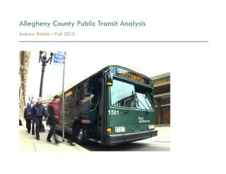
Port Authority’s fleet includes more than 700 buses and more than 80 light rail vehicles. The Authority also owns two inclines.
Port Authority's budget is funded by passenger fares and advertising revenue (27% of operating revenue) along with money from county,
state and federal sources (73% of operating revenue.)2
The Authority's 2,600 employees operate, maintain and support bus, light rail, incline and paratransit services for approximately
200,000 daily riders.
Ridership
In fiscal year 2015 (beginning of July through the end of June), Port Authority served more than 214,000 riders on an average weekday.
Total rides for FY2015 totaled almost 64 million. A closer look at the FY2015 ridership data:
§ Average weekday bus riders: 179,361
§ Average weekday T riders: 27,877
§ Average Saturday ridership system wide: 103,233
§ Average Sunday ridership system wide: 64,792
1 http://www.portauthority.org/paac/CompanyInfoProjects/AgencyProfile.aspx
2 http://www.portauthority.org/paac/portals/capital/budgetbooks/BudgetBook2016.pdf
3. 3
Access to Transportation: Key to Escaping Poverty
In a large, continuing study of upward mobility based at Harvard University, commuting time has emerged as the single strongest factor in
the odds of escaping poverty.3 The longer an average commute in a given county, the worse the chances are of low-income families there
moving up the ladder.4
The relationship between transportation and social mobility is stronger than that between mobility and several other factors, like crime,
elementary-school test scores or the percentage of two-parent families in a community.5
Local Analysis & Methodology
To examine this correlation at a local level, I have composed an analysis of spatial data displaying a broad economic snapshot of the
Pittsburgh metro area, and overlaid this with a route map of the areas served by Port Authority of Allegheny County Bus Operations:
§ Population Density – 2012
§ Change in Population Between 2000 – 2010
§ Median Household Income – 2012
§ Unemployment – 2012
§ Average Commute Time to Work – 2010
3 http://www.equality-of-opportunity.org/images/nbhds_exec_summary.pdf
4 http://www.nytimes.com/2015/05/07/upshot/transportation-emerges-as-crucial-to-escaping-poverty.html?_r=0
5 ibid.
4. 4
After looking at this data and the map of average commute times, I studied the efforts of a local public transit advocacy group
developed by the Thomas Merton Center – Pittsburghers for Public Transit (PPT). Their research, based on public surveys and community
input has resulted in three focus areas within the Pittsburgh Metro Area in need of public transit service improvements:6
§ North Hills – suffers from complete lack of service
§ Penn Hills – various safety issues resulting from lack of adequate route penetration
§ Garfield – an impoverished area within city limits that suffers from lack of weekend service
Goals for This Study
§ Gain a better understanding of the region from a broad economic standpoint
§ Analyze access and route penetration of Port Authority bus system
§ Compare economic data to route penetration and average commute times
§ Further analysis of PPT focus areas
§ Evaluation of transit access relative to economic health
6 http://www.pittsburghforpublictransit.org/campaigns/
5. 5
Expected Outcomes
§ Port Authority conducts frequent rider surveys/internal research and attempts to be responsive to community needs as much as
possible within their budget constraints, so I hope to see quality service to the low-income communities who are most likely to
depend on public transit as the primary means of transportation. The passage of the Act 89 Transportation bill in 2013 will
continue funneling a great deal of federal and state money (nearly $500 million statewide annually by 2018)7 into improving
public transportation, so the future outlook is positive in that regard.
§ While distance from downtown may seem to logically imply a longer commute time, based on available data it is impossible to
know where an individual works relative to where they live. This is why I am using the average commute time block data, as that
was found to be the strongest factor in upward social mobility by the Harvard study that inspired my analysis. I will be interested
to see the correlation between commute time and the other economic factors I mapped.
§ Preliminary analysis of the data, and research I have done for other projects has made me aware of some disheartening statistics
in regard to the economic health of many area residents. Unemployment rates between 20-40% are shockingly common in several
neighborhoods, predominately areas east of the city with significant African-American populations. Median income is below the
national average for many residents, and PPT research states that the base fare for public transit in Allegheny County is the
second highest in the nation, behind only New York City.8 This paints a worrisome economic picture for the region, and the ongoing
gentrification displacing residents from many city neighborhoods is likely a driving force behind the growing income inequality.
§ As a regular daily rider on the Port Authority system for most of my adult life, I have seen firsthand the struggles faced by both
the riders and the Authority itself over the years. I am very interested in this study on a personal level and curious to know more
about the region in the context of economic health and public transit access.
7 http://pahighwayinfo.org/wp-content/uploads/2013/11/Detailed-Summary-of-Act-89-of-2013.pdf
8 http://www.pittsburghforpublictransit.org/campaigns/affordable-fares/
8. 8
Population Density Analysis
§ This map illustrates that the denser urban population base of Allegheny County is well served by the Port Authority, as the system is
designed so that a majority of routes pass through downtown. The outlying suburbs do not fare as well, specifically the areas of
the North Hills beyond West View and McKnight Road, western suburbs such as Robinson, and many areas of the South Hills.
§ Broad swaths of the eastern suburbs suffer from poor route penetration, a problem that PPT has highlighted in their campaign to
improve safety and service to Penn Hills:
o Residents are forced to walk long distances on roads without sidewalks in order to catch a bus. Community members are
often in danger of being struck by vehicles, and a woman was hit by a car last summer.9
o Suggested proposals include:
§ run the 79 along Mt. Carmel road between the Lincoln loop and the Giant Eagle
§ provide more frequent service to Hulton Arbors – a section 8 housing development in Verona
§ provide weekend service on the 77 on Leechburg and Saltsburg
§ run midday and weekend service on the P16U route
§ Starting in 2000 residents of the County, in particular the City of Pittsburgh, increasingly used public transportation for commuting
to work. At the same time, the Port Authority experienced severe service reductions. Secure funding through Act 89 will ensure the
Port Authority’s goal to improve service and enhance rider experiences.10
9 http://www.pittsburghforpublictransit.org/campaigns/penn-hills/
10 http://www.portauthority.org/paac/portals/capital/budgetbooks/BudgetBook2016.pdf
11. 11
Change in Population Analysis
§ Allegheny County is currently experiencing a dramatic population change. Historically, the County’s population has been
decreasing due to the exodus of the steel industry and the lack of economic opportunities. Flight from the region bottomed out in
2010 and today the region is experiencing growth. The success of regional educational and medical centers has spurred a
revitalized, vibrant economy that has received accolades, such as Pittsburgh being labeled the “Most Livable City.”11
§ Population growth has shifted demographics. Millennials (the generational group attributed to birth years between the early
1980s and early 2000s) account for 20.4% of the County’s population and 30.3% of the City of Pittsburgh’s population. This
population group will continue to create unique opportunities for economic development and produce new demands on public
transportation. The Rockefeller Foundation in a 2014 survey found that 66% of millennials rank public transportation as a top
priority for migrating to a region. Of those millienials making $30,000 or less, 92% stated affordable public transportation is a
must. Millennials have moved to the north, west, and central (Pittsburgh) regions of Allegheny County. These trends will create
opportunities for enhanced public transportation ridership.12
§ Movement of general significance regardless of millenial status has been either directly into city neighborhoods, specifically the
East End or out beyond the first ring suburbs into deeper suburban areas such as Robinson and Cranberry Townships.
11 http://www.citylab.com/work/2012/09/eds-and-meds-alone-cant-revitalize-cities/3292/
12 http://www.portauthority.org/paac/portals/capital/budgetbooks/BudgetBook2016.pdf
14. 14
Median Household Income Analysis
§ Median household income in Allegheny County is $48,948 – slightly below the national median of $50,157.13
§ This map provides a straightforward look at the success the Port Authority has had in designing routes that provide service to
households at or below the median income. As lower income households have less options when selecting an area they can afford
to live in, it is crucial that the Port Authority takes this information into account when determining route access. The wealthy eastern
neighborhoods of the city like Shadyside, Squirrel Hill, and Point Breeze, etc. exist at a sweet spot of high income households that
also benefit from better than average access to transit. It is very expensive to live in these neighborhoods, but I don’t believe that
the access to public transit is causing an increase in housing values.
§ I think it is interesting to see that some areas that appeared to be underserved in terms of route penetration compared to
population density also tend to be areas of high median household income, indicating that high earning households don’t seem to
necessarily favor areas with good public transit access. This is understandable, as these are households that probably own at least
one vehicle and would perhaps prefer to commute to their work destination privately for any number of reasons.
§ We can also see that there is room for improvement in service to lower median income areas north of Millvale and West View; the
area surrounding Baldwin and West Homestead in the South Hills; west of Carnegie; and eastern areas between Churchill, Penn
Hills and Blawnox. One anomaly in the data for the South Hills may be the existing light rail service (the T) that is much stronger in
these areas than others, which might explain what appears to be significant shortcomings in the Port Authority’s bus service there.
13 http://www.point2homes.com/US/Neighborhood/PA/Allegheny-County-Demographics.html
17. 17
Unemployment Rates Analysis
§ Pittsburgh overall had an unemployment rate of 8.4% in 2012 – slightly below the national average of 9.5% as shown in the data
collected for this map.
§ What is striking about this to me is the multitude of regions showing unemployment rates at or above the top threshold of this map,
at 21% or greater. This is more than double the national average and demonstrates a significant problem for employment in these
areas.
§ Drawing on available demographic data, we can see that many of the areas with extreme unemployment rates are also home to
large African-American populations.14 This may indicate a general lack of opportunity for African-American households in the
region.
§ Relating this data to transit access, I think it is safe to say that lack of access to reliable public transit was not the underlying cause
of the greater unemployment woes of the region, as most of the areas displaying greater than average unemployment actually
appear to have the benefit of fairly regular and reliable public transportation access.
§ An exception may be the areas I have mentioned repeatedly in the South Hills, North Hills, and suburbs to the east and west that
suffer from low median household income, high unemployment, and poor transit access. Many of these areas also experienced a
slight population increase in 2010, perhaps indicative of low-income families being pushed further out of the city into areas with
poor transit access due to ongoing issues of gentrification.
14 http://www.socialexplorer.com/6f4cdab7a0/explore
20. 20
Average Commute Time to Work Analysis
§ The average commute to work time for Allegheny County is 26 minutes, very close to the national average of 25.4 minutes.
Although, we can see from this map that there are many pockets of the metro area that are above the median, and some of this
can be attributed to the challenging topography of Pittsburgh and the prevalence of bridges and tunnels that impair traffic flow.
§ Looking at the data in this map, we can see that there are many areas where commuters experience much greater than average
commute times. It’s important to consider that many commuters, especially those south and east of the city who work downtown must
contend with the traffic generated by the various tunnels, which cause significant commuter delays, especially during rush hour.
§ There seems to be strong correlation between the areas with the longest commute times and a lack of significant public transit route
penetration – specifically areas to the east like Homewood and Larimer; the eastern suburbs around Penn Hills; the South Hills to
the west of Duquesne; Mt. Oliver; west of Ingram, etc. These are also areas with significant African-American populations.15
§ As any traffic analysis will tell you, the greater passenger density and ability to take advantage of the busways and HOV lanes
available to transit users should keep commuting times by public transit on the shorter end of these metrics. I think this is also
evident in the final map here, where you can see some areas with solid route penetration and overall transit access that have
commute times that are at or below the average.
15 http://www.socialexplorer.com/6f4cdab7a0/explore
21. 21
Final Analysis
§ After considering all of the spatial data I have analyzed in compiling this project, I have developed a much deeper awareness of
the various underlying socio-economic issues facing our region, and I have explored some of the powerful relationships between
them and the transit opportunities available to different communities in Pittsburgh.
§ As commuting time has emerged as the strongest factor affecting the odds of escaping poverty, I think further analysis of this data
will prove to be crucial as the Port Authority continues developing plans for improving and restructuring access and route
penetration in the future.16 I plan to share my findings with the PPT in hopes of aiding them in their mission of guaranteeing
equitable public transit access in the area.
§ I would also like to incorporate a fare analysis into this project in the future. As I mentioned earlier in my study, the base fare of
Pittsburgh public transit ($2.50) is surpassed only by New York City, which has a higher median income ($54,057) than Pittsburgh
($49,809) and also has greater penetration of public transit access and usage (55.66%) compared to Pittsburgh (18.03%).17
§ PPT has published some interesting data on this as well, stating that “In a survey conducted [by the Port Authority] in 2014, 26.3%
of riders reported having no other transportation options. Increasing the fare would put a huge strain on these riders’ finances. A
minimum-wage earner in Pittsburgh has to work 41 minutes per day just to cover the cost of getting to work.”18
§ Pittsburgh is undergoing dramatic changes in its populations, industries, and economies right now, and I fear that without adequate
service available to marginalized, low-income, and minority communities, the future for these groups is very grim indeed.
16 http://www.equality-of-opportunity.org/images/nbhds_exec_summary.pdf
17 http://www.census.gov/programs-surveys/acs/
18 http://www.pittsburghforpublictransit.org/campaigns/affordable-fares/