Unlocking the Power of ChatGPT and AI in Testing - A Real-World Look, present...
NBA Fashion Knicks and Nets Jerseys
1. NBA Fashion: Knicks and Nets Jerseys
Andrew Horowitz
The holidayseasonisupon us,whichmeansthatpeople acrossthe countrytake pride inwearingtheir
ugliestsweaters. Inthe spiritof holidayfashion,NBA uniformsdefinitelymake a distinctstatement.
Some jerseysare trulyawesome,whileothersare cringe worthy. Let’stake alookat the historic
portfolioof jerseys forthe KnicksandNetsandpickthe bestfew and the worstfew.
New York Knicks
Best Jerseys:
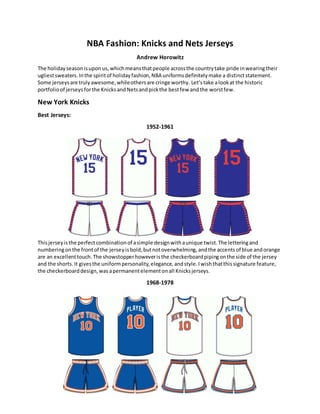
1952-1961
Thisjerseyisthe perfectcombinationof asimple designwithaunique twist.The letteringand
numberingonthe frontof the jerseyisbold,butnotoverwhelming, andthe accents of blue andorange
are an excellenttouch.The showstopperhoweveristhe checkerboardpipingonthe side of the jersey
and the shorts. It givesthe uniformpersonality,elegance, andstyle.Iwishthatthissignature feature,
the checkerboarddesign, wasapermanentelementonall Knicksjerseys.
1968-1978
2. Thiswas the jerseywornduringthe Knickstwochampionshipruns,thusrepresentingthe most
successful erainfranchise history.Intermsof design,the jerseyis graceful,butalsoeye-catching. The
blue and orange in the home white model, andthe orange andwhite inthe blue roadmodel, seamlessly
complimentthe base colorof the jersey.Additionally,itisthe firstKnicksjerseytouse an elastic
waistband.Althoughthisjerseywascreated45yearsago, it isclearthat it wasthe inspirationforthe
currentKnicksjersey, astheyhope tosummon the same championshipsuccess.
Worst Jerseys:
1979-1983
In 1979, the Knickscompletelyalteredthe lookof theirjerseysandthe resultwasnotpretty. The colors
of these jerseysdo notmatch the classicorange and blue of the Knicks,butrather use a reddishorange
and a purplishblue.Deviatingfromthe lookof the championshipseasons,the shortshave apseudo
Yankeeslogoonthe right side andthe player’snumberonthe leftside.Thisresultsinalack of brand
and teamdifferentiation.Inaddition,the player’snumberappearsinmassive fontonthe backof the
jerseyanddominatesthe name of the teamonthe frontof the jersey. Simplyput,the jersey istryingto
do waytoo much. Thankfully,the Knicksscrappedthisjersey afteronly fourseasons andmovedback
towardsa more traditional andcleanlook.
1997-2001
3. Thisjerseyistoughon the eyes.Inthe 1990’s, black was requiredonall NBA jerseys because itwas
consideredthe mostmarketablecolor.However,pairingblackwithblueandorange isn’tagood
combination.The deeptone of blacktendstodrownoutthe lighterblue andorange tones.Inaddition,
the side pipingonboththe top and bottom of thisjerseyiswaytoo wide andthe shortsthemselvesare
waytoo busy.Just like the 1979 jersey,this1997 designonlylastedforfouryears, andblackwas
completelyremovedfromall Knicksjerseysinthe 2012-2013 season. Inmy opinion,acase of additionof
by subtraction.
New Jersey/Brooklyn Nets
Best Jerseys:
1977-1990
Theysay symmetryisbeautiful,butinthe case of the 1977-1990 Netsjersey,the asymmetricdesign
workswonders.While mostNBA teamshave side pipingonbothsidesof the jersey,the Netstookarisk
and focusedonincorporatinganintricate designononlyone side.The riskfullypaidoff.The leftside
pipingof the jerseythatfeaturesstarsandstripesisnot onlypatriotic,but isalsodistinguishable and
visuallyappealing. Simplyput,the ode tothe Americanflag, asrepresentedonthisiterationof Nets
jerseys,makespeople stopandstare.
2012-Present
4. In 2012, the NetsmovedtoBrooklyn, andwithitcame a complete jerseyandlogoredesigntomirrorthe
toughnessof NewYorkCity. Abandoningcolorsall together,the BrooklynNetsjerseyandlogoare black
and white,afar cry fromthe red,white,andblue of the past.The new home and awayjerseysare
perfectexamplesof aclean,butsimplyapproachto design.Theyaccentthe base color(home-white and
road-black) withasolidinverse pipingthroughoutthe jerseytopandbottom.The jerseysalsopay
homage to the boroughwiththe wordBrooklynbroadacross the chest,rather thanthe teamname.
Statedsimply,the presentdayNetsjerseysrepresentatimelesslookforthe franchise movingforward.
Worst Jerseys:
1982-1984
Thisjerseylastedforonly twoseasonandit’seasyto see why.Tryingto be unique,the Netswentwith
scripton both the home andaway jerseys,afont-type thatissmoothanddelicate.Inaleague
predicatedontoughness,passion,andintensity,the use of scriptisconfusingand ineffective.Notto
mentionthatthe scriptNJ on the shortsisextremelyhardtoread.Additionally,the brandingonthese
jerseysisextremelyinconsistent.The frontof the home jerseysaysNets,while the frontof the away
uniformsaysNewJersey.Luckily,the jerseyproduced directly afterthisdebacle isone of the bestin
Netshistory.
1990-1991
5. I am infavor or beingcreative andunique whendesigninganNBA jersey,butthe roaduniformwornby
the NewJerseyNets duringthe 1990-1991 campaignwas a failedattemptat thinkingoutside the box.
Unbelievably,the jersey istie-dye.Tall,muscular,andtoughNBA basketball playerswere askedtowear
a similarstyle of clothingthatislovedby2nd
graders.The discrepancybetweenthe jersey designitself
and the playerswearingitwas vast.To thisday, itis one of the most infamousjerseydesignsof all-time
because of howtrulyabsurdit was.