Private Call Girls Durgapur - 8250192130 Escorts Service with Real Photos and...
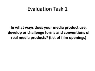
Evaluation task 1
1. Evaluation Task 1
In what ways does your media product use,
develop or challenge forms and conventions of
real media products? (i.e. of film openings)
2. The scene of my film is of the ident I created for Jump in Films. I chose to name it
Jump in Films and I think it symbolises taking a risk trying something new.
I chose a photo I took of my brother as I feel that him jump off the tree fit
perfectly with the tile. I also feel that the colours that are in the background if the
photo are quite clam and relaxing instead of the typical black and grey shades we
have in the cinema. How ever the brightness of the white will get the viewers
attention letting them know the film is about to start.
3. The next shot in my film is of the ABA logo I decided to put this in my film as
it is a boxing film and I feel that the ABA would be interested in sponsoring
the film as they are mentioned throughout the film and as one of there
boxers in staring in the film.
I chose the ABA in particular as I agree with there rules and regulation f
boxing and the story line of my film crossing into these rules where one of my
characters boxing license may get revoked.
I think by them sponsoring the film it would also generate publicity for them.
4. I then go straight into the title of the film as many of the films in this
genere do this.
I chose the tittle fight as it is short and simple . This means that my
target audience would be able to remember the name easily. Most
sports and fighting films have shorts simple titles so my film follows
the codes and conventions of its genre.
5. This is just one on a list of many people that appear
in my credits for the job the mains ones that I had
were the director, costume design,
cinematographer, camera work, editor, casting
director and music editor.
6. I had many shots like these in my film as there is no
actual fighting in the beginning of my film. I wanted
my film to follow the leading character through one
of his training session. With out even naming the
character viewer will figure out who is as most of
the shots are centred around him or there are close
ups of him none on the other characters.
7. These are the shots where I started list the characters in
the film. The credits matched up with the characters on
screen allowing easy recognition later on if one wanted to
look up an actor. I chose a simple white font as it stand out
on all the colours and surfaces within the gym.