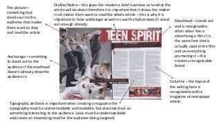
1. Masthead – stands out
and is recognisable,
often when this is
advertising a film it is
the same font that is
actually used in the film
and on everything
promoting it – this
creates a recognisable
brand
The picture –
something that
stands out to the
audience that makes
them want to stop
and read the article
Columns – the layout of
the writing here is
recognisable with a
magazine or newspaper
article
Anchorage – something
to stand out to the
audience if the masthead
doesn’t already draw the
audience in
Typography and lexis is important when creating a magazine the
typography must be understandable and readable, but also stand out as
something interesting to the audience. Lexis must be understandable
and create an interesting read for the audience being targeted.
Skyline/Byline – this gives the readers a brief overview as to what the
article will be about therefore it is important that it draws the reader
in ad makes them want to read the whole article – this is why it is
important to have anchorage as well in case the byline doesn’t stand
out enough already.