Red wine analysis using programming in R to conclude findings of chemical properties that are contributing factors to quality and alcoholic content of red wine.
(NEHA) Call Girls Katra Call Now 8617697112 Katra Escorts 24x7
Red wine
1. Red Wine Analysis by Alicia Dale
To begin my analysis, let's take a look at the dataset. The data set provided has 1599
observations and 13 variables, and contains information about red wine and the chemical
properties that make up its profile. The wines were rated by atleast 3 experts, who rated on a
scale from 0-10 to determine quality, where 0 is bad and 10 is excellent. I'd like to find chemical
compositions that affect quality and alcoholic content. I'll conduct my analysis by building
univariate, bivariate, and multivariate plots and creating a predicitive model based on
information found from my plots. Let's begin by loading the data and printing out the first 6
rows, followed by a stat summary.
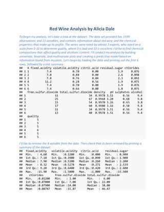
## X fixed.acidity volatile.acidity citric.acid residual.sugar chlorides
## 1 1 7.4 0.70 0.00 1.9 0.076
## 2 2 7.8 0.88 0.00 2.6 0.098
## 3 3 7.8 0.76 0.04 2.3 0.092
## 4 4 11.2 0.28 0.56 1.9 0.075
## 5 5 7.4 0.70 0.00 1.9 0.076
## 6 6 7.4 0.66 0.00 1.8 0.075
## free.sulfur.dioxide total.sulfur.dioxide density pH sulphates alcohol
## 1 11 34 0.9978 3.51 0.56 9.4
## 2 25 67 0.9968 3.20 0.68 9.8
## 3 15 54 0.9970 3.26 0.65 9.8
## 4 17 60 0.9980 3.16 0.58 9.8
## 5 11 34 0.9978 3.51 0.56 9.4
## 6 13 40 0.9978 3.51 0.56 9.4
## quality
## 1 5
## 2 5
## 3 5
## 4 6
## 5 5
## 6 5
I'd like to remove the X variable from the data. Then check that its been removed by printing a
summary of the dataset.
## fixed.acidity volatile.acidity citric.acid residual.sugar
## Min. : 4.60 Min. :0.1200 Min. :0.000 Min. : 0.900
## 1st Qu.: 7.10 1st Qu.:0.3900 1st Qu.:0.090 1st Qu.: 1.900
## Median : 7.90 Median :0.5200 Median :0.260 Median : 2.200
## Mean : 8.32 Mean :0.5278 Mean :0.271 Mean : 2.539
## 3rd Qu.: 9.20 3rd Qu.:0.6400 3rd Qu.:0.420 3rd Qu.: 2.600
## Max. :15.90 Max. :1.5800 Max. :1.000 Max. :15.500
## chlorides free.sulfur.dioxide total.sulfur.dioxide
## Min. :0.01200 Min. : 1.00 Min. : 6.00
## 1st Qu.:0.07000 1st Qu.: 7.00 1st Qu.: 22.00
## Median :0.07900 Median :14.00 Median : 38.00
## Mean :0.08747 Mean :15.87 Mean : 46.47
2. ## 3rd Qu.:0.09000 3rd Qu.:21.00 3rd Qu.: 62.00
## Max. :0.61100 Max. :72.00 Max. :289.00
## density pH sulphates alcohol
## Min. :0.9901 Min. :2.740 Min. :0.3300 Min. : 8.40
## 1st Qu.:0.9956 1st Qu.:3.210 1st Qu.:0.5500 1st Qu.: 9.50
## Median :0.9968 Median :3.310 Median :0.6200 Median :10.20
## Mean :0.9967 Mean :3.311 Mean :0.6581 Mean :10.42
## 3rd Qu.:0.9978 3rd Qu.:3.400 3rd Qu.:0.7300 3rd Qu.:11.10
## Max. :1.0037 Max. :4.010 Max. :2.0000 Max. :14.90
## quality
## Min. :3.000
## 1st Qu.:5.000
## Median :6.000
## Mean :5.636
## 3rd Qu.:6.000
## Max. :8.000
Bucket the Data
Quality Bucketed Data
Red_Wine$quality.bucket <- cut(Red_Wine$quality, c (2,4,6,8))
table(Red_Wine$quality.bucket)
##
## (2,4] (4,6] (6,8]
## 63 1319 217
Quality Bucket <- most of the values reside in the middle, and high end bucket with the least of
the count residing in the lowest quality bucket.
Alcohol BucketedData
Red_Wine$alcohol.bucket <- cut(Red_Wine$alcohol, c (7, 10, 13, 15))
table(Red_Wine$alcohol.bucket)
##
## (7,10] (10,13] (13,15]
## 747 829 23
Alcohol Bucket <- most of the values lie in the second bucket, followed by the 1st bucket, and the
bucket with the highest alcohol has the lowest count.
Dimensions of the dataset
## [1] 1599 14
3. Dimensions <- the Red Wine data has 1599 observations and 14 variables, this shows that my
bucketed variables are now present in the dataset and can be used for my analysis.
Structure of the dataset
## 'data.frame': 1599 obs. of 14 variables:
## $ fixed.acidity : num 7.4 7.8 7.8 11.2 7.4 7.4 7.9 7.3 7.8 7.5 ...
## $ volatile.acidity : num 0.7 0.88 0.76 0.28 0.7 0.66 0.6 0.65 0.58 0.
5 ...
## $ citric.acid : num 0 0 0.04 0.56 0 0 0.06 0 0.02 0.36 ...
## $ residual.sugar : num 1.9 2.6 2.3 1.9 1.9 1.8 1.6 1.2 2 6.1 ...
## $ chlorides : num 0.076 0.098 0.092 0.075 0.076 0.075 0.069 0.
065 0.073 0.071 ...
## $ free.sulfur.dioxide : num 11 25 15 17 11 13 15 15 9 17 ...
## $ total.sulfur.dioxide: num 34 67 54 60 34 40 59 21 18 102 ...
## $ density : num 0.998 0.997 0.997 0.998 0.998 ...
## $ pH : num 3.51 3.2 3.26 3.16 3.51 3.51 3.3 3.39 3.36 3
.35 ...
## $ sulphates : num 0.56 0.68 0.65 0.58 0.56 0.56 0.46 0.47 0.57
0.8 ...
## $ alcohol : num 9.4 9.8 9.8 9.8 9.4 9.4 9.4 10 9.5 10.5 ...
## $ quality : int 5 5 5 6 5 5 5 7 7 5 ...
## $ quality.bucket : Factor w/ 3 levels "(2,4]","(4,6]",..: 2 2 2 2 2
2 2 3 3 2 ...
## $ alcohol.bucket : Factor w/ 3 levels "(7,10]","(10,13]",..: 1 1 1 1
1 1 1 1 1 2 ...
4. This output displays the internal structure and data type for each column in the dataset.
Attribute information:
Input variables (based on physicochemical tests):
1 - fixed acidity (tartaric acid - g / dm^3)
2 - volatile acidity (acetic acid - g / dm^3)
3 - citric acid (g / dm^3)
4 - residual sugar (g / dm^3)
5 - chlorides (sodium chloride - g / dm^3
6 - free sulfur dioxide (mg / dm^3)
7 - total sulfur dioxide (mg / dm^3)
8 - density (g / cm^3)
9 - pH
10 - sulphates (potassium sulphate - g / dm3)
11 - alcohol (% by volume)
Output variable (based on sensory data):
12- quality (score between 0 and 10)
Univariate Plots
Before we start analyzing I would like to create a plot for each variable in the data set.
Quality and Alcohol
5. Quality <- most of the counts reside in the 5-6 range
Quality Bucket <- the 4-6 range for quality has the most data
Alcohol <- most of the counts reside in the 9-11 range
Alcohol Bucket <- most red wines seem to have alcoholic content from 7-13
Quality and Alcohol Stat Summaries
summary(Red_Wine$quality)
## Min. 1st Qu. Median Mean 3rd Qu. Max.
## 3.000 5.000 6.000 5.636 6.000 8.000
summary(Red_Wine$alcohol)
## Min. 1st Qu. Median Mean 3rd Qu. Max.
## 8.40 9.50 10.20 10.42 11.10 14.90
6. Quality and Alcohol BoxPlots
Boxplots allow us to view the 1st quartile, median, 3rd quartile and outliers in the data set very
easily. Therefore they are a great way to showcase simple statistics in a visualization.
7. Quality <- the median and third quartile have the same value. Outliers are at 8 and 2. There
appears to be two distinctive bars around the 5 and 6 range from the jitter points on the graph.
Alcohol <- the median is right above 10 and the 1st and 3rd quartile appear to be in the 9-11
range with outliers beyond 13 and 14.
I would like now to look at the variables that contain data related to acids.
Volatile Acidity, Fixed Acidity, and Citric Acid
Volatile acidity showed a bimodal distribution with the majority of the samples between
.25g/dm^3 - .80g/dm^3, but the log distribution created a more normal distribution output.
Fixed acidity shows a normal distribution with majority of the samples between 6.5g/dm^3 -
10g/dm^3.
Citric Acid shows a distribution with outliers at 0 and anotheroutlierat .5.
Acids Stat Summaries
summary(Red_Wine$volatile.acidity)
8. ## Min. 1st Qu. Median Mean 3rd Qu. Max.
## 0.1200 0.3900 0.5200 0.5278 0.6400 1.5800
summary(Red_Wine$fixed.acidity)
## Min. 1st Qu. Median Mean 3rd Qu. Max.
## 4.60 7.10 7.90 8.32 9.20 15.90
summary(Red_Wine$citric.acid)
## Min. 1st Qu. Median Mean 3rd Qu. Max.
## 0.000 0.090 0.260 0.271 0.420 1.000
Let's look at boxplots of these variables to see some visual stats.
Acids BoxPlots
9. Volatile Acidity <- contains outliers at 1.6, but the 1st and 3rd quartiles are in the range of .39-
.64.
Fixed Acidity <- contains outliers from 12-16, 1st and 3rd quartiles are between 7.10-9.20 range.
Citric Acid <- contains outliers at 1, 1st and 3rd quartiles have a much larger range in
comparison to the distribution and in comparison to the other boxplots, with a range from .09-
.420.
Now that we have some plots for different types of acids as well as a quick stat summary, lets
explore more variables.
Residual Sugar and Chlorides Diagrams
## NULL
10. The two top graphs are left skewed diagrams.
Residual sugar <- most of the counts are 4 and less, outliers start around 8 and go through 16.
Chlorides <- most of the counts are less than .2, with outliers up to .6
Log 10 Diagrams <- zoomed into the graphs to rid of outliers and create normal distributions
Residual Sugar <- I chose to zoom into the values 1-6 for my log10 graph to have a closer look at
the higher count values and dispose of the outliers
Chlorides <- I zoomed into the values that lie between .05-.2 to look at the higher counted
values
Residual Sugar and Chlorides Stat Summaries
summary(Red_Wine$residual.sugar)
## Min. 1st Qu. Median Mean 3rd Qu. Max.
## 0.900 1.900 2.200 2.539 2.600 15.500
summary(Red_Wine$chlorides)
## Min. 1st Qu. Median Mean 3rd Qu. Max.
## 0.01200 0.07000 0.07900 0.08747 0.09000 0.61100
11. Both median and average values are very close to eachother in both of the summaries.
All of the chloride content resides between 0.0 and .1. There is an outlier at .6.
Residual Sugar and Chlorides Boxplots
Let's explore the stat summaries with a visualization of boxplots from the following variables.
12. The non-zoomd in graphs show very low variable counts with a lot of outliers
Residual Sugar <- most values are under 4, and the outliers lie past 4 and up to 15.
Chlorides <- most values are under .1, with outliers up to .7.
Zoomed in Plots - Rid of outliers in the distribution
Residual Sugar Zoom <- from this plot we can have a clearer image of where the highest counts
of residual sugar lie by using coord_cartesion to find values between 1 - 4
Chlories <- from this plot we can again see where the highest counts in the distribution lie by
zooming into values that lie between .05 - .125
Free Sulfur Dioxide and Total Sulfur Dioxide
I would like to understand these variables before plotting so let's explore how these variables
impact red wine and what they are.
Free Sulfur Dioxide <- prevents microbial growth and the oxidation of wine. By preventing
oxidation it can affect flavor of wine.
Oxidation can occur throughout the winemaking process, and even after the wine has been
bottled. Anthocyanins, catechins, epicatechins and other phenols present in wine are those most
easily oxidised, which leads to a loss of colour, flavour and aroma - sometimes referred to as
flattening.
Free sulfur dioxide counts of higher value should preserve more of the wines flavor and
might help us in finding a relationship between free sulfur dioxide and quality of red wine.
https://www.google.com/webhp?sourceid=chrome-instant&ion=1&espv=2&ie=UTF-
8#q=oxidation+of+red+wine
Total Sulfur Dioxide <- amount of free and bound forms of S02; in low concentrations, SO2 is
mostly undetectable in wine, but at free SO2 concentrations over 50 ppm, SO2 becomes evident
in the nose and taste of wine
Only a proportion of the SO2 added to a wine will be effective as an anti-oxidant. The rest will
combine with other elements in the wine and cease to be useful. The part lost into the wine is
said to be bound, the active part to be free.
http://www.monashscientific.com.au/SO2ChemistryRedWine.htm
13. Sulfur Dioxide Diagrams
Free Sulfur Dioxide <- range resides from 0-40, with outliers past 60.
Total Sulfur Dioxide <- range resides from 0-150, with outliers past 250.
Free and Total Sulfur Dioxide Summaries
summary(Red_Wine$free.sulfur.dioxide)
## Min. 1st Qu. Median Mean 3rd Qu. Max.
## 1.00 7.00 14.00 15.87 21.00 72.00
summary(Red_Wine$total.sulfur.dioxide)
## Min. 1st Qu. Median Mean 3rd Qu. Max.
## 6.00 22.00 38.00 46.47 62.00 289.00
15. Free Sulfur Dioxide <- range from 1st to 3rd quartile is from 5-20, with outliers past 40.
Total Sulfur Dioxide <- range from 1st to 3rd quartile is from 25-65, with outliers past 100 up to
almost 300.
Would like to explore the relationship of how the outliers might affect quality of red wine for my
bivariate analysis.
Density, pH, and Sulphates Diagrams
Density <- produced a normal distribution with a bell-curve.
pH <- produced another bell-curve normal distribution plot. This is distriubution looks similar to
the density graph.
Sulphates <- produced a left-sided distribution with a right-sided tail.
Density, pH, and Sulphates Stat Summaries
summary(Red_Wine$density)
## Min. 1st Qu. Median Mean 3rd Qu. Max.
## 0.9901 0.9956 0.9968 0.9967 0.9978 1.0040
16. summary(Red_Wine$pH)
## Min. 1st Qu. Median Mean 3rd Qu. Max.
## 2.740 3.210 3.310 3.311 3.400 4.010
summary(Red_Wine$sulphates)
## Min. 1st Qu. Median Mean 3rd Qu. Max.
## 0.3300 0.5500 0.6200 0.6581 0.7300 2.0000
Density, pH, and Sulphates BoxPlots
17. Density <- you can tell that this is a normal distribution due to the accumulation of values in the
center of the plot.
pH <- since the distributions for density and pH are similar, you can see they also share almost
identical comparisons when looking at the boxplots.
Sulphates <- this plot looks much different with the values residing on the lower end of the plot,
and outliers after the value of 1.
Univariate Analysis
What is/are the main feature(s) of interest inyour dataset?
In this sample, their are 1599 observations with 12 features (fixed.acidity, volatile.acidity,
citric.acid, residual.sugar, chlorides, free.sulfur.dioxide, total.sulfur.dioxide, density, pH,
sulphates, alcohol, alcohol.bucket, quality, quality.bucket)
Heres some observations from the dataset:
Sulfur.dioxide (both Free and Total) is distributed over a large range across the samples.
The alcohol content variable ranges from 8.40 - 14.90.
The quality of the samples range from 3 to 8 with a median of 6.
The highest range seen if for fixed acidity, with minimum of 4.6 and maximum of 15.9.
pH value varies from 2.720 to 4.010 with median of 3.210.
What other features inthe dataset doyou think will helpsupport your
investigationintoyour feature(s) of interest?
For my analysis I created a plot for each variable allowing me to find my values of interest. I
would like to explore variables that are contributing factors to quality and alcoholic content.
I would like to explore relationships between:
18. ALCOHOL & QUALITY
Hypothesis - I think as a society we associate quality with higher counts of alcohol, just think of
what we consider to be "classy" drinks, for instance a manhattan drink is made of whiskey,
vermouth, and bitters and has 27.68% alcoholic content. Many other high end beverages show
this trend of higher alcoholic content and how that equates to quality, I'm sure theres also a
trend in price as alcoholic content increases, but that's for another assignment:).
FREE SULFUR DIOXIDE & QUALITY
Hypothesis - I would like to compare free sulfur dioxide to quality and see if there's a chance
that FSD may prevent flavor loss and therefore increase quality in red wine.
pH & FREE SULFUR DIOXIDE
Hypothesis - I want to see if there is a relationship with pH and FSD, from this article :
https://www.practicalwinery.com/janfeb09/page5.htm, it states that FSD is direclty dependent
on pH and that by knowing the pH, you can determine the percentage of free sulfur dioxide.
TOTAL SULFUR DIOXIDE & RESIDUAL SUGAR/QUALITY
Finding a relationship - I would like to analyze total sulfur dioxide and compare it to residual
sugar content in red wine to see if theres a relationship, and look to explore a potential
relationship with quality as well.
ACIDITY & ALCOHOL
Finding a relationship - I'm just interested to see if there is any relationship to conduct further
analysis on, I haven't found anything online, I'm just curious as to what I might find.
RESIDUAL SUGAR & ALCOHOL
Hypothesis - I would think that as alcohol increases that sugar would decrease, based on my
experience with the taste of wine.
DENSITY & ALCOHOL
*Hypothesis - I believe that higher alcoholic content would have lower density, based of of this
quick article that talks about ethanol and density comparisons:
http://web2.slc.qc.ca/jmc/w05/Wine/results.htm*
Did you create any new variables fromexisting variablesinthe dataset?
Yes, I created a bucketed variable for the quality and the alcohol variables in the dataset. I felt
this was necessary to get better output of visuals for my two main variables of interest.
19. Of the features youinvestigated, were there any unusual distributions?
Did you performany operations on the data to tidy, adjust, or change the form
of the data? If so, why did you do this?
From the above plots, there are some outliers in some of the variables like free and total sulfur
dioxide, and the fixed and volatile acidity variables. Also the output for Volatile acidity outputs
as a bimodal normal distribution. But when taking the log distribution, the plot becomes a
normal distribution.
Bivariate Plots
Now that I analyzed each variable individually, I would like to start showing comparisons
between the variables by creating a visual graphic to display possible correlated variables.
Which variables standout and would I like to further explore?
20. The correlation matrix above shows us this:
Fixed Acidity -> showing positive correlation with citric acid, and density, and negative
correlation with pH and volatile acidity.
Volatile Acidity -> is highly negatively correlated with citric acid and quality.
Free Sulfur Dioxide -> shows positive correlation with total sufur dioxide and
Density -> shows significant negative correlation with alcoholic content and pH.
Exploration of Comparisons for Quality
22. Free Sulfur Dioxide and Quality <- there are higher counts in the middle of the distribution and
lower counts on the tails of the x-axis. I wouldn't say that free sulfur dioxide has an impact on
quality, low and high quality wines share lower counts of FSD.
Total Sulfur Dioxide and Quality <- similar graph to FSD I can see that the highest counts lie in
the middle of the quality distribution with similar TSD counts on low and high quality wines.
Sugar and Quality <- the higher residual sugar counts lie in the center of the distribution, similar
to the two previous graphs, so not a clear distinction if residual sugar impacts quality of wine.
Alcohol and QualityBoxplot <- Theres an increase as quality increases so does alcohol.
Alcohol and QualityQuantile Regression <- With the quantile regression model we can see that
their is a bend in the graph around the middle of the quality the alcoholic content decreases, but
the increase begins again after quality of 5 and continues to move upward from 5-8.
Residual Sugar and Total Sulfur Dioxide
Sweet wines get the biggest doses of sulphur because sugar combines with and binds a high
proportion of an SO2 added. Let's see if we can prove this correct with the information provided
in the dataset.
23. Plot 1 <- This graph above shows that total sulfur dioxide is higher for sweeter wines, and lower
for less sweet wines. Let's zoom in with a ggplot graph using coord_cartesion for the x and y axis
to get a clearer visualization.
Plot 2 <- Based on this graph, the highest counts of total sulfur dioxide also belong to higher
counts of residual sugar. So the article was correct by saying that higher counts of total sulfur
dioxide belong to higher counts of residual sugar.
Alcohol and Acid
Volatile Acidity: is the amount of acetic acid in wine, which at too high of levels can lead to an
unpleasant, vinegar taste
Fixed Acidity: most acids involved with wine or fixed or nonvolatile (do not evaporate readily)
Citric Acid: found in small quantities, citric acid can add 'freshness' and flavor to wines
Alcohol and 3 Acids ScatterPlots
25. Volatile AcidityJitterPlot <- Besides the clustering around 9-10, It looks like as alcohol increases,
volatile acidity decreases.
Volatile AcidityQuantile Regression <- with the quantile regression you can see that the
majority of the values reside from .25 - .75. But the higher values of volatile acidity belong only
to lower counts of alcoholic content.
Fixed Acidity <- As alcohol increases theres less data to compare except for the one outlier at 15
on the x-axis that has quite a high fixed acidity, but I don't feel that is enough to justify that
higher alcoholic content equates to higher fixed acidity.
Citric Acid <- we have a similar graph with one outlier on the x-axis at 15.
From these graphs the only one I would say has significance would be volatile acidity
Quality and Acids
26. Volatile Acidity -> higher quality has lower volatile acidity, showcases negative correlation with
quality
Volatile Acidity Faceted by Quality -> this second graph shows higher peaks in quality for
volatile acidity at 5, 7, and 8.
Fixed Acidity -> not enough correlation in graph to have conclusive specualtion
Citric Acid -> positive correlation with quality
Density/Sugar and Alcohol
According to this article http://winefolly.com/tutorial/10-darkest-full-bodied-red-wines/ higher
density in red wines equates to less alcoholic content.
Hypothesis: High density means less alcohol? Is this true?
27. Density and Alcohol <- Looking at the outliers in the graph it shows that less dense red wine has
higher alcohol. So this graph proves the article and my hypothesis correct!
Density and Residual Sugar <- As sugar increases so does density in Red Wine
pH and Free Sulfur Dioxide
Hypothesis - I want to find a relationship between pH and FSD,
https://www.practicalwinery.com/janfeb09/page5.htm, this article states that FSD is direclty
dependent on pH and that by knowing the pH, you can determine the percentage of FSD, I'm
expecting to find a trend line.
28. Free Sulfur Dioxide and pH <- There seems to be a normal distribution with the dataset, a slight
bell-curve is present. I was expecting so see a more skewed graph with a tail on one of the sides,
so this is a bit unexpected.
Bivariate Analysis
Talk about some of the relationships youobservedinthis part of the
investigation. Howdid the feature(s) of interest vary withother featuresin
the dataset?
I explored a lot of different relationships in my investigation. Firstly I explored variables of
interest that were being used to compare quality. From that analysis and plotting I found
alcohol to have the strongest relationship with quality, showing that as alcohol increases so
does quality.
Did you observe any interesting relationships betweenthe other features
(not the main feature(s) of interest)?
Then I was curious if higher residual sugar counts resulted in higher total sulfur dioxide, and my
plot showed this to be true. The added TSD to sugary wines is to help preserve it. Next I explored
relationships between volatile acidity, fixed acidity, citric acid and alcohol. Fixed acidity and
citric acid didn't show much of a relationship, but volatile acidity decreased as alcohol increased.
I was also curious about how density impacted alcohol, I know that sugar adds density to water
alone so I wanted to see how I could showcase that, I wanted to see as well how alcohol
affected density. My plots show that as density decreases alcohol increases, and as sugar
increases so does density. I would like to explore this further with my multivariate plots and see
how sugar, density and alcohol compare all on one graph. Lastly I compared pH and Free Sulfur
Dioxide expecting to see a skewed distribution based on an article I read that said based on pH
you can determine the FSD content, so due to the normal distribution I dont see a trend line for
these variables.
What was the strongest relationshipyoufound?
These had the strongest relationships.
Higher Alcohol == Higher Quality
Higher Residual Sugar == Higher Total Sulfur Dioxide
Lower Volatile Acidity == Higher Alcohol
Higher Sugar == Higher Density
Multivariate Plots
29. Based on my findings from my bivariate plotting, I would like to create a few multivariate plots
to investigate more complex interactions between variables. Since quality is one of my main
variables of interest I would like to use my bucketed variables to make the distinction between
lower and higher buckets.
Density/Alcohol and Quality
From this plot, we can see that lower quality and alcohol wines have higher density as opposed
to higher quality/alcohol wines have much lower density
Let's look at the median and mean of this plot
## quality.bucket mean_density median_density
## 1 (2,4] 0.9966887 0.99660
## 2 (4,6] 0.9968673 0.99680
## 3 (6,8] 0.9960303 0.99572
30. This output shows that lower quality red wine has higher density when compared to higher
quality buckets, which has lower density. This is because lower quality red wine has higher
residual sugar content, and sugar results in higher density wines.
Density/Residual Sugar and Alcohol
31. From this plot we can see that the lowest alcohol counts have the highest density as well as the
highest residual sugar.
Higher alcohol counts have lower residual sugar and lower density.
The log10 graph shows this in even a clearer graph.
Volatile Acidity/Residual Sugar and Quality
32. Let's look at the lowest quality color first, the lowest quality of Red Wine, has the highest
Volatile Acidity counts over all the other buckets.
The middle bucket, has the highest residual sugar counts overall, as well as high volatile
acidity, but not as high as the lowest quality bucket.
The highest quality bucket, falls closer to the middle of the distribution with the lowest volatile
acidity and lowest residual sugar counts.
Volatile Acidity/Residual Sugar and Alcohol
33. The lowest alcoholic bucket has the highest sugar counts, with not significant volatile acidity
count.
The middle bucket has the highest volatile acidity and the second highest sugar count.
The highest alcohol bucket has the lowest volatile acidity and the lowest sugar counts.
Volatile Acidity, Quality and Alcohol
34. From this graph above you can see the clear distinction that higherquality is directly
correlated with higheralcohol and lower volatile acidity.
Multivariate Analysis
For my multivariate analysis, I began with bucketing the quality and alcohol varialbes to show
distinction between the lowest and highest counts. Then I began my plotting the density and
alcohol variables against the quality to showcase the relationship. I noticed that as higher
quality and alcohol buckets had the lowest density. Then I compared density, residual sugar, and
alcohol, finding that higher alcohol, has lower sugar and density values. Next I wanted to look
into other varialbes that impacted quality from my bivariate analysis. I created a line graph to
showcase volatile acidity, sugar and quality varialbes, and found the highest quality have the
lowest residual sugar and volatile acidity. My next graph compared the same two varialbes
against the alcohol varialbe. The findings were similar, higher alcohol has lower volatile acidity
and lower sugar counts. Since volatile acidity seemed to be a varialbe that showed distinction in
both the quality and alcohol variables I decided to create one last multivariate with my two
main variables of interest with volatile acidity. My findings showed that higher quality and
alcohol had lower volatile acidity.
Final Plots and Summary
So for my final plots and summary I chose 3 plots which best describe my findings from my
analysis.
Plot 1
Quality Count Diagram
35.
36. I chose this plot because seeing the quality count gives you an idea of what you are looking at
and analyzing when comparing to the data as a whole. Most of the counts for the data are in
quality 5 and 6. The outliers are the low and the high end of the Red Wine data.
Plot 2
Quantile Regression (Quality and Alcohol)
37. For this plot I chose to showcase quality and alcohol since they were my primary variables of
interest. Also added quantile regressions to the plot to showcase where the quantiles are.
Plot 3
Density, Alcohol and Quality
38. This plot showcases the relationship between density, alcohol, and quality. I chose this plot from
my exploration becasue it shows a drastic change in the variables. It shows that as alcohol and
quality increase density drops immensily. So heavier red wines have lower alcohol and lower
quality.
Reflection
The red wine dataset contains information on 1599 samples, containing information from 12
variables. I began my EDA by creating univariate plots on each individual variable from the data
set as well as variables that I had created from the dataset to make observations from the data
given. I then created bi and multivariate plots based off of my primary variables of interest
(quality,alcohol) and their contributing factors.
Here is a summary of my analysis:
• From my two variables of interest I thought I would find that as alcoholic content
increased so would quality, and from my plots I proved my hypothesis correct.
• Volatile Acidity was also a factor that helped in determining my two main interest
variables, as VA decreased alcoholic content increased, and as quality increased, VA
decreased.
• Density decreases as alcohol increases, higher alcoholic content has lower residual
sugar, which causes the decrease in density.
39. Some struggles I ran into for this project was when creating my plots and having to ecide what
type of plot would best showcase the variables content and when and if to add limits or breaks
to the x and y axis. A lot of the first plots I created were not used in the final report of my
project, a lot of trial and error had taken place. For instance, my quality and alcohol chart from
the dataset wasn't as clear as I had wanted it to be. So the changes that I made on the chart
were a reflection of what I wanted the viewer to understand immediately after looking at my
plot. So I made a quantile regression model with markers on the graph showcasing quantile
regression over the two variables that showed the viewer that as quality increased, so did
alcohol. Another struggle I faced was creating a scatterplot matrix that was easily readable. I
went through 3 different versions, each a little better than the last, and finally the last plot I
created is what made it to the report. After careful review of all my reports content I was finally
satisfied after many alterations were made, mostly consisting of adding layers to plots to add
more detail that showed the content in a more effecient way so that the viewer quickly
understood the correlation and then could go onto the next graph and view the entire analysis
report.
I wish the dataset contained information about the different types of red wine that were
featured. For example, if the data specified between which wines were Pinot Noir, Cabernet
Savignon, or maybe their were red wine blends also in the data, but that information isn't given
so we cannot determine. I would like this feature to be added to the data set because in order
for this data to be completely useful I would need to use it in my everyday life, and I purchase
wine by type of wine. For the most part, when I shop for red wine, I can only see the alcoholic
content, no other attributes are listed usually. So maybe if this data set contained information
that was widely featured on red wine bottles it could be more useful.
References:
https://www.kaggle.com/piyushgoyal443/d/piyushgoyal443/red-wine-dataset/red-wine-
analysis
https://www.rstudio.com/wp-content/uploads/2015/03/ggplot2-cheatsheet.pdf
http://ggplot2.tidyverse.org/reference/geom_quantile.html#arguments
http://astrostatistics.psu.edu/datasets/2006tutorial/html/quantreg/html/rq.html
![## 3rd Qu.:0.09000 3rd Qu.:21.00 3rd Qu.: 62.00
## Max. :0.61100 Max. :72.00 Max. :289.00
## density pH sulphates alcohol
## Min. :0.9901 Min. :2.740 Min. :0.3300 Min. : 8.40
## 1st Qu.:0.9956 1st Qu.:3.210 1st Qu.:0.5500 1st Qu.: 9.50
## Median :0.9968 Median :3.310 Median :0.6200 Median :10.20
## Mean :0.9967 Mean :3.311 Mean :0.6581 Mean :10.42
## 3rd Qu.:0.9978 3rd Qu.:3.400 3rd Qu.:0.7300 3rd Qu.:11.10
## Max. :1.0037 Max. :4.010 Max. :2.0000 Max. :14.90
## quality
## Min. :3.000
## 1st Qu.:5.000
## Median :6.000
## Mean :5.636
## 3rd Qu.:6.000
## Max. :8.000
Bucket the Data
Quality Bucketed Data
Red_Wine$quality.bucket <- cut(Red_Wine$quality, c (2,4,6,8))
table(Red_Wine$quality.bucket)
##
## (2,4] (4,6] (6,8]
## 63 1319 217
Quality Bucket <- most of the values reside in the middle, and high end bucket with the least of
the count residing in the lowest quality bucket.
Alcohol BucketedData
Red_Wine$alcohol.bucket <- cut(Red_Wine$alcohol, c (7, 10, 13, 15))
table(Red_Wine$alcohol.bucket)
##
## (7,10] (10,13] (13,15]
## 747 829 23
Alcohol Bucket <- most of the values lie in the second bucket, followed by the 1st bucket, and the
bucket with the highest alcohol has the lowest count.
Dimensions of the dataset
## [1] 1599 14](data:image/gif;base64,R0lGODlhAQABAIAAAAAAAP///yH5BAEAAAAALAAAAAABAAEAAAIBRAA7)