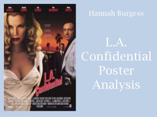
2. The Narrative
& Colour
The main colour in this
poster is black and red
with orange tones. This
suggests that the
narrative will be very
dark and the red suggest
blood (criminal activity)
but also passion. The
orange also suggests a
sunset which implies that
the majority or key parts
of the narrative happen
in the evening. The block
of white colour at the
forefront of the image of
the woman‟s dress is also
very striking…
3. Key Images
The key image in this poster is
of the woman on the left
forefront. Her white dress
stands out clearly from the black
and red in the background.
White usually suggests purity
and innocence however from her
facial expression and the low cut
top, it suggest a more sinister
character and that she is more
of a seductress type character.
4. Camera
Distance
By having the female character at the
very front of the image it shows that she
is potentially a dominant character and
has a leading role in the film. By having
the male characters on one side of the
poster and the female character on the
side it suggest that they are on opposing
„teams‟ or have contrasting opinions.
By incorporating a long shot into the
image the audience is able to see the
time of day as being evening and that the
location is in Hollywood, this helps the
audience to understand the context of
the film.
The medium shot allows the two main
characters to be seen in detail and the
distance between them allows their
unstable/lack of relationship.
The slight low angle makes the
characters appear dominating and in
power, this is reflective of the narrative
of them being criminals or in the police
force.
5. At the top of the poster is the actors and
T
actresses names. They are shown in order of
their importance of their role in the film.
Like in many film posters in the film noir
h
genre, the anchorage is often at the top of the
poster. The anchorage on this poster says
“Everything is Suspect… Everyone is for sale…
And nothing is what it seems.”
e Anchorage‟s are used to help enforce a message
that the poster is trying to convey. This
anchorage helps to enforce the idea of criminal
activity and corruption.
The title is in a sans serif font which is often
used to clearly show the title. I think in this
T
case it was specifically chosen as it reflects a
font stereotypically used in a film about crime
and police. The title is portrayed in the same
way no matter where it is seen (All the posters,
e
in the film etc.) this means that the film can be
recognised simply based on the font and colour
of the title. The red colour stands out as a stark
contrast to the black background. The colour
x
red is often used to signify blood, passion and
love, This ideology is also reflected as the title
is right next to the image which reinforces this
idea.
t Like in most film posters the technical
information of who produced,
distributed the film etc. is shown at the
edited
bottom.
6. Lighting
The lighting in this image is
Chiaroscuro as only one light
source is used on the image of
the people which means that
shadows appear on their faces
making them appear in a
dangerous and dark way.
Ambient lighting is also used as
the lighting has been softened to
soften the harshness of the
shadows making them appear
more natural. The orange sunset
has also been softened in order
to make it blend better into the
darkness.
7. The Layout
Like most film noir posters,
this poster is portrait.
The images in this poster
aren‟t blended in to look as if
they are all in perspective of
each other. This is done to
show the dominance of the
female character and how as
each Detective has less of an
impact within the narrative
their role because smaller and
they fade into the background
more.
Like in most film posters the
actors names are at the top
and the technical information
is at the bottom. The technical
information is essential and
needs top be shown on every
film poster.