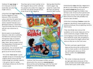
1. I believe the age range is
6-11 because of all the
bold titles and all of the
bright colours.
I think that the target audience
for this magazine is boys
because of the masculine
colours and also the quite basic
but bold titles and because of
all the mischief that Dennis is
getting involved in. The colours
used connotate that this comic
will be more attractive to
males.
Dennis seems to be shocked
because a man who is probably
his father has coming running
through the door in hospital
gowns and said that he has a
baby sister; Dennis doesn’t seem
too happy about this because of
the reaction of his facial
expressions, this connotates that
he could have been up to no
good cause he seems shocked.
They have put an issue number on to
the magazine because this will help
the people who collect the magazine
and may also attract people to find
more issues of the magazine
I think that including a freebee inside the
magazine may attract more people to buy
the comic because they are getting more for
their money
I think that the class that this magazine is
aimed at is the children of the people in
the social categories from A to C1
because even though the children may
not have a lot of money their parents will
have more money than the people lower
down the list so they will probably buy
more for their children
They most likely have not put the
publisher on the comic because as it’s a
comic aimed at younger children they
are not going to be as bothered about
who made the comic they are going to
care more about the bright colours and
pictures that are on the front cover.
The comics front cover is quite
likeable because of the bold and
bright colours used in the full
bleed image but a dislike towards
it for girls is that it is rather
stereotypical because of all of the
colours used.
The font used was a good choice
because they stand out and there are
not too many words so its simple and
eye catching also because of the
colours used in the mainstream
headings.
I believe that the younger children who are
attracted to this comic are mainstreamers
because they will probably go with the flow and
will get the comic because their friends have
bought it.
This comic is obviously aimed at
younger generations because of the
quite animated and bold bright colours
on the front cover of the comic.
Having advertised the
8 extra pages may
make the reader feel
like they are getting
more for their money
2. I believe that the target audience for this
comic is for people aged 12-16 years old
because there are more words on the
front cover and the colours are not as
bold and bright as the Beano comic.
The colours used on the front cover
connotate that this front cover will
be more attractive for males. They
also connotate that there is a lot of
anger and hatred between the two
colours because of the reds and
oranges used.
They have put the publishers name and logo onto
the front cover because the target audience may
see that the comic was made by marvel and they
have read and enjoyed there comics before.
The massive bird man in the full
bleed image takes up quite a lot of
space, his big wings connotate that
he has a lot of strength and power.
He is also standing on top of a
cactus, this is a low angle shot
which connotates that he wants to
be in charge and he is more
powerful than spider man who is
on the floor.
The comics plug may attract other
readers apart from the normal
marvel comic readers because there
may be people who are interested in
history and the civil war but also
because it says that is a chapter this
shows that more than likely there will
be more than one comic and will
attract the comics collectors.
The price is more expensive compared
to the Beano comic because its target
audience is older than the target
audience for beano as they will have
more money.
‘Prey for Life’ is a play on words because
the attacker(the bird man) is hunting on
his prey(Spiderman) this also connotates
that spiderman may be praying for his life
to be saved.
Spiderman’s ripped mask connotates that he may want to
escape and get away from what he has got himself in to, it
also connotates that as he is losing the fight he is trying to
save himself from revealing his true identity.
The masthead is bold and bright
and stands out from the page
compared to the other colours on
the page , this will also attract
people who have read spiderman
magazines before.
Putting the Issue number on the front
cover will also attract people who collect
spiderman and other marvel comics
because it will help them keep track of
which issues they have but also if a new
buyer has read the magazine and they
want to read more they will be able to
find other issues.
Spiderman’s looking scared and
nervous, his facial expressions
connotate that he could be quite
vunerable at that point.
In this full bleed image it looks
like that the comic book hero is
losing one of his many
battles, people may be interested
as to what really happens
3. I think that this magazine is
aimed at people aged 9 – 12
years old because of the dull
colours used.
The chiller font is used to
compliment the picture well
because it is similar looking to
all of the gunk coming out of
the nose and eyes.
Putting a plug on the front cover
of the comic will attract readers
because it is advertising a story
which happens within the comic
and that way people will be
interested as to what happens
next
Putting the Issue number on the
front cover will attract past
readers of the comic and will
also help collectors find other
comics.
The price of the comic is not
that expensive, its not as
expensive as the other marvel
comic ‘Spiderman’ because the
target audience for this comic is
younger so they wont have as
much money as them.
The Masthead of the comic is
quite bold and stands out and
will be quite attractive towards
males; it will also be eye
catching too.
I think that the social
categories that this comic is
aimed at people in the social
categories, C1, C2 and D
because it’s a reasonable and
affordable price.
They have included the
publishers logo on the front
cover because it may attract
other marvel readers who
have read their comics
before.
This plug advertising the
continuing of a past story
will attract past issue
readers because they may
want to read this issue to
find out what happens next.
The full bleed image is quite
effective as it stands out
because of the
gruesomeness and the facial
expressions have
connotations of anger and
are trying to make people
fearful but also readers may
be curious as to what he is
and what story is behind it.
Childhood’s end is the name
of the magazine
The sharp teeth have
connotations of flesh ripping
and tearing things apart which
could also cause fear
4. The target audience for this comic
cover is girls aged 6 – 10.
I have used pinks and purples for the
main colour scheme for this comic
because it goes well with the target
audience and also represents
connotations.
I have put the issue number on the
front cover of the comic because it can
show that this is a collectors item and
that there will be more than one of
this comic so people will be interested
in reading it again.
I have included the website on
the cover because this way
people are able to visit the
website to find out more
information on the comic.
By placing a freebee in the magazine
will attract the readers because this
way they are getting more for their
money.
I have used a doughnut as the
main character for my comic
because it has connotations
of sweetness and children also
will like a sweet snack such as a
doughnut.
I have put a free trip to Disneyland
Paris inside the comic because
children would love the chance to win
a trip and also it will attract more
readers.
I have a bold pink masthead
because the colour represents a
stereotypical girl and younger
females will be attracted by the
boldness and it also stands out.
I haven’t included the publishers
name because the younger
generations would not be interested as
to who made the comic but as to what
has been included inside and whether
there are any free gifts or
competitions inside.
I have put the release date of
the comic on to the front cover
because that way people will be
able to know when the release
date was and also if people are
collecting the comic they will be
able to tell which issues they
have and which ones they need
to collect.
I have put a plug on the front
cover because this will inform
people about what is included
inside the comic and if people
have read the comic before and
enjoyed it then they will also
buy it again so will attract past
readers.
The font used was a good choice
because its bold and stands out so it
will be attractive for the readers.
I think that the social class that this magazine is
aimed at is children of the people in categories C2, D
and E because the comic is affordable for anyone.
I made the magazine an affordable price because it
makes it affordable for anyone in working class and also
the people who are in higher classes.