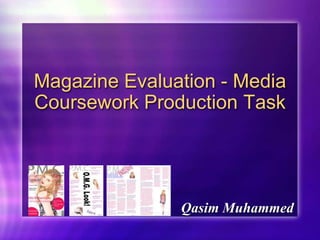
2. P.M.C. Front Cover and A Real Magazine This is the front cover of my magazine P.M.C. My magazine is unique and different in many, different ways, but there is one thing in common that it has with other real magazines and that is my magazine looks as if it is a real magazine. This is because, of the colours, layout and the front cover picture. The front cover picture looks as if this person/model AbiRobertson is a real pop artist, from the hair, make-up and the dress that she is wearing, and also because of the prop that she is holding including her pose. All of these make her look like a real pop artist that has had a full, look celebrity makeover and as the picture is also glossy, this makes it look even more real. The layout of the magazine, is very sophisticated. The Mast Head, id big and bold, and because the colour of it is grey it adds colour to the magazine and also makes the mast head stand out a lot, just like Q magazine. Adding to this, the straplines are on the two sides of the magazine, they are also colourful and some of the important information, such as the artist names stand out, giving the audience and readers of the magazine an insight into what is inside. The colours of my magazine are quite bold, sophisticated and colourful and this makes the magazine stand out and looks as if it is a real, actual magazine.
3. P.M.C Contents Page and A Real Magazine The three pictures in the contents page make the magazine look real, because the pictures look professional, glossy and it makes the model Abi Robertson look as if she is a real pop artist. All of this is because of the make-up, hair and the pink dress that she is wearing. The layout of the magazine, is sophisticated and professional. In the middle instead of putting the word contents, I put “O.M.G. Look!” This is to create an effect and make the magazine look more fun and glossy and also to give it a bit of an exciting, celebrity feel. The colours of the magazine are bold and sophisticated and this makes the magazine look, really, really good and realistic as they stand out and also resume the contents page into a welcoming feel. The language and the text of the magazine is sophisticated and modern and also the language relates to young teenage people, as they are the audience.
4. P.M.C. Double Page Spread and other Real Magazines The double page spread looks exactly like a double page spread that you might see in Q Magazine. This is because, the pictures, colours and also the layout and the content of the magazine are professional, realistic, glossy and attracts the target audience that I want to attract and that is teenagers/adults that are in there mid 20s. The colours of the double page spread are bold, professional and glossy. This shows that the magazine has a relaxing feel where the audience can just pick up the magazine and read stuff that they want to read, not a whole load of nonsense. The pictures of Abi Robertson are glossy, professional and realistic and this is what I see and what other people will see in real magazines that are out there on the shelves. The content and the text and language of the double page spread is exactly what my target audience will want to see, as it is formal, relaxing and good. Also, the content and information about a new artist on the block Abi Robertson is exactly what teenagers and mid 20 something adults would want to see. The layout of the double page spread, is professional . It is in order and not all over the place and this is what audiences want to see.
5. Social Groups and Institution’s The social groups that my magazine represents it young people from the age of 15-26. This is because of the colours and the type of information that I have included, because the artists that I have included have fans that are mainly young people. The institution that might distribute my media product are mainly big supermarkets like Asda, Tesco, Sainsbury’s etc and corner shops, because my magazine is like other pop magazines and also it includes everything that young people want to see in a magazine, so they would want to distribute it due to the amount of sales that it will gain.
6. Attraction of Audience I attracted/ addressed my audience by the colours and the content of the magazine, because my magazine mainly contains young artists that I have a very large fans that are mainly young, so they would relate to that artists. Also the artists are all different, so different types/kind of people can relate to them. Also I have attracted/ addressed the audience because I have put two offers down and so the audience will be attracted to them and I have addressed them because it is like I am talking to them and this carries out throughout my magazine. There are quite a number of things that I have learnt about technology and that is that with the right and correct use of technology you can do unbelievable and fantastic/ professional things with it which you would never ever think you would be able to do. Adding to this, technology and creativity makes your work look good, professional, real and reliable. Looking back at my prelimary task, I have learnt many things I have learnt how to use Photoshop properly, I have also learnt that it is okay to copy another magazine and put it into your magazine but make it your own. As well as these things I have learnt that the colour of a magazine is the main part of a magazine in order for it to look professional and unique. Adding to this, I have learnt that magazines will look good and professional, if they look neat/ funky, if certain types of things stand out, if the content is what your audience wants and also if you spend a lot of time on it.