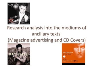
Research analysis into the mediums of ancillary texts
1. Research analysis into the mediums of
ancillary texts.
(Magazine advertising and CD Covers)
2. CD Cover (front)
Main image: Typography:
• Matt is looking at the Matt Cardle (artist)
camera. When We Collide
- By doing this potential (album)
buyers are able to identify • Two different types of
with Matt as this is his first typography is used.
album. - Matt Cardle , this font
• A medium-shot shows Matt could be seen as a
is causally dressed wearing a signature, he’s establishing
jacket. himself after winning.
- This could reinforce his - When We Collide,
‘chilled out’ character. is easy to read and buyers
are able to easily identify
the name of the album.
Colours:
• The black and white colour scheme,
allows ‘The X Factor’ winners logo to stand
out.
- This is important as he's new this is
how potential buyers are to identify him.
3. CD Cover (front)
Main image:
• Matt looks down instead of
looking directly at the
camera. Typography:
- Gazing at the ground MATT CARDLE (artist)
Matt looks pensive. LETTERS (album)
• He's standing clasping his • The typography is simple.
hands together and isn’t - This could relate to
showing much facial Matt’s simplicity and again
expression. his ‘relaxed’ personality.
- This could connote the • The font used is also easy
‘sad’ emotions spread across to read.
various songs. - This is useful as
• A medium-shot shows Matt potential buyers are able to
dressed in a shirt, with scruffy read the wording clearly.
gelled hair.
- This could reinforce his
‘relaxed’ personality. Colours:
• The colour used is fairly dull.
- One colour could suggest he’s feeling
one mood throughout the 13 songs
featured on this CD.
4. CD Cover (back)
Record company and logo. Barcode.
Track listing – Matt has 13
songs featured on this CD.
- Starlight
- Run For Your Life
- All For Nothing
- Pull Me Under
Most common features - Amazing
Institutional information - - Faithless
Who produced it found on the reverse of a - Beat Of A Breaking Heart
- Richard ‘Biff’ Stannard - Stars & Lovers
- Ash Howes CD Cover - Letters
- Gary Barlow - Reflections
- Year it was produced - Walking On Water
- 2011 - Slowly
- When We Collide
Some sort of imagery, though not all the time.
Examples include:
Needs to relate to the - Image of artist
front cover of the CD. - Some sort of location
- Patterns
5. Aim of a CD Cover:
• Attract audiences:
- The cover must be eye catching.
- Audiences must be able to identify the artist/band through image(s) and album name.
• Show a visual representation of the artist:
- Show the personality of the artist/band from images, e.g. Facial expressions.
• Use the typical codes and conventions.
Example on the front CD Cover:
- Simple colour scheme.
- Artist/Band names clearly stated.
- Name of the album clearly identifiable.
Example on the back CD Cover:
- Song titles noticeably listed.
- Barcode.
- Record company/logo.
- Institutional information.
• Maximise sales and revenue.
6. Magazine Advertising
Use of contrasting colours: Image of artist:
- Orange. - The image is slightly faded.
- White. - The image is a close up of
- Black. Ed Sheeran’s (artist) face.
The use of the black and - He is looking directly at the
white text against the orange camera.
background allow it to stand - The close up, and the
out. fact that he is looking
directly at the camera allows
potential buyers to identify
Font: the artist.
- Font is clear/easy to read.
iTunes logo:
Place of wording: - This stands out clearly as
-The wordings are in line and the black contrast with the
placed one after the other. orange.
- This makes it easy to - The iTunes logo signifies,
read, and ensures everything The name of the album is : the producers are taking
is read. - This may look plain and simple, however, it stands into account the changes in
- The word click is underlined, out and potential buyers are to easily remember how people consume music
this suggesting it is easy to be this because of its simplicity. electronically instead of
downloaded on iTunes. buying CD’s.