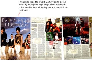
1. I would like to do the what NME have done for this
article by having one large image of the band with
only a small amount of writing so the attention is on
the image.
2. With a smaller image of the band being used on
another page so the reader knows that the article is
connected to the previous page
3. I would also like to keep the similar colours for the
article. Nothing to bright but enough to catch the
readers attention
4. I would also like to use a drop capital in the same way
NME has done
5. I would like to have the page numbers bold and make
them stand out so the reader can get to the article
they want to reader faster.