
Recommended
Recommended
More Related Content
Similar to Minute Maid Product Redesign
Similar to Minute Maid Product Redesign (20)
More from Megan Kelly
Recently uploaded
Recently uploaded (20)
Minute Maid Product Redesign
- 1. Megan BennettMinute Maid Product Redesign
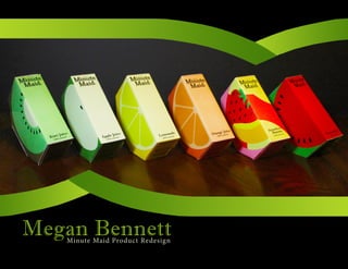
- 2. Product Name Minute Maid (Juice Boxes) Target Group Kids and Young Adults (ages 3-30) Brief history This company was created by Coca-Cola. Starting in 1945, Minute Maid’s name was chosen because of how easy and fast it was to prepare and drink their products. In 1960 Minute Maid and Coca-Cola teamed up, and buisness “boomed” ever since then. They created chilled drinks, frozen preparable drinks, and dozens of different flavors. As time went on, they added more nutrition to the drinks and changing their look. Their most recent changes have been in lighter drinks that have great flavor with fewer calories. Big Idea Simplicity has a great way of grabbing attention. Kids want something tasty and something fun, while parents want something inexpensive and something healthy. My redesign will incorperate all of those ideas into one unique design. Instead of the stereotypical box shape of a juice box, the box will be the shape of a trapezoid. This is meant to make it look like an actual slice of fruit, with the color and the picture on the box being the flavor of the drink. I plan to advertise this design through my websites/ blogs, through the book in this class, and through presentations. This design will sell more than the original design because it has a look that grabs attention on the outside, and a taste and health benefit that will grab attention on the inside. plan on advertising your new redesigned product. Also include how your redesign and advertising will increase sales.) 1
- 3. Titles: Imprint MT ShadowStyle: Regular Size: 30 pt Color: Black or white Body Copy: Minion Pro Style: Regular Size: 12 pt Color: Black Leading between title and body: 16 pt GradientsLighter color towards center of fruit design Do not use gradient colors that aren’t the same color (no red with green, black with orange, etc) Kiwi Green #94d670 RGB: 148, 214, 112 Pantone: 7487 C CMYK: 44, 0, 74, 0 Leaf Green #498308 RGB: 80, 124, 20 Pantone: 370 C CMYK: 75, 27, 100, 12 Inside an Apple #eff2ba RGB: 239, 242, 186 Pantone: 7499 C CMYK: 7, 0, 34, 0 Black #000000 RGB: 000 Pantone: 426 C CMYK: 75, 68, 67, 90 Inside an Orange #ffa239 RGB: 249, 161, 61 Pantone: 715 C CMYK: 0, 24, 50, 0 Outside an Orange #ec6c00 RGB: 255, 119, 43 Pantone: 1575 C CMYK: 3, 70, 100, 1 Watermelon #f60034 RGB: 246, 0, 52 Pantone: 032 C CMYK: 0, 100, 82, 0 White #ffffff RGB: 255, 255, 255 Pantone: 7541 C CMYK: 0, 0, 0, 0 2
- 4. Color Color: Can change to color of fruit flavor Gradient: Darker color on the right of gradient Strip Design Keep strip proportionate Must be larger than the logo when used as a design Position: Always pointing down to content Positioning Logo No text directly tangent to the logo Can be placed on a black background Do not crop logo in any way Size for Juice Box The base of logo must be 1.4 inches wide Words on the Logo Words only may be used on occasion if the complete logo is present somewhere else. ColoredUsed for all products. B&W Only used for drafts, black and white prints, when faxed, or if fruit color is white. 3
- 5. Flat Package Design (Orange Juice example) Thin black lines are just visual help to see where the folds will be. They won’t be printed onto the final product. Light orange triangle shapes all around the design will fold underneath and be hidden for both durability and for shape. 4
- 6. Before and After and Photography 5
- 7. 6
- 8. Magazine Ad This simplistic ad will be included in several different magazines. What’s in it for Me? It’s as healthy as eating a slice of fruit. 100% natural fruit juices in a fun box at a price that is healthy for your wallet too. Will it Increase Sales? These one-of-a-kind juice boxes have 30% more juice than the regular juice boxes, at the origi- nal price. With a hearty and healthy juice inside and a fun unique design outside, it’s sure to make all your friends jealous. 8
- 9. Table of Contents 1Target name, target group, product idea, and product history 2Color and font instructions 3Logo instructions 4Flat package design 5Before and after photography 6Final picture 7Magazine ad, what’s in it for me, and will it increase sales