1. In what ways does your media
product use, develop or challenge
forms and conventions of real media
products?
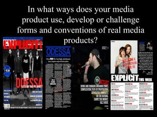
2. With the positioning of the title of my magazine, it was set out in the
normal place, meaning that it would easily catch a potential reader’s view
if they were looking through a magazine rack for a magazine. Also, the
bold red coloured font stands out on the magazine. This has been proven
to be a good technique by Kerrang! Magazine. However, a normal
convention of a music magazine is for the title of the magazine to be
partially covered, however my magazine was newly released, so I did not
think that it was suitable for the magazine’s title to be covered as it may
potentially effect the amount of people who buy the magazine as they
might not be able to see the name. Especially with the connotations of the
title ‘Explicit’ if ‘music’ was covered then people would not be too happy
with the title of the magazine that they were buying.
Also, with the font that I have used for my title, it reflects the generic
conventions of a rock/metal music magazine as the fonts of the other
magazines that I have researched have got ‘jarred’ or elements missing of
their fonts. This could connote the loud music which is featured in the
magazine and could be seen as part of a disturbance.
My mast head is also conventionally what you would expect from a
rock/metal magazine as the size is equally as large as the main artist
which is featured within the magazine. Although in Q and NME magazine
this is not a convention, it has shown to be a technique used within my
genre of music, which is why I chose to adopt that convention within my
magazine.
3. I took the conventions of the contents pages from RockSound
and Kerrang to organise the graphology of my piece. This
included the layout of the text, how many columns there were
and the placement of images and the editors letter. The contents
of the magazines that I did my research on were consistent with
the box-like graphology. This is shown through the different
sections of the contents which are set for the different features
within the magazine. Magazines also use the technique of putting
the most important double page spreads which have been
featured as a jpeg on the contents to advertise what is going to be
in the magazine.
For my cover I used the conventions from RockSound to create
the listings of bands. This is due to RockSound using two
columns (which co-ordinates with the rule of thirds) either side
of the page and altering the size between the left and right (right
being biggest) and the colours also alternating as the list went on.
The name of the artist featured on front is mostly on the right of
the page covering part of the body of the artist as it helps for the
artists name to stand out as people will be drawn to the images
and then they shall go down and focus on the name of the artist.
The graphology conventions for both pages are generally very
cramped with a lot of information on, which represents the music
that the magazine is portraying as there is usually a lot going on.
I used this technique to fit in with the stereotypical graphology of
a music magazine within my genre.
4. The framing of images of a band for a cover piece has many
conventions. One is that the front man (vocalist) is stood in the
middle, as they are the most important person in the band
(apparently). Another is that the rest of the band form a ‘V’ shape
and go back from where the front man is, or they are to
bundle around him to create a miniature crowd around
them. In order to create the image to look like a normal group
photo, the band would have to be standing fairly close together to
show that they
are a close band, and that they get on well.
Choosing my models for my magazine was simple for the front
cover as they are genuinely a band, who I follow on twitter. I did
not need to style them as I let them wear their own clothes so
that they were more comfortable in the images. I have noticed
that in the magazines that I have researched that the artists are
fairly relaxed with their clothing as I think that they have a free
choice of what they want to wear. Also, due to the cover linking
to the DPS I wanted it to be a running theme of the band, which
meant them looking consistent with their DPS. This is also
featured in Kerrang! when they have artists featuring throughout
the magazine as it is not a pop genre. As in a pop genre magazine
they would dress up and do their make up specially for their
article and probably newly released album or upcoming tour.
Within the rock/metal genre this is not appropriate in most cases
as they do not put on much of a show such as Katy Perry would.
5. The colour scheme of my project runs throughout the
magazine. This is a feature of a Kerrang! Magazine as they
have red, yellow and black running throughout the contents
and DPS’ within the magazine. However, usually the DPS’
have their own colour scheme, but it is still linked to the
colour scheme of the main magazine.
The colour scheme is suitable for the target audience as it
will fit with both genders and the ages of the target
audience. This is something that Kerrang! Does as they
have yellow as one of their colours and this connects with
the younger audience and it connotes happiness and
togetherness, this is also a symbol of the music that I am
representing as all of the artists are shown to be respectful
of the other musicians and they listen to each other’s music
and support each other throughout the music genre of my
magazine.
I used a semi-monochrome colour scheme as Metal
Hammer uses a monochrome colour scheme and it fits in
well with the rest of the genre and therefore it would aid
the magazine in gaining the readers.
Editor's Notes
Costumes, props, iconography used to reflect genre