SlideShare a Scribd company logo
1 of 10
The EHR user interface (UI) design above displays each patient encounter in a single-screen view.
(See A Single-Screen EHR Design for the Patient Encounter).
The window above is a mockup of what the user's EHR screen would look like.
When you're ready, advance to the next slide.
Each category of data is assigned to a pane of fixed location on the screen – for instance, the Assessment and Plan
is displayed in the pane on the bottom left.
 This design is similar to that of a paper encounter form (see Why T-Sheets Work), except that both the panes and
the fields within those panes can be interactive (see above and Pane Management -- Part 1).
Navigation from the screen displaying one encounter (for instance, an office visit) to another is accomplished
by selecting the date of the visit in the date-sorted list at the upper right of the screen.
Each screen is a snapshot, showing the patient’s story as it existed at the time of that visit.
This is the story of an elderly woman who had been followed for years for mild glaucoma in her right eye (OD).
While previous encounters exist, for this demo we begin with her office visit of 10/15/2008.
Please take a minute to understand how the information in each pane fits together to give us a sense of this
patient.
In this design, information that has changed since the previous exam is shown in blue font, while unchanged information
is shown in black font.
We see that in 2008 her eye pressure is well controlled just with Alphagan drops, that her visual field and optic nerve
are normal, and that she is planning to move to Florida.
Continue to step through the subsequent slides at your own pace, taking enough time to see her story unfold.
The next time we see this patient is more than three years later. The information is mostly self-explanatory.
Like many patients, she has not been consistently taking all of her medications, in this case Alphagan drops for glaucoma.
Her pressure of 31 is too high for her optic nerve, which shows damage to the lower (inferior) half. The cross-hatching in
the upper (superior) half of her visual field indicates loss of vision in that region, corresponding to the damage inferiorly to
her optic nerve.
Note that information unchanged from the previous exam is less prominent not only because it is not in blue
font, but also because it displays in exactly the same location on the screen, meaning that attention is not
drawn to it.
This single-screen design, showing new information in all categories, can help the clinician do a better job of
taking care of the patient. The fact that this patient’s daughter was recently diagnosed as a glaucoma suspect
suggests a possible high level of anxiety, both for the patient and for her family. This design allows the clinician
to keep in mind the emotional and social aspects of a disease while managing the medical aspects.
Information which has changed significantly since the last exam or which is markedly out of range can be
emphasized by using a different font color -- in this case, red.
This is the last slide.

More Related Content

More from Tim Histalk

4. 2018 low end vendors 4-6
4. 2018 low end vendors 4-64. 2018 low end vendors 4-6
4. 2018 low end vendors 4-6Tim Histalk
 
3. 2018 mid range vendors 4-4
3. 2018 mid range vendors 4-43. 2018 mid range vendors 4-4
3. 2018 mid range vendors 4-4Tim Histalk
 
2. 2018 macro vendors 3 30
2. 2018 macro vendors 3 302. 2018 macro vendors 3 30
2. 2018 macro vendors 3 30Tim Histalk
 
1. 2018 top his vendors 3 26
1. 2018 top his vendors 3 261. 2018 top his vendors 3 26
1. 2018 top his vendors 3 26Tim Histalk
 
1. 2018 top his vendors 3 25
1. 2018 top his vendors 3 251. 2018 top his vendors 3 25
1. 2018 top his vendors 3 25Tim Histalk
 
1. 2018 top his vendors 3 23
1. 2018 top his vendors 3 231. 2018 top his vendors 3 23
1. 2018 top his vendors 3 23Tim Histalk
 
2. february 1988
2. february 19882. february 1988
2. february 1988Tim Histalk
 
5. december 1987
5. december 19875. december 1987
5. december 1987Tim Histalk
 
4. november 1987
4. november 19874. november 1987
4. november 1987Tim Histalk
 
2 september 1987
2 september 19872 september 1987
2 september 1987Tim Histalk
 
109. cerner, part 6
109. cerner, part 6109. cerner, part 6
109. cerner, part 6Tim Histalk
 
108. cerner, part 5
108. cerner, part 5108. cerner, part 5
108. cerner, part 5Tim Histalk
 
107. cerner, part 4
107. cerner, part 4107. cerner, part 4
107. cerner, part 4Tim Histalk
 

More from Tim Histalk (20)

4. 2018 low end vendors 4-6
4. 2018 low end vendors 4-64. 2018 low end vendors 4-6
4. 2018 low end vendors 4-6
 
3. 2018 mid range vendors 4-4
3. 2018 mid range vendors 4-43. 2018 mid range vendors 4-4
3. 2018 mid range vendors 4-4
 
2. 2018 macro vendors 3 30
2. 2018 macro vendors 3 302. 2018 macro vendors 3 30
2. 2018 macro vendors 3 30
 
1. 2018 top his vendors 3 26
1. 2018 top his vendors 3 261. 2018 top his vendors 3 26
1. 2018 top his vendors 3 26
 
1. 2018 top his vendors 3 25
1. 2018 top his vendors 3 251. 2018 top his vendors 3 25
1. 2018 top his vendors 3 25
 
1. 2018 top his vendors 3 23
1. 2018 top his vendors 3 231. 2018 top his vendors 3 23
1. 2018 top his vendors 3 23
 
HISsies 2018
HISsies 2018HISsies 2018
HISsies 2018
 
3. march 1988
3. march 19883. march 1988
3. march 1988
 
2. february 1988
2. february 19882. february 1988
2. february 1988
 
1. jan 1988
1. jan 19881. jan 1988
1. jan 1988
 
5. december 1987
5. december 19875. december 1987
5. december 1987
 
4. november 1987
4. november 19874. november 1987
4. november 1987
 
3. october 1987
3. october 19873. october 1987
3. october 1987
 
2 september 1987
2 september 19872 september 1987
2 september 1987
 
109. cerner, part 6
109. cerner, part 6109. cerner, part 6
109. cerner, part 6
 
108. cerner, part 5
108. cerner, part 5108. cerner, part 5
108. cerner, part 5
 
107. cerner, part 4
107. cerner, part 4107. cerner, part 4
107. cerner, part 4
 
1. august 1987
1. august 19871. august 1987
1. august 1987
 
Cerner Part 3
Cerner Part 3Cerner Part 3
Cerner Part 3
 
Cerner Part 2
Cerner Part 2Cerner Part 2
Cerner Part 2
 

Pp snapshots in time

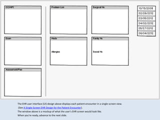
  • 1. The EHR user interface (UI) design above displays each patient encounter in a single-screen view. (See A Single-Screen EHR Design for the Patient Encounter). The window above is a mockup of what the user's EHR screen would look like. When you're ready, advance to the next slide.
  • 2. Each category of data is assigned to a pane of fixed location on the screen – for instance, the Assessment and Plan is displayed in the pane on the bottom left. This design is similar to that of a paper encounter form (see Why T-Sheets Work), except that both the panes and the fields within those panes can be interactive (see above and Pane Management -- Part 1).
  • 3. Navigation from the screen displaying one encounter (for instance, an office visit) to another is accomplished by selecting the date of the visit in the date-sorted list at the upper right of the screen. Each screen is a snapshot, showing the patient’s story as it existed at the time of that visit.
  • 4. This is the story of an elderly woman who had been followed for years for mild glaucoma in her right eye (OD). While previous encounters exist, for this demo we begin with her office visit of 10/15/2008. Please take a minute to understand how the information in each pane fits together to give us a sense of this patient.
  • 5. In this design, information that has changed since the previous exam is shown in blue font, while unchanged information is shown in black font. We see that in 2008 her eye pressure is well controlled just with Alphagan drops, that her visual field and optic nerve are normal, and that she is planning to move to Florida. Continue to step through the subsequent slides at your own pace, taking enough time to see her story unfold.
  • 6. The next time we see this patient is more than three years later. The information is mostly self-explanatory. Like many patients, she has not been consistently taking all of her medications, in this case Alphagan drops for glaucoma. Her pressure of 31 is too high for her optic nerve, which shows damage to the lower (inferior) half. The cross-hatching in the upper (superior) half of her visual field indicates loss of vision in that region, corresponding to the damage inferiorly to her optic nerve.
  • 7. Note that information unchanged from the previous exam is less prominent not only because it is not in blue font, but also because it displays in exactly the same location on the screen, meaning that attention is not drawn to it.
  • 8. This single-screen design, showing new information in all categories, can help the clinician do a better job of taking care of the patient. The fact that this patient’s daughter was recently diagnosed as a glaucoma suspect suggests a possible high level of anxiety, both for the patient and for her family. This design allows the clinician to keep in mind the emotional and social aspects of a disease while managing the medical aspects.
  • 9. Information which has changed significantly since the last exam or which is markedly out of range can be emphasized by using a different font color -- in this case, red.
  • 10. This is the last slide.